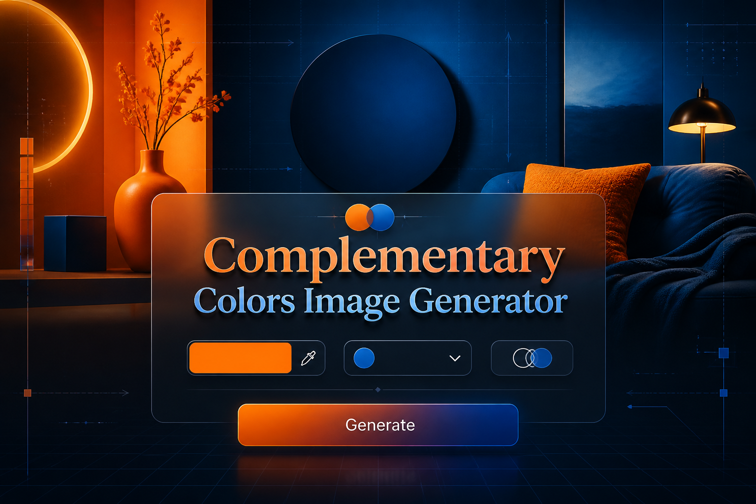
Complementary Colors Image Generator
Complementary Colors Image Generator is a free online tool to generate complementary colors style images. The tool is free to use, just enter prompt in complementary colors style and generate complementary colors image style in seconds similar quality to flux, midjourney, open ai, imagen, nano banana AI image quality.
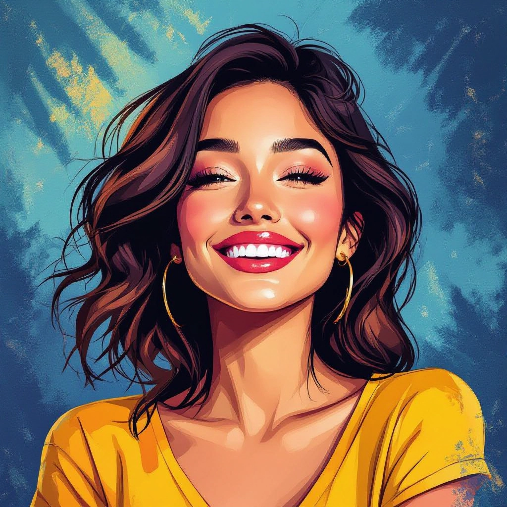
Generate Complementary Colors AI Image for Free
Receive our FREE AI updates via email once a week
What is a complementary colors Generator?

A Complementary Colors Generator is an AI tool that creates images and palettes based on complementary color theory, pairing hues that sit opposite each other on the color wheel to maximize contrast and visual harmony. Instead of random palettes, the generator calculates optimal complementary pairs, adjusts saturation and luminance, and applies them across image regions so highlights, shadows, and focal points use opposing colors for striking results.
Designers, illustrators, brand strategists, and social media creators use this generator to produce bold visuals that draw the eye and communicate mood through color contrast. Photographers and UI designers use it to test accessibility and legibility, while artists use it to explore vivid compositions where complementary relationships intensify emotion and depth.
How to Create complementary colors Images
Step 1: Choose a base color and describe the scene or subject you want to render. Step 2: Generate a complementary palette with the tool, then refine hue, saturation, and brightness to balance contrast between foreground and background. Step 3: Apply the palette to the image, preview variations, tweak placement or tone mapping, and export the final high-resolution image for use in branding, illustration, or web assets.
Enter AI Complementary Colors Prompt

Type your complementary colors character or scene description in the prompt box. Include details like character appearance, clothing, expressions, and setting to get better AI complementary colors results.
Choose AI Model Settings
Select your preferred image size and aspect ratio. Our AI model delivers professional quality comparable to:
- • Flux AI Quality
- • Midjourney Standard
- • OpenAI DALL-E
- • Google Imagen
Download AI Complementary Colors Image

Once your AI complementary colors image is generated, click the download button to save it to your device. The image will be in high quality format ready for use.
Features of AI complementary colors Image Generator
Automatic complementary palette generation
The AI analyzes your base hue and produces precise complementary pairs and triads, offering alternate complementary options with adjusted saturation and luminosity for different visual intensities.

Region-aware color mapping
Assigns complementary colors to distinct image regions such as foreground, midground, and background to preserve depth while maximizing contrast between focal elements.
Hue balance and accessibility tools
Built-in contrast checks and color blindness simulation let you tweak complementary combinations to meet legibility and accessibility standards without losing the intended visual punch.

Style presets tuned to complementary palettes
Choose presets like cinematic teal-orange, bold poster contrast, or subtle complementary wash to instantly apply curated complementary treatments tailored to common creative briefs.
High-resolution export and color codes
Export images in multiple formats and get exact HEX, RGB, and HSL values for each complementary swatch so you can reproduce the palette across print and digital channels.
Types of AI Powered Complementary Colors Style Images
Complementary color styling can be adapted to many visual languages. Below are common AI powered variations that emphasize complementary contrast while serving different artistic and commercial needs.
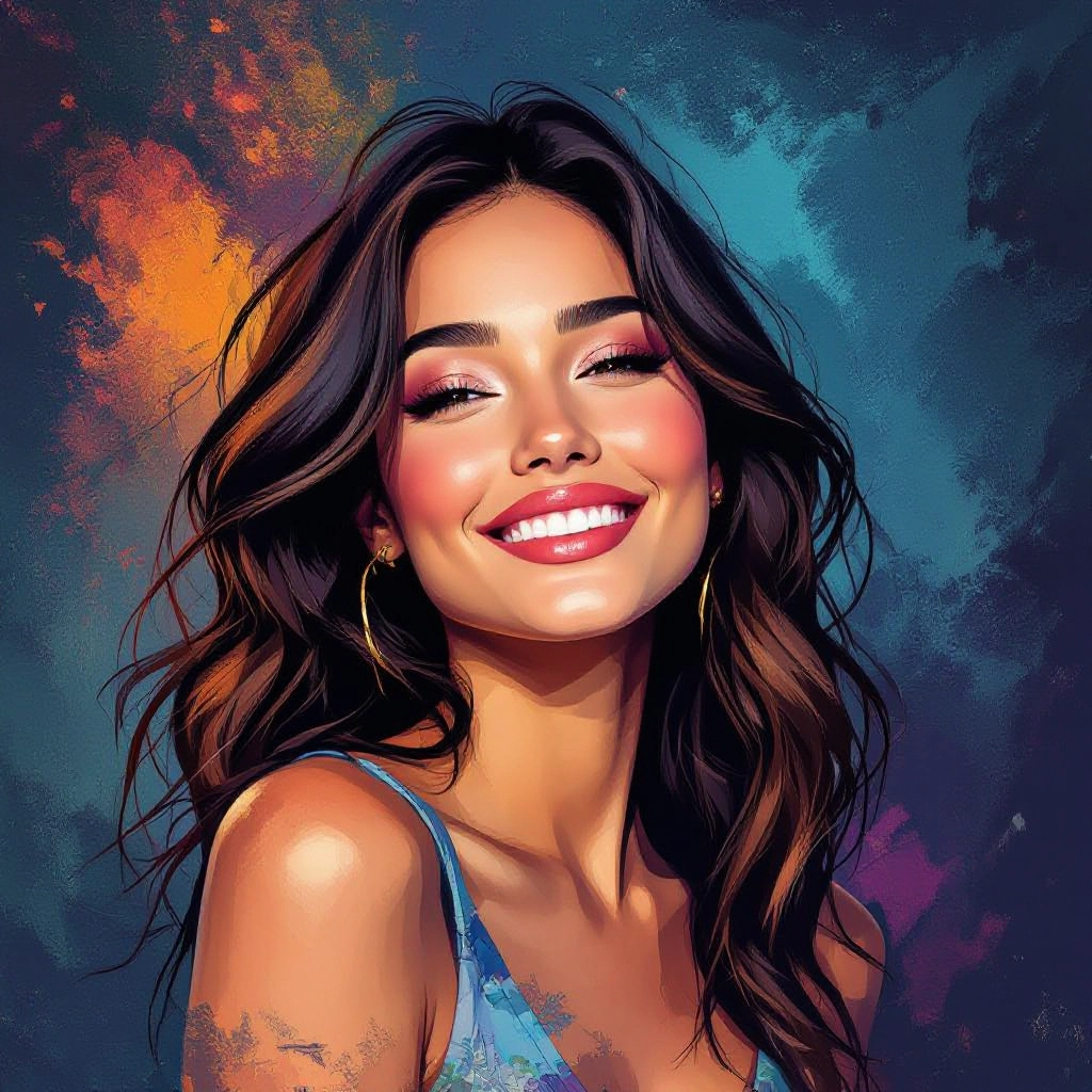
Cinematic Complementary Grading
Rich teal and warm orange pairings applied to scenes to create cinematic depth, where shadows favor one complementary hue and highlights favor the opposite for dramatic impact.
Poster High-Contrast Graphics
Flat shapes and bold complementary contrasts meant for posters and billboards, using saturated opposing hues to maximize readability from a distance.
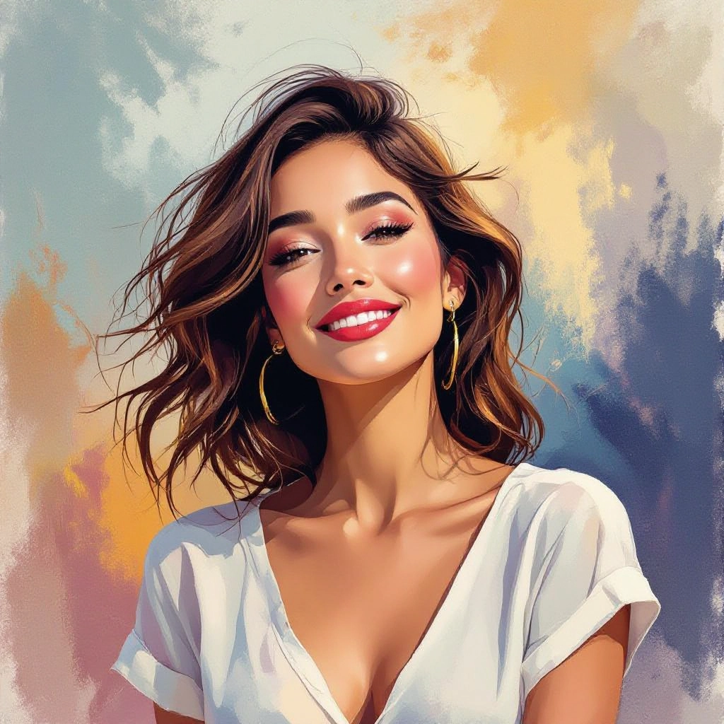
Subtle Complementary Wash
Low-saturation complementary overlays that provide harmony without overwhelming detail, ideal for editorial spreads and background treatments.
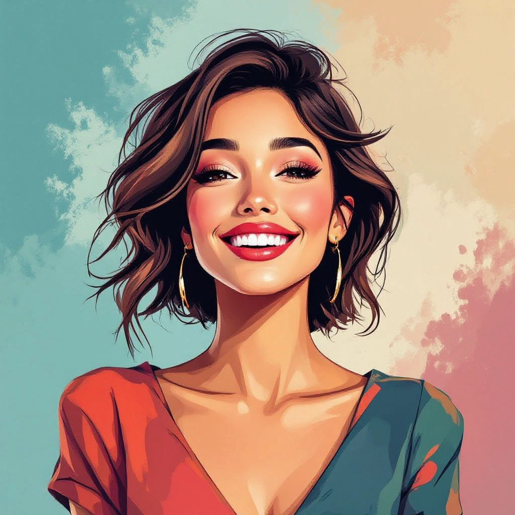
Pop Art Complementary Pop
Vivid complementary pairings with hard edges and halftone textures to create a pop art aesthetic that celebrates intense color contrast.
Complementary Night Scene Lighting
Uses cool-warm complementary mixes to simulate neon or stage lighting, placing cool complements in shadow and warm complements in highlights for mood.
Illustrative Complementary Blends
Hand-drawn or vector illustrations that use complementary accents to define focal points, adding vibrancy to character art and concept illustrations.
Applications of AI complementary colors image style
Brand identity and logos
Create memorable brand marks using complementary colors to increase contrast and recognition while keeping a balanced brand palette for multiple touchpoints.
Advertising and poster design
Design attention-grabbing ads and posters where complementary contrasts are used to highlight offers, calls to action, and key imagery for maximum impact.
Illustration and concept art
Artists can explore mood and storytelling by assigning complementary hues to characters and environments, enhancing visual tension and narrative clarity.
Social media content
Produce thumbnail images and posts with dramatic complementary contrasts to increase click-through and engagement across feeds and stories.
UI and web design testing
Evaluate color legibility and visual hierarchy by testing complementary schemes for buttons, alerts, and hero sections while maintaining accessibility standards.
Photography color grading
Apply complementary grading to photos to create stylized looks, reinforce subject separation, and generate mood through contrasting color temperature.
FAQs about AI complementary colors image generator
What makes a color pair complementary?
Complementary colors sit opposite each other on the color wheel, such as blue and orange or red and green. They produce strong contrast and enhance perceived vibrancy when placed together.
Can I adjust saturation and brightness after generation?
Yes. The tool provides sliders to fine-tune saturation, brightness, and hue offsets so you can soften or amplify contrasts while preserving complementary relationships.
Is the generator suitable for accessibility testing?
Yes. The generator includes contrast ratio checks and color blindness simulations so you can verify that complementary combinations remain legible for diverse viewers.
How do I use complementary palettes in branding?
Use one color as the dominant brand hue and the complementary color as an accent for calls to action and highlights. Keep neutral backgrounds to prevent the complement from overwhelming the design.
Can I export color codes for print?
Yes. Exported palettes include HEX, RGB, and HSL values. For print, convert to CMYK using your design software to ensure accurate color reproduction.
Does the AI support artistic styles like watercolor or neon?
Yes. Style presets allow complementary palettes to be applied to different rendering styles such as watercolor wash, neon lighting, or vector flat art to match your creative intent.