Responsive Generator
Create responsive HTML and CSS that adapts perfectly to all screen sizes
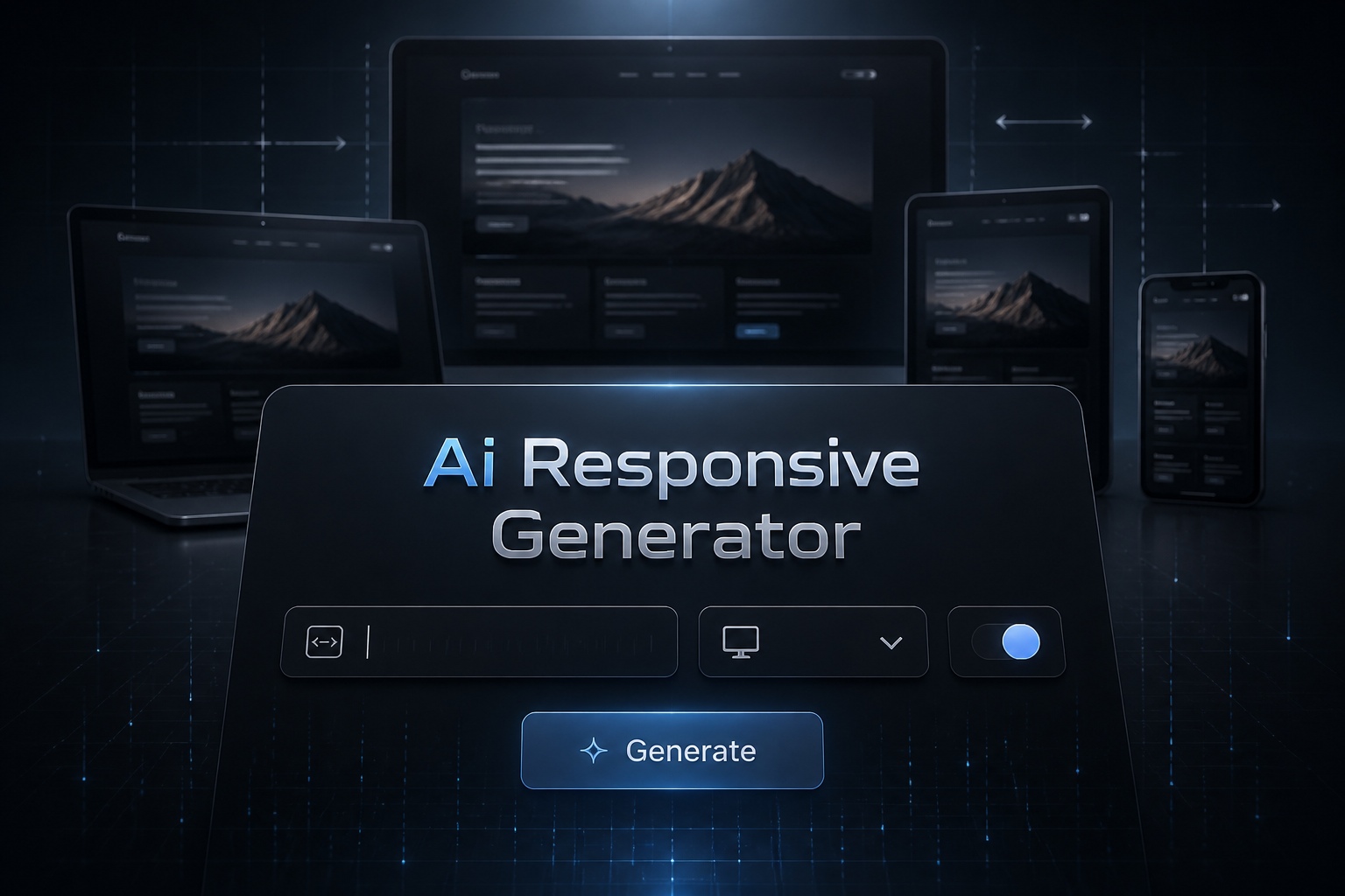
What is AI Responsive Design Generator
This tool generates mobile-first responsive HTML and CSS with media queries, flexible units, and adaptive layouts. Create designs that work seamlessly across all devices from phones to large desktops.
How to Use AI Responsive Design Generator
Follow these simple steps to use the ai responsive design generator:
1. Describe the component or layout
Describe the component or layout
2. Select responsive approach (mobile-first recommended)
Select responsive approach (mobile-first recommended)
3. Choose CSS units strategy (rem, px, or fluid)
Choose CSS units strategy (rem, px, or fluid)
4. Generate HTML and CSS with breakpoints
Generate HTML and CSS with breakpoints
5. Test across different screen sizes
Test across different screen sizes
Examples of Content Generated by AI Responsive Design Generator
Here are some examples of what you can create with our tool:
Responsive navigation with mobile hamburger menu
Card grid that adjusts from 1 to 4 columns
Hero section with responsive background images
Responsive typography with fluid scaling
Frequently Asked Questions
What breakpoints are used?
Typically uses mobile (320px+), tablet (768px+), desktop (1024px+), and large desktop (1440px+) breakpoints. Responsive design adapts to every screen — ensure the logic behind it scales too with code from our AI Python Code Generator.
Is it mobile-first?
Yes, by default uses mobile-first approach with min-width media queries, but you can choose desktop-first.
Does it use modern CSS?
Yes, uses Flexbox, CSS Grid, and modern responsive techniques like clamp() and calc().
Are images responsive?
Yes, includes responsive image techniques with srcset, picture element, and object-fit.
Can I customize breakpoints?
Yes, specify custom breakpoints for your specific design requirements.