Creating stunning AI art goes beyond just writing good prompts. One of the most powerful tools in your creative toolbox is understanding complementary colors. These color pairs can make your AI-generated images pop, create visual balance, and evoke specific emotions. Whether you’re a beginner or an experienced digital artist, mastering complementary colors will take your AI artwork to the next level.
In this guide, you’ll learn everything about using complementary colors in AI art, from basic color theory to advanced techniques for prompting AI generators. Let’s dive in and discover how to create eye-catching artwork that stands out.

Table of Contents
- What Are Complementary Colors?
- Why Complementary Colors Matter in AI Art
- Basic Complementary Color Pairs You Should Know
- How AI Image Generators Understand Colors
- Prompting Techniques for Complementary Colors
- Best Complementary Color Combinations for Different Moods
- Common Mistakes to Avoid
- Tools and Generators for Complementary Color Schemes
- Advanced Techniques for Color Control
- Real-World Examples and Applications
- Frequently Asked Questions
- Key Takeaways
What Are Complementary Colors?
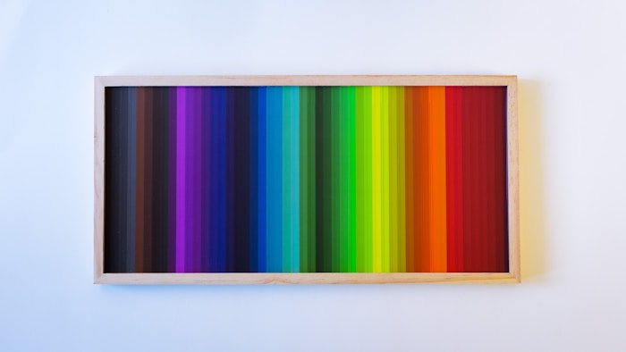
Complementary colors are pairs of colors that sit directly opposite each other on the color wheel. When placed side by side, these colors create the strongest contrast and make each other appear brighter and more vibrant. This natural visual phenomenon happens because complementary colors stimulate different photoreceptors in our eyes.
The three main complementary color pairs are:
- Red and Green
- Blue and Orange
- Yellow and Purple
These pairs form the foundation of complementary color theory. However, the color wheel contains many more complementary combinations when you consider tertiary colors like red-orange, yellow-green, and blue-violet. Each pair on opposite sides of the wheel creates a complementary relationship.
Understanding this basic principle is crucial because AI image generators are trained on millions of images that use these color relationships. When you prompt for complementary colors, you’re tapping into patterns the AI has learned from art, photography, and design across history.

Why Complementary Colors Matter in AI Art
Complementary colors aren’t just a technical concept. They have real power in how your AI art looks and feels. Here’s why they matter:
They Create Visual Impact
When you use complementary colors, your artwork immediately grabs attention. The high contrast between these colors makes elements stand out. This is why you see major brands like Firefox and the LA Lakers using complementary schemes in their logos.
They Balance Warm and Cool Tones
Every complementary pair combines a warm color with a cool color. Blue (cool) pairs with orange (warm). Red (warm) pairs with green (cool). This temperature difference creates natural balance in your compositions. Your eyes are drawn to the contrast, but the overall effect feels harmonious.
They Guide the Viewer’s Eye
In AI-generated artwork, complementary colors help establish visual hierarchy. You can use one color for the background and its complement for key elements you want to highlight. This technique ensures viewers focus on the most important parts of your image.
They Work with AI Training Data
AI image generators learn from existing artwork, and complementary color schemes are everywhere in professional art and design. According to recent market analysis, the AI art market was valued at $3.2 billion in 2024 and is growing at nearly 29% annually. As more artists use AI tools, understanding color theory becomes essential for standing out in this expanding field.
Basic Complementary Color Pairs You Should Know
Let’s break down the primary complementary pairs and how to use them effectively in your AI art projects.
Red and Green

Red and green might remind you of Christmas, but this powerful combination works year-round when used thoughtfully. The key is avoiding pure, saturated versions of both colors together. Instead, try variations like burgundy and sage green, or coral and forest green.
Best for: Nature scenes, dramatic portraits, fantasy landscapes
Mood: Energy, vitality, natural contrast
When prompting AI generators, specify shades rather than pure hues. For example, “a portrait with deep burgundy lighting and olive green background” works better than simply “red and green portrait.”
Blue and Orange
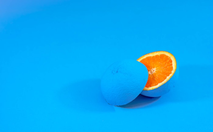
This is arguably the most popular complementary pair in modern art and design. Research shows that AI models tend to overuse orange and teal because these colors appear so frequently in training data, especially in movie posters and professional photography.
Best for: Sunsets, sci-fi scenes, character portraits, product photography
Mood: Warmth balanced with calm, professional yet energetic
The blue-orange combination works because it feels natural. Think of a sunset with orange skies and blue water, or daylight with blue skies and warm orange sunlight on buildings. When using AI FREE FOREVER’s complementary colors image generator, this combination consistently produces visually striking results.
Yellow and Purple
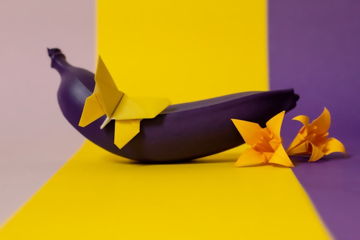
Yellow and purple create sophisticated, high-contrast artwork. This pairing appears frequently in luxury branding and fashion design. Purple conveys royalty and creativity, while yellow brings optimism and energy.
Best for: Fantasy art, fashion designs, branding artwork, abstract compositions
Mood: Sophisticated, creative, luxurious
According to color psychology, purple suggests creativity and luxury, making this combination perfect for high-end design work. When prompting, try variations like “golden yellow accents on deep violet background” or “lavender tones with mustard yellow highlights.”
How AI Image Generators Understand Colors
Knowing how AI processes color information helps you write better prompts and get more consistent results.
Training on Millions of Images
AI image generators learn color relationships by analyzing vast datasets of existing artwork, photographs, and designs. According to industry statistics, Stable Diffusion models alone have created over 12.5 billion images as of 2024. This massive training helps AI understand which colors work well together.
The AI doesn’t just memorize colors. It learns patterns about how colors interact, which combinations appear in certain contexts, and what emotional responses different color schemes typically evoke. This is why AI can identify complementary colors on the color wheel to create contrast automatically.
Color Names vs. Color Codes
Here’s something important to know: most AI image generators work better with color names than hex codes or RGB values. When you prompt “cerulean blue” or “burnt orange,” the AI understands these descriptive terms better than “#0080FF” or “RGB(255, 140, 0).”
AI models are trained on text descriptions of images, not technical color codes. A detailed study on AI color prompting found that specific color names like “turquoise” or “coral” produce more accurate results than generic terms like “blue” or “orange.”
Context Matters More Than You Think
AI image generators interpret colors based on context. If you prompt “lavender,” the AI might include actual lavender flowers in the image. To avoid confusion, be specific: “lavender-colored sunset” or “lavender purple tones” works better.
The same applies to complementary color prompts. Instead of just saying “complementary colors,” describe the specific pairing you want and how you want them used in the composition.
Prompting Techniques for Complementary Colors
Writing effective prompts for complementary color schemes takes practice. Here are proven techniques that work across most AI image generators.
Start with Specific Color Names
Be as specific as possible with your color descriptions. Instead of “blue background,” try “navy blue background” or “electric blue backdrop.” The more precise you are, the better control you have over the final result.
Generic prompt: “A landscape with complementary colors”
Better prompt: “A mountain landscape with burnt orange sunset sky and deep teal water reflections”
Notice how the better prompt specifies exact shades and where each color should appear. This gives the AI clear direction.
Use Color Theory Terms Carefully
While you can use terms like “complementary colors” or “analogous colors” in your prompts, experts warn that these terms can be unreliable without specific definitions. The AI might interpret “complementary colors” differently each time.
A better approach combines color theory terms with specific color names:
Vague: “Portrait with complementary color scheme”
Better: “Portrait with complementary color scheme using royal blue and golden orange tones”
Specify Where Colors Should Appear
Tell the AI exactly which elements should have which colors. This prevents “color spill,” where colors bleed into unintended areas.
Example: “A fantasy castle with purple stone walls, yellow glowing windows, and purple towers against a golden sunset sky”
This prompt clearly assigns purple to specific architectural elements and yellow to light sources, creating intentional complementary contrast.
Layer Your Color Descriptions
Build complexity by describing primary colors first, then adding complementary accents:
Example: “A serene forest scene dominated by various shades of green foliage, with strategic pops of deep red flowers creating visual interest and complementary contrast”
This technique mimics how professional designers work, establishing a dominant color family before adding complementary accents.
Reference Mood and Atmosphere
Combine color specifications with mood descriptors. This helps the AI understand not just what colors to use, but how to use them:
Example: “Moody cyberpunk street scene with cool electric blue neon signs contrasting against warm orange street lighting, creating a vibrant yet ominous atmosphere”
The mood descriptor “moody” and “ominous” guides how saturated and intense the complementary colors should be.
Best Complementary Color Combinations for Different Moods
Different complementary pairs evoke different emotional responses. Here’s how to choose the right combination for your artistic goals.
Energetic and Vibrant: Red and Green
When you want your artwork to feel alive and energetic, red and green deliver intensity. Use this combination for:
- Action scenes and dynamic compositions
- Nature artwork with strong visual impact
- Abstract art that demands attention
- Sports and fitness-related imagery
Pro tip: Soften the intensity by using tints and shades. Instead of pure red, try rose or burgundy. Instead of bright green, use sage or forest green. This makes the combination less jarring while maintaining the complementary contrast.
Professional and Balanced: Blue and Orange
This is the go-to combination when you need artwork that feels both professional and approachable. Perfect for:
- Business and corporate imagery
- Travel and adventure scenes
- Portrait photography styles
- Sunset and landscape artwork
The reason blue and orange works so well is that it mirrors natural lighting conditions we see every day. Blue represents shade and sky, while orange represents sunlight and warmth. This makes images feel familiar and comfortable to viewers.
Creative and Luxurious: Yellow and Purple
For artwork that needs to feel upscale, creative, or mystical, yellow and purple is your best choice. Use it for:
- Fantasy and magical themes
- Luxury product visualization
- Creative industry branding
- Spiritual and mystical artwork
Research on complementary color psychology shows that purple conveys creativity and luxury, while yellow brings optimism and joy. Together, they create sophisticated visual statements.
Modern and Edgy: Teal and Coral
This variation of blue and orange has become popular in modern design. These softer, more contemporary versions of the traditional pair feel fresh and current. Great for:
- Social media content
- Modern interior design concepts
- Tech and startup branding
- Contemporary fashion imagery
Natural and Earthy: Olive and Rust
Another variation of red and green, this muted combination feels organic and grounded. Ideal for:
- Sustainable and eco-friendly themes
- Rustic and vintage aesthetics
- Autumn and harvest imagery
- Natural product photography
According to recent design trends, softer, earthy complementary colors like olive and rust are gaining popularity as people seek more natural, refined color palettes.
Common Mistakes to Avoid When Using Complementary Colors
Even experienced artists make mistakes with complementary colors in AI art. Here are the most common pitfalls and how to avoid them.
Using Pure, Saturated Colors at Full Intensity
The biggest mistake is using both complementary colors at 100% saturation. This creates overwhelming visual tension that can be hard to look at. Pure red next to pure green can actually vibrate and strain the eyes.
The fix: Adjust the saturation or lightness of at least one color. Use a vibrant blue with a muted orange, or a bright yellow with a deep purple. This maintains contrast while reducing eye strain.
Splitting Colors 50/50
Using complementary colors in equal amounts often looks unbalanced. Professional designers follow the 60-30-10 rule:
- 60% dominant color
- 30% secondary complementary color
- 10% accent color (can be a tint or shade of either)
This creates hierarchy and lets one color lead while the other supports. Your AI prompts should reflect this balance by emphasizing one color over the other.
Ignoring Contrast Ratios
For text or important elements in your AI artwork, accessibility matters. Make sure there’s enough contrast between complementary colors and any text or crucial details. This is especially important if you’re creating artwork for commercial use.
The fix: When adding text or important details, use tools like contrast checkers to ensure readability. Or specify in your prompt that text areas should have high contrast backgrounds.
Forgetting About Color Temperature
Not all blues are cool, and not all oranges are warm. Some blues have warm undertones, and some oranges can feel cooler. Mixing temperatures inconsistently can muddy your complementary color scheme.
The fix: Be specific about color temperature in your prompts. Specify “cool electric blue” or “warm burnt orange” to maintain clear temperature differences.
Overusing the Orange and Teal Bias
Because AI models see orange and teal so often in training data, they default to this combination frequently. If you don’t want your artwork to look like every other AI image, you need to specifically prompt for different complementary pairs or add parameters to exclude certain colors.
The fix: When using Midjourney or similar tools, you can use exclusion commands like “–no teal, orange” to avoid the common bias. Or strongly emphasize different color combinations in your prompt.
Not Considering the Subject Matter
Some complementary combinations don’t fit certain subjects. Purple and yellow might not work for a realistic portrait, while red and green could look out of place in a corporate setting.
The fix: Match your complementary scheme to your subject. Research which industries, themes, or subjects typically use which color combinations. Fashion and luxury can handle bold complements, while corporate and professional work might need subtler applications.
Tools and Generators for Complementary Color Schemes
You don’t have to figure out complementary colors alone. Several tools can help you plan and execute perfect color schemes in your AI art.
AI FREE FOREVER – Your Best Starting Point
Before diving into complex color theory, try AI FREE FOREVER’s complementary colors image generator. This free tool is specifically designed to create images with perfect complementary color balance. Unlike generic AI generators, it’s optimized for color harmony, ensuring your artwork uses complementary pairs effectively from the start.
What makes AI FREE FOREVER stand out:
- No signup or subscription required – completely free
- Built-in understanding of complementary color theory
- Consistent results with balanced color distribution
- Works great for beginners and professionals alike
You can also explore AI FREE FOREVER’s analogous colors generator when you want harmonious color schemes instead of high-contrast complementary pairs.
Colormind – AI-Powered Palette Generator
Colormind uses deep learning to generate cohesive color schemes. You can lock specific colors and let the AI generate complementary options. It’s particularly useful for finding the perfect complementary pair before you start prompting your image generator.
Adobe Color Wheel – Professional Color Selection
For more precise control, Adobe’s color tools let you visualize complementary relationships and extract color palettes from existing images. This is helpful when you want to match the complementary scheme of a reference image.
Coolors – Quick Palette Generation
Coolors offers fast complementary color scheme generation with the ability to lock colors and adjust saturation, brightness, and hue. It also provides hex codes you can reference when describing colors in your prompts.
Khroma – AI-Trained Personal Color Tool
Khroma learns your color preferences through a training process, then generates personalized color combinations. It’s trained on thousands of popular human-made palettes, making it excellent for finding complementary schemes that match your taste.
Figma Color Wheel – For Design Integration
If you’re working on design projects that incorporate AI-generated art, Figma’s color wheel tool seamlessly integrates with your design workflow. You can generate complementary schemes and immediately apply them to your projects.

Advanced Techniques for Color Control in AI Art
Once you understand the basics, these advanced techniques will give you even more control over complementary colors in your AI-generated artwork.
Split-Complementary Color Schemes
Instead of using direct opposites, try split-complementary schemes. This technique uses one base color and the two colors adjacent to its complement. For example, if your base color is blue, instead of using orange (its direct complement), you’d use yellow-orange and red-orange.
Split-complementary schemes offer more color variety with less visual tension than pure complementary pairs. They’re perfect for complex scenes where you need multiple colors that still work together harmoniously.
Prompt example: “Fantasy landscape with deep blue sky, golden yellow highlights on clouds, and warm red-orange sunset glow on mountains”
Using Complementary Colors for Lighting
Professional photographers and cinematographers often use complementary colors in lighting. Apply this to AI art by specifying complementary colors for different light sources:
Prompt example: “Portrait lit by warm orange key light from the right, with cool blue fill light from the left, creating dramatic complementary lighting”
This technique adds depth and dimension to your AI-generated images. According to professional designers, strategic color contrast through lighting is one of the most effective ways to create visually striking artwork.
Color Dominance and Accents
Let one complementary color dominate while using its complement sparingly for accents. This creates sophisticated compositions that don’t overwhelm viewers.
Prompt example: “Minimalist bedroom interior in soft sage green tones, with a single vibrant red velvet armchair as the focal point”
This approach works particularly well for minimalist designs where you want maximum impact with minimal elements.
Gradients Between Complementary Colors
Create smooth transitions between complementary colors for dreamy, atmospheric effects. This works beautifully for skies, water, and abstract backgrounds.
Prompt example: “Ethereal gradient background transitioning smoothly from deep purple at the top to golden yellow at the bottom, soft and dreamy atmosphere”
Gradients soften the stark contrast of complementary colors while maintaining their visual relationship.
Complementary Colors in Different Saturation Levels
Use the same complementary pair but at different saturation levels throughout the image. This creates unity while maintaining visual interest.
Prompt example: “Ocean scene with highly saturated deep blue water, desaturated pale orange beach sand, and medium-saturation orange sunset sky, creating layered complementary color depth”
Inverting Complementary Relationships
Create a series of images where complementary colors switch roles. In one image, blue dominates with orange accents. In the next, orange dominates with blue accents. This technique is powerful for creating visual series or portfolios.
Adding Neutral Bridges
Use neutral colors (white, black, gray, or beige) between complementary colors to reduce intensity while maintaining the color relationship:
Prompt example: “Modern living room with navy blue walls and burnt orange furniture, separated by white architectural elements and light gray flooring”
This technique prevents color clash while preserving complementary dynamics.
Examples and Applications of Complementary Colors
Understanding theory is important, but seeing how complementary colors work in practice helps even more. Let’s look at real applications across different AI art styles.
Portrait Photography Style
In AI-generated portraits, complementary colors separate the subject from the background. Try prompts like:
“Cinematic portrait of a woman with warm orange side lighting on her face, set against a cool teal blue studio background, professional photography style”
This mimics how professional portrait photographers use colored gels and backgrounds. The warm skin tones (orange family) naturally complement the cool background, making the subject pop without looking unnatural.
Landscape and Nature Scenes
Nature offers countless complementary color opportunities. Sunset scenes naturally provide orange and blue. Autumn foliage gives red and green. Spring flowers offer yellow and purple.
“Autumn forest path covered with red and orange fallen leaves, dappled with green moss and ferns in the undergrowth, early morning natural lighting”
When using AI FREE FOREVER’s landscape photography generator, these natural complementary combinations produce realistic, visually appealing results.
Abstract and Geometric Art
Abstract art lets you use complementary colors at their boldest. The lack of realistic subjects means you can push saturation and contrast further:
“Bold geometric abstract composition with electric blue triangular shapes intersecting vibrant orange circular forms, high contrast modern art style”
Abstract work using complementary colors creates immediate visual impact. According to research on AI color mastery, abstract prompts work particularly well with complementary schemes because there are no “realistic” color expectations to meet.
Sci-Fi and Futuristic Scenes
Science fiction artwork often uses complementary colors to create otherworldly atmospheres. Blue and orange dominate this genre, from movie posters to video games:
“Futuristic cyberpunk city street at night, neon blue holographic advertisements reflecting off wet pavement, warm orange street lights and glowing windows creating depth”
This combination feels simultaneously familiar and alien, perfect for cyberpunk aesthetics and futuristic scenes.
Product Visualization
For product renders and commercial artwork, complementary colors make products stand out:
“Luxury watch product photography, golden yellow watch face against deep purple velvet background, studio lighting with soft shadows”
The complementary contrast draws the eye to the product while the luxury colors (purple and gold) communicate value and quality.
Fantasy and Magical Themes
Fantasy art thrives on complementary color schemes, especially purple and yellow, which evoke magic and mystery:
“Mystical wizard casting a spell with golden yellow magical energy emanating from his hands, wearing flowing deep purple robes, fantasy illustration style”
The complementary colors enhance the magical feeling while creating clear visual separation between the character and their magic.
Fashion and Editorial Photography
Fashion photography uses complementary colors to make clothing and models stand out:
“High fashion editorial photo, model wearing vibrant red haute couture gown in a lush green garden setting, natural afternoon lighting, Vogue magazine style”
The classic red and green combination works because the subject and environment complement each other while remaining distinct.
Interior Design Visualization
AI-generated interior designs benefit from complementary colors applied thoughtfully:
“Modern minimalist bedroom with soft sage green walls, burnt orange accent pillows and throw blanket, natural wood furniture, peaceful and balanced atmosphere”
This application shows how complementary colors create interest in functional spaces while maintaining comfort and livability.
How to Apply Complementary Colors Across Different AI Platforms
Different AI image generators handle color prompts differently. Here’s how to optimize your complementary color prompts for popular platforms.
For Midjourney Users
Midjourney responds well to artistic descriptors and specific color names. Include terms like “cinematic,” “vibrant,” or “muted” to control color intensity:
Good Midjourney prompt: “cinematic portrait with vibrant complementary lighting, warm orange key light, cool teal blue rim light, photorealistic, 8k, detailed”
Use the “–stylize” parameter to control how artistic versus literal your complementary colors appear. Lower stylize values (0-50) give you more direct control, while higher values (500-1000) let Midjourney interpret more creatively.
To avoid the orange-teal bias, use: “–no orange, teal” if you want different complementary pairs.
For DALL-E Users
DALL-E excels at understanding detailed descriptions. Be very specific about where each complementary color should appear:
Good DALL-E prompt: “A beautiful garden scene where purple wisteria flowers hang from an overhead arbor and golden yellow sunflowers grow in the foreground, creating natural complementary color harmony, soft natural lighting, professional photography”
DALL-E often needs more explicit instructions about color placement to avoid random color distribution.
For Stable Diffusion Users
Stable Diffusion gives you the most technical control. You can use specific terminology and even reference artistic styles:
Good Stable Diffusion prompt: “concept art, split complementary color scheme, base color royal blue with yellow-orange and red-orange accents, fantasy castle at sunset, trending on artstation, highly detailed”
Stable Diffusion also allows negative prompts, useful for avoiding unwanted colors: Negative prompt: “green, pink, brown, muted colors”
For AI FREE FOREVER
AI FREE FOREVER’s complementary colors generator is specifically optimized for color relationships, so you can use simpler prompts:
Simple prompt that works well: “mystical forest scene, purple and yellow color palette”
Because the tool is designed for complementary colors, it automatically balances the colors properly without needing extensive color instructions. This makes it ideal for beginners or when you want quick results without complex prompting.
For Adobe Firefly
Adobe Firefly works best with commercial and professional terminology. It’s designed for business use, so frame your prompts accordingly:
Good Firefly prompt: “professional product photography, complementary color scheme with coral pink product against teal blue background, commercial quality, advertisement-ready, high-resolution”
According to AI prompting experts, Firefly responds particularly well to detailed color specifications and commercial design terms.
Tips That Work Across All Platforms
Regardless of which AI generator you use:
- Start with specific color names, not generic terms
- Describe where each color should appear
- Include mood and atmosphere descriptors
- Reference lighting when using complementary colors for dramatic effect
- Test different variations of the same prompt to see which platform interprets your colors best
How to Evaluate Your Complementary Color AI Art
Creating art with complementary colors is one thing. Knowing if it’s effective is another. Here’s how to evaluate your results.
The Squint Test
Squint your eyes when looking at your AI-generated image. The complementary colors should create clear contrast and visual interest even when the image is blurry. If everything blends together, your color balance might need adjustment.
Check the Focal Point
Your eye should immediately go to the most important part of the image. If complementary colors are working correctly, they guide attention to key elements. If your eye wanders randomly, the color contrast might be too evenly distributed.
Test in Grayscale
Convert your image to grayscale. Complementary colors should maintain visible contrast even without hue. If the colors look identical in grayscale, you need more value contrast (lightness and darkness) in addition to hue contrast.
Get Feedback
Show your work to others and ask what they notice first. If they mention the complementary color contrast, it’s working. If they don’t notice it at all, or if they say the colors feel jarring, you might need to adjust saturation or balance.
Consider Your Goals
Evaluate based on your original intention:
- If you wanted energy and impact, do the colors create that feeling?
- If you wanted sophistication, do the colors feel refined?
- If you wanted to highlight specific elements, do the complementary colors guide the viewer there?
Compare with Professional Work
Look at professional artwork in similar styles. How do they use complementary colors? Are their saturation levels similar to yours? Do they use the same color distribution ratios? Learning from successful examples helps you improve.
Frequently Asked Questions About Complementary Colors in AI Art
What are complementary colors in simple terms?
Complementary colors are pairs of colors that sit directly opposite each other on the color wheel. The main pairs are red and green, blue and orange, and yellow and purple. When placed next to each other, these colors create strong contrast and make each other look brighter and more vibrant.
Why do AI image generators often default to orange and blue?
AI models are trained on millions of images from movies, photography, and design. Orange and blue (or teal) appear extremely frequently in professional visual media because they create natural-looking, appealing contrast. The AI learns this pattern and tends to reproduce it. You can override this by specifically prompting for different color combinations or using exclusion parameters.
Can I use hex codes or RGB values in my AI art prompts?
Most AI image generators don’t work well with technical color codes like hex or RGB values. They’re trained on text descriptions, not numerical codes. Instead, use specific color names like “cerulean blue,” “burnt orange,” or “mustard yellow.” The AI understands these descriptive terms much better than “#FF6600.”
How do I avoid the colors looking too intense or garish?
The key is adjusting saturation and value. Don’t use both complementary colors at full saturation. Instead, use a vibrant version of one color with a muted version of its complement. You can also use tints (adding white) or shades (adding black) to soften the intensity while maintaining the complementary relationship.
What’s the difference between complementary and analogous colors?
Complementary colors sit opposite each other on the color wheel and create high contrast (like blue and orange). Analogous colors sit next to each other on the wheel and create harmony with low contrast (like blue, blue-green, and green). Complementary colors are bold and energetic, while analogous colors are calm and cohesive. You can explore both using AI FREE FOREVER’s analogous colors generator.
Should I always use complementary colors in my AI art?
No, complementary colors are just one approach. They’re excellent for creating impact and contrast, but they’re not right for every project. Sometimes analogous, monochromatic, or triadic color schemes work better depending on your mood and message. Use complementary colors when you want energy, contrast, and visual punch.
How many complementary color pairs should I use in one image?
Generally, stick to one complementary pair per image. Using multiple complementary pairs (called a tetradic or double-complementary scheme) can work, but it’s much harder to balance and can easily look chaotic. Master single complementary pairs before attempting more complex schemes.
Do complementary colors work for all art styles?
Complementary colors work across all art styles, but how you apply them changes. In realistic artwork, use them subtly through lighting and environment. In abstract or stylized art, you can push saturation and contrast much further. The key is matching the intensity of your complementary scheme to the style of your artwork.
What if the AI ignores my color instructions?
This happens sometimes, especially with complex prompts. Try these fixes: (1) Simplify your prompt and focus primarily on color, (2) Use more specific color names, (3) Describe where each color should appear very explicitly, (4) Generate multiple variations until you get one that follows your color instructions, (5) Try a different AI generator that handles colors better, like AI FREE FOREVER’s complementary colors tool.
How do I learn which complementary combinations look good together?
Study professional artwork, movie posters, and brand designs. Notice which complementary pairs appear most often in your favorite styles. Experiment with color palette generators like Colormind or Coolors. Most importantly, practice by creating lots of variations with different complementary schemes and comparing the results.
Can I mix complementary colors with other color scheme types?
Yes, advanced color schemes often combine approaches. You might use a complementary pair for high-impact elements while using analogous colors for the background. Or use a split-complementary scheme that softens the stark contrast. As you gain experience, mixing color theory approaches creates sophisticated, unique palettes.
What’s the 60-30-10 rule for complementary colors?
The 60-30-10 rule suggests using 60% of a dominant color, 30% of the complementary secondary color, and 10% of an accent (often a tint or shade of one of the main colors). This creates visual hierarchy and prevents the image from feeling evenly split and unbalanced. Apply this ratio by emphasizing one color in your prompts while describing the complement as accents or supporting elements.
Key Takeaways: Mastering Complementary Colors in AI Art
Let’s wrap up everything you need to remember about using complementary colors in your AI-generated artwork:
- Complementary colors create maximum contrast – Pairs like red-green, blue-orange, and yellow-purple sit opposite on the color wheel and make each other appear more vibrant when used together.
- AI generators understand color names better than codes – Use descriptive color names like “cerulean blue” or “burnt orange” instead of hex codes or RGB values for better results.
- Balance is crucial – Follow the 60-30-10 rule with 60% dominant color, 30% complementary color, and 10% accents. Don’t split complementary colors 50/50.
- Adjust saturation to avoid eye strain – Use one color at high saturation and its complement at lower saturation, or use tints and shades instead of pure hues.
- Be specific in your prompts – Describe exactly where each color should appear and include mood descriptors to guide the AI’s interpretation.
- Different moods need different pairs – Blue-orange feels professional and balanced, red-green feels energetic and vital, yellow-purple feels luxurious and creative.
- Watch out for the orange-teal bias – AI models default to this combination frequently. Use exclusion parameters or strongly specify different complementary pairs to avoid generic results.
- Start with the right tools – AI FREE FOREVER’s complementary colors generator offers the easiest way to create perfectly balanced complementary color schemes without complex prompting.
- Test and iterate – Generate multiple variations of your prompts, evaluate them using the squint test and grayscale check, and refine based on what works best.
- Study professional examples – Learn from successful artwork, movie posters, and brand designs to understand how complementary colors work in practice.
- Context matters as much as color – Match your complementary scheme to your subject matter. Subtle applications work better for realistic subjects, while bold contrast suits abstract and stylized art.
- The AI art market is growing rapidly – With the AI art industry projected to reach $40.4 billion by 2033, understanding professional techniques like complementary color theory helps you stand out in an increasingly competitive field.
Ready to create stunning AI art with perfect complementary color balance? Start with AI FREE FOREVER’s free complementary colors image generator and put these techniques into practice. No signup required, no limits – just powerful AI art tools at your fingertips.
For more color theory tools and image generators, explore our complete collection of AI image generators, including specialized options for vibrant color schemes, monochromatic designs, and cinematic color grading.
Master complementary colors, and you’ll master one of the most powerful tools in digital art creation. Your AI-generated artwork will pop with visual interest, guide viewers’ attention exactly where you want it, and communicate emotions more effectively than ever before.