Generate Responsive Page Layouts
Create modern layouts with CSS Grid, Flexbox, and mobile-first responsive design
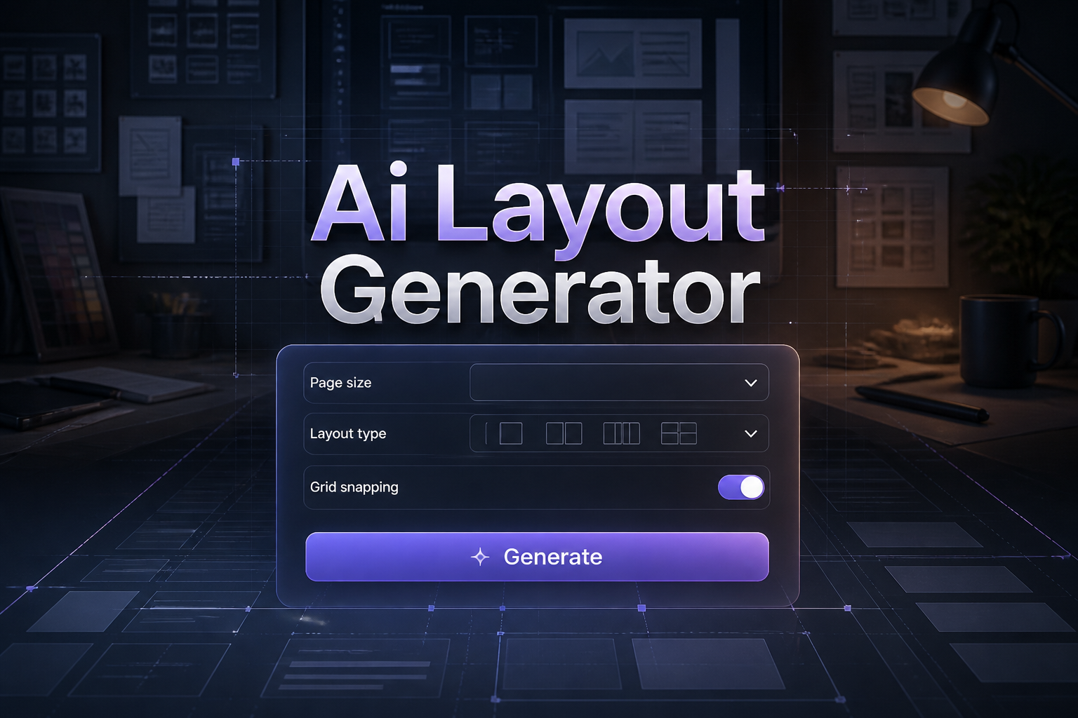
What is AI Layout Generator
This tool generates complete responsive layouts using CSS Grid, Flexbox, or hybrid approaches. Get HTML structure and CSS with mobile-first design and multiple breakpoints.
How to Use AI Layout Generator
Follow these simple steps to use the ai layout generator:
1. Describe the layout structure you need
Describe the layout structure you need
2. Select layout technique (Grid, Flexbox, or hybrid)
Select layout technique (Grid, Flexbox, or hybrid)
3. Choose responsive breakpoint strategy
Choose responsive breakpoint strategy
4. Generate HTML and CSS code
Generate HTML and CSS code
5. Customize spacing and add content
Customize spacing and add content
Examples of Content Generated by AI Layout Generator
Here are some examples of what you can create with our tool:
Two-column blog with sticky sidebar
Dashboard layout with collapsible navigation
Masonry grid for image gallery
Holy grail layout with header, footer, and columns
Frequently Asked Questions
Does it use CSS Grid or Flexbox?
You can choose CSS Grid, Flexbox, or a hybrid approach that uses both for optimal layout. Layouts define user experience visually — make them functional with backend integration code from our AI Python Code Generator.
Are the layouts responsive?
Yes, all layouts include mobile-first responsive design with breakpoints for tablet and desktop.
Can I get complex multi-column layouts?
Yes, generate complex layouts with multiple columns, nested grids, and asymmetric designs.
Does it include semantic HTML?
Yes, layouts use proper HTML5 semantic elements (header, nav, main, aside, footer).
Is the code browser-compatible?
Yes, uses modern CSS with fallbacks and vendor prefixes for broad browser support.