Derived from the Greek words “monos” (one) and “chroma” (color), monochromatic design uses variations of a single hue to create spaces that feel intentional, sophisticated, and visually harmonious. Rather than relying on contrasting colors to generate interest, this approach explores depth through shades, tints, and tones of your chosen color.
A single-color room that feels luxurious rather than boring. Walls, furniture, and decor unified by one carefully chosen hue. This is monochromatic design at its finest, and it has become one of the most sought-after approaches in interior design heading into 2026.
This guide breaks down the essential principles of monochromatic design, explains why interior designers consistently favor this technique, and shows you how to apply it effectively in your own spaces. You will also discover how techniques like color drenching and color capping are evolving this classic approach for modern homes.
Table of Contents
- What is Monochromatic Design?
- Key Components: Hues, Shades, Tints, and Tones
- Why Interior Designers Favor Monochromatic Schemes
- The Psychology Behind Single-Color Spaces
- Core Principles for Monochromatic Interior Design
- Color Drenching: The Technique Dominating 2026
- Room-by-Room Application Ideas
- 5 Mistakes That Undermine Monochromatic Schemes
- Tools to Help You Create Monochromatic Palettes
- Frequently Asked Questions
What is Monochromatic Design?
Monochromatic design refers to using a single base color throughout a space, extended through its various shades, tints, and tones. While many people assume this means black and white only, modern monochromatic interiors span an entire spectrum. Deep greens, royal blues, warm terracottas, and soft blush pinks all qualify when applied consistently throughout a room.
The distinction between monochromatic and monotonous is crucial here. A well-executed monochromatic space feels dynamic and layered, not flat or boring. Interior designer Kristyn Harvey explains that layering monochromatic colors allows the eye and brain to rest, creating a sense of peacefulness that multi-color schemes struggle to achieve.
Unlike complementary or analogous color schemes that rely on relationships between different hues, monochromatic design draws all its visual interest from within a single color family. This creates unity without sacrificing depth, making it particularly effective for both residential and commercial spaces.
Key Components: Hues, Shades, Tints, and Tones
Mastering monochromatic design requires understanding its building blocks. Each component plays a distinct role in creating visual variety within your single-color palette.
Base Color (Hue) serves as the foundation of your monochromatic scheme. According to color theory principles, there are 12 pure pigments on the color wheel, and your chosen hue determines the emotional direction of your entire space. This is the heartbeat of your design, as designer Kate Haynes describes it.
Shades result from adding black to your base color. These darker variations bring depth, drama, and grounding to a monochromatic room. Navy blue derived from a sky blue base, or forest green from sage, exemplifies this principle in action.
Tints emerge when white mixes with your hue. These lighter versions create airiness and softness, often serving as excellent choices for walls and ceilings in rooms where you want to expand the perceived space.
Tones develop by adding gray to your base color. Interior designers frequently rely on tones because they produce muted, sophisticated variations that feel easier to live with long-term. A tone adds complexity without the intensity of pure shades or the starkness of bright tints.
The interplay between these elements prevents monochromatic spaces from feeling one-dimensional. Imagine coral red walls paired with a toned-down persimmon on upholstery and diluted coral-tinted linen curtains. You are working within the same color family while creating distinct visual layers.
Why Interior Designers Favor Monochromatic Schemes
Professional designers return to monochromatic palettes repeatedly, and their reasons extend beyond aesthetic preference.
Cohesion comes naturally with this approach. When every element shares a color foundation, rooms feel intentionally curated rather than accidentally assembled. Designer Erica Nast notes that consistently monochromatic color schemes are luxurious and make a loud statement quietly, similar to how a black-on-black outfit instantly elevates personal style.
Monochromatic schemes also simplify decision-making during the design process. Once you select your base color, subsequent choices about furniture, textiles, and accessories follow a clear logic. This reduces the overwhelm that often accompanies interior design projects.
Small spaces particularly benefit from this technique. By eliminating strong color contrasts, monochromatic design creates visual continuity that makes rooms appear larger than their actual dimensions. The eye moves smoothly across surfaces without interruption, expanding perceived boundaries.
Texture and form gain prominence in single-color environments. Without competing colors drawing attention, the weave of a linen curtain, the grain of wood furniture, or the sheen of a metallic accent becomes the focal point. Statement pieces and architectural details stand out against their unified backdrop.
The Psychology Behind Single-Color Spaces
Color psychology plays a significant role in why monochromatic interiors feel so impactful. Different hues evoke specific emotional responses, and surrounding yourself completely with one color amplifies its psychological effect.
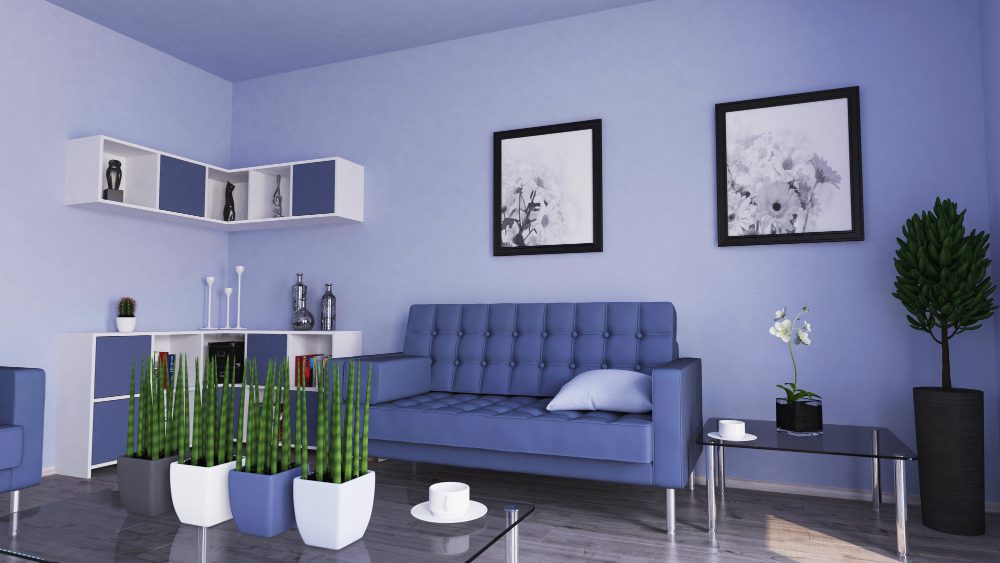
Blue monochromatic schemes promote calm and tranquility. Research indicates that blue relaxes the mind and can even slow heart rate and blood pressure. Aquatic shades like sky blue and light blue carry healing associations, making blue an exceptional choice for bedrooms and bathrooms.
Green draws connections to nature, growth, and restoration. In 2026, greens like Valspar’s Warm Eucalyptus and Behr’s Hidden Gem have been selected as colors of the year, reflecting a cultural hunger for spaces that feel grounded and restorative.
Warm neutrals such as beige, taupe, and cream create cocooning environments that feel safe and comfortable. Designer Kristyn Harvey pairs these with warm whites and brass hardware to maintain thermal consistency throughout the color temperature of a space.
Bolder choices like deep reds and burgundies introduce intimacy and drama. While they require more courage to commit to, rooms drenched in these saturated hues become memorable spaces that make strong statements about the inhabitant’s personality.
The immersive quality of monochromatic design means your color choice matters more than in mixed-palette rooms. Spending time in a blue room will have measurably different effects on your mood than spending equal time in a yellow one.
Core Principles for Monochromatic Interior Design
Executing monochromatic design successfully requires attention to several foundational principles that separate sophisticated results from amateur attempts.
Vary Your Values Deliberately
Value refers to the lightness or darkness of a color. Strong monochromatic schemes incorporate at least three distinct values: light for ceilings and backgrounds, medium for larger furniture pieces and walls, and dark for grounding elements like rugs and accent furniture. This distribution creates the visual hierarchy that keeps eyes engaged.
Layer Textures Generously
Without color contrast to generate interest, texture becomes your primary tool for adding dimension. Combine smooth surfaces like glass and polished metal with rougher materials like linen, wool, and rattan. A cream-colored room might include velvet throw pillows, a jute rug, ceramic vases, and matte painted walls. Each texture catches light differently, preventing flatness.
Consider Finish and Sheen
The finish on surfaces affects how your chosen color reads in a space. Matte walls absorb light while gloss trim reflects it, creating subtle differentiation even when both are painted identically. Interior designer Sharon McCormick recommends using different sheens of the same color, such as high gloss bookcases next to matte walls, to introduce drama without additional hues.
Use Light Strategically
Both natural and artificial lighting change how colors appear throughout the day. A color that looks serene in morning light may feel entirely different under evening incandescents. Test your paint samples on multiple walls and observe them at different times before committing. Position lamps and fixtures to create shadows that add depth to your monochromatic surfaces.
Include Negative Space
Even in fully color-drenched rooms, some breathing room helps the eye process the environment. This might mean leaving a blank wall section, selecting furniture with visual lightness, or incorporating translucent materials that soften the color saturation in certain areas.
Color Drenching
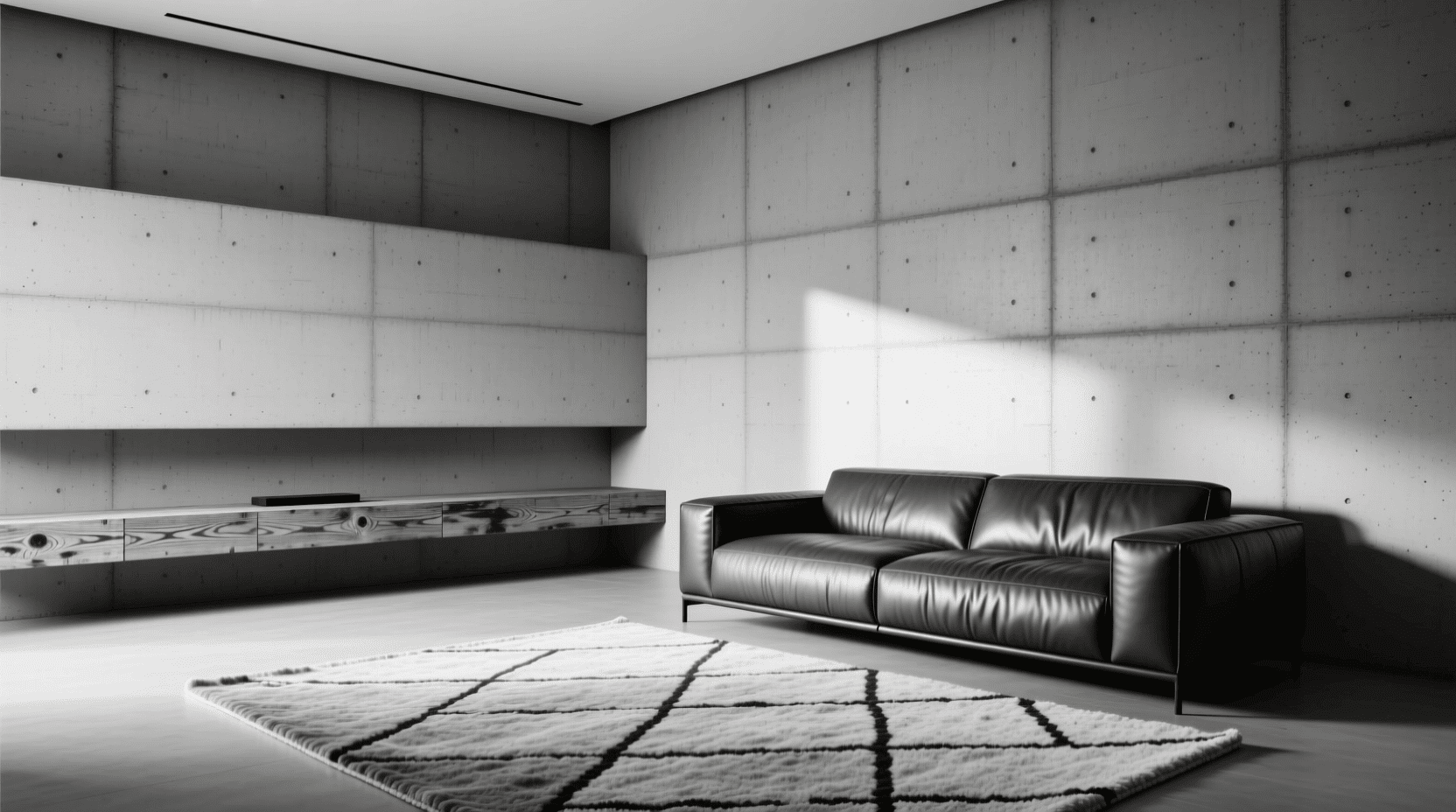
Color drenching takes monochromatic design to its logical extreme by painting all surfaces in a room, including walls, ceiling, trim, and doors, in the same hue. This technique creates what designers describe as a cocoon-like effect that feels intentional and immersive.
Interior designer Sharon McCormick explains this trend has staying power through 2026, allowing homeowners to make bold statements while maintaining visual cohesion. The approach works particularly well with jewel tones and saturated colors, creating dramatic yet harmonious spaces.
One misconception about color drenching involves room size. Dark colors do not automatically shrink spaces. By removing contrast and visual breaks, color drenching actually creates an illusion of spaciousness. Designer Shea McGee has championed this technique in small rooms, noting that the seamless color application eliminates jarring transitions that make spaces feel chopped up.
Color capping has emerged as a sophisticated variation for 2026. This technique involves painting the ceiling or the upper portion of walls in a slightly different shade from the same color family. Designer Hilary Marconetto explains that using paint tones from the same palette and highlighting the ceiling with a darker tone draws the eye upward, making rooms feel larger or more intimate depending on shade choices.
Double drenching represents another evolution, pairing soft clay walls with warmer terracotta ceilings, or powder blue walls with navy woodwork. The relationship between two tones adds dimension without disrupting the calm of the room, creating richness that single-color applications sometimes lack.
Room-by-Room Application Ideas
Bedrooms
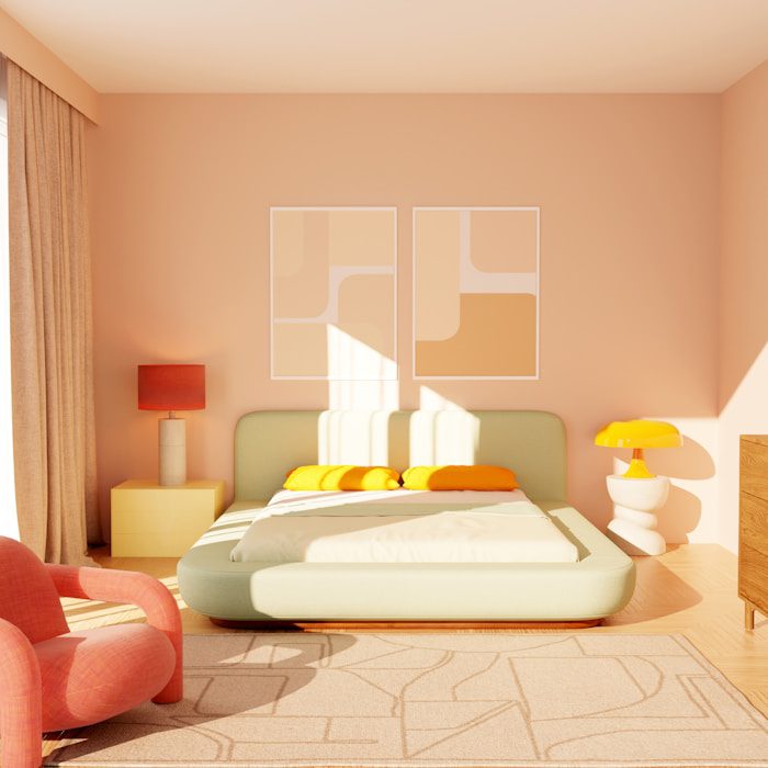
Bedrooms benefit enormously from monochromatic treatment because the cocooning effect supports restful sleep. Blues and greens pack particularly strong psychological benefits, with blue standing out as one of the most calming choices. Consider painting walls in a medium-value shade while using lighter tints for bedding and darker shades for furniture and window treatments.
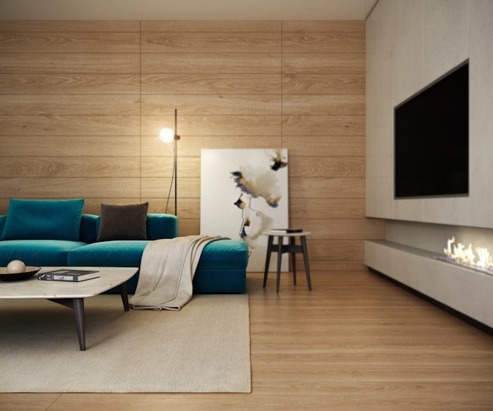
Living Rooms
Monochromatic living rooms can lean either calm or dramatic depending on your color choice. Warm neutrals like beige and taupe create inviting gathering spaces, while deep greens or navy blues establish sophisticated entertaining areas. Layer throw pillows, rugs, and curtains in varying values of your chosen hue to maintain interest across the seating area.
Kitchens
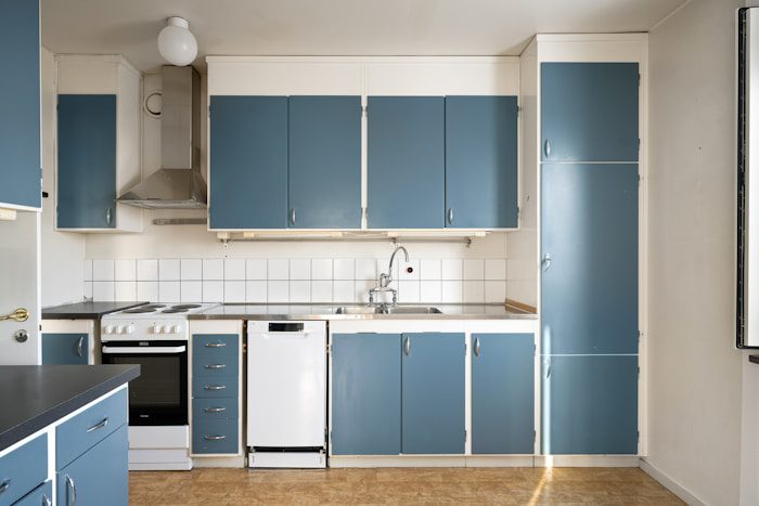
White kitchens dominated for years, but 2026 sees painted cabinets in deep colors like teal, dark blue, and taupe gaining popularity. A monochromatic kitchen might feature forest green cabinets, sage green walls, and mint green accents. Metallic hardware and natural wood elements provide necessary contrast without introducing additional colors.
Bathrooms
Spa-like atmospheres emerge naturally from monochromatic bathroom designs. Earthy tones like warm beige and taupe pair beautifully with natural stone and wood accessories. The consistent color palette creates tranquility while different textures in tile, towels, and fixtures add dimension.
Small Spaces
Powder rooms, hallways, and entryways make excellent testing grounds for color drenching if you feel hesitant about committing to an entire room. These smaller spaces allow experimentation with bolder colors and provide an introduction to living with immersive single-hue environments.
5 Mistakes That Undermine Monochromatic Schemes
- Neglecting Texture Variation: Flat surfaces in identical finishes create boring spaces regardless of color. Every monochromatic room needs multiple textures, from smooth to rough, matte to shiny, woven to solid.
- Ignoring Architectural Details: Color drenching highlights crown molding, trim, and paneling naturally. If your space lacks these elements, consider adding them before committing to a full single-color treatment. Architectural features give your color something to wrap around.
- Choosing the Wrong Value Range: Using only light tints or only dark shades eliminates the contrast that creates visual interest. Successful monochromatic schemes span a significant portion of the value scale from light to dark.
- Forgetting About Lighting: Colors shift dramatically under different light conditions. Test paint samples throughout the day and consider how your artificial lighting affects your chosen hue. What looks perfect in showroom conditions may disappoint in your actual space.
- Skipping Sample Testing: Large swatches painted on actual walls beat small chips every time. Colors look different at scale, and adjacent surfaces affect perception. Invest time in proper sampling before purchasing gallons of paint.
Tools to Help You Create Monochromatic Palettes
Several digital tools simplify the process of building cohesive monochromatic color schemes.
Paint brand websites from Benjamin Moore, Sherwin-Williams, and Behr offer palette-building features that show shades, tints, and tones within color families. These tools visualize how different values work together and often include room mockups.
Adobe Color provides a color wheel tool where you can select monochromatic as your harmony rule and explore variations of any base color. The interface shows exact color codes for digital applications.
Coolors.co generates monochromatic palettes instantly when you lock in a base color and select the monochromatic scheme option. This proves especially useful for visualizing five or six coordinating values at once.
For image generation and visualization, AI-powered tools can help you see how monochromatic schemes might look in various room settings. The monochromatic image generator allows experimentation with single-color aesthetics before committing to physical changes.
Frequently Asked Questions
Does monochromatic mean only black and white?
No. While black and white represent one type of monochromatic scheme, the term applies to any single hue used with its tints, tones, and shades. A room entirely in varying blues, greens, or pinks qualifies as monochromatic.
Will a monochromatic room feel boring?
Not when executed properly. Texture variation, value contrast, and thoughtful material selection create engaging spaces without relying on multiple colors. The key lies in layering rather than applying flat, uniform surfaces throughout.
Can I add accent colors to a monochromatic scheme?
Technically, adding a second color moves you away from strict monochromatic design. However, many designers incorporate small amounts of complementary colors through artwork or accessories without disrupting the overall single-color effect. Metallics like brass and chrome often serve as neutral accents that maintain monochromatic integrity.
Which rooms work best for monochromatic design?
Bedrooms and bathrooms benefit from the calming effects of single-color schemes. Small spaces like powder rooms allow bold experimentation. Living rooms and dining areas work well when you want sophisticated entertaining spaces. Essentially, any room can succeed with monochromatic treatment given proper planning.
How do I choose the right base color?
Consider the room’s purpose, available natural light, and your emotional goals for the space. Cool colors like blue and green promote relaxation, while warm colors like terracotta and burgundy create energizing or intimate atmospheres. Test samples extensively before committing.
Is color drenching expensive to execute?
Paint remains one of the most cost-effective ways to transform a space. Color drenching uses the same amount of paint as traditional painting; you are simply applying it more consistently across all surfaces. The technique offers high visual impact without requiring expensive materials or professional installation.