You might think limiting yourself to a single color would make your designs boring. The opposite is true. A monochromatic color scheme creates visual harmony that multi-color palettes often struggle to achieve. From Apple’s sleek grayscale websites to the haunting green hues of The Matrix, this approach to color has proven its power across industries.
This guide breaks down what monochromatic colors actually mean, walks you through real-world examples, and gives you actionable techniques for applying this color scheme to your own projects—whether you’re designing a website, decorating a room, or creating digital artwork.
Table of Contents
- What Is a Monochromatic Color Scheme?
- Key Terms You Need to Know: Hue, Tint, Shade, and Tone
- Why Use a Monochromatic Color Scheme?
- Monochromatic Color Scheme Examples
- How to Create Your Own Monochromatic Palette
- Practical Tips for Using Monochromatic Colors
- 5 Mistakes to Avoid With Monochromatic Designs
- Tools for Generating Monochromatic Palettes
- Frequently Asked Questions
What Is a Monochromatic Color Scheme?
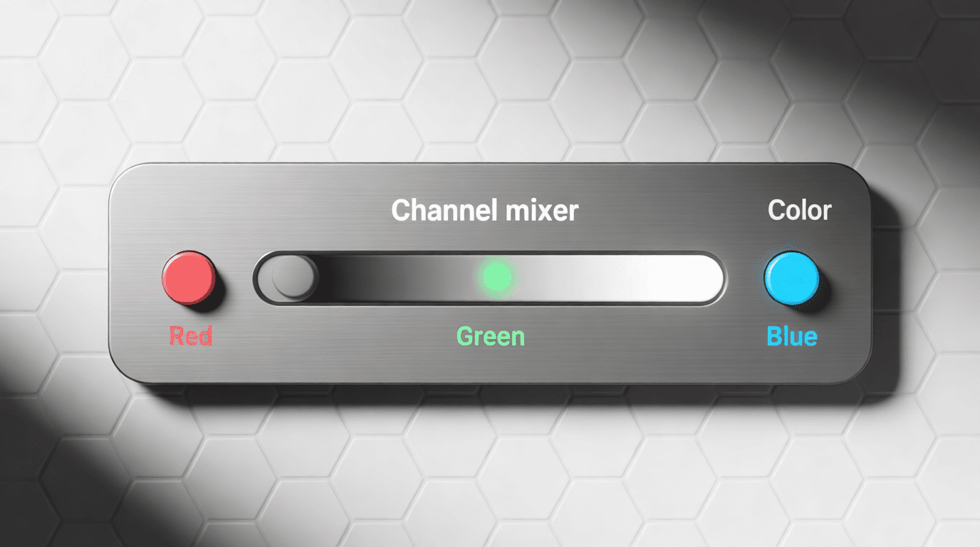
The word “monochromatic” comes from Greek roots—”monos” meaning one, and “chroma” meaning color. A monochromatic color scheme uses variations of a single base color throughout a design. Rather than being restricted to one flat shade, you work with that color’s tints (lighter versions), shades (darker versions), and tones (muted versions).
Think of it this way: if you choose blue as your base color, your palette might include sky blue, navy, slate blue, and powder blue. All of these originate from the same position on the color wheel but differ in lightness, darkness, or saturation. This creates visual cohesion while still providing enough variety to keep things interesting.
Many people confuse monochromatic with black and white photography or grayscale imagery. While grayscale technically falls under the monochromatic umbrella (black and white exist at the extremes of every color), true monochromatic schemes typically center on a colored hue. According to W3Schools’ color reference, these schemes use different tones from the same angle on the color wheel—the same hue—which guarantees all colors will complement each other.
Hue, Tint, Shade, and Tone
Before diving deeper, let’s clarify the terminology that makes monochromatic palettes work.
Hue refers to the pure, base color—the pigment before any mixing occurs. Red, blue, yellow, green—these are hues in their truest form. When building a monochromatic scheme, your hue serves as the foundation everything else builds upon.
Tint is what you get when you add white to your base hue. This creates lighter, softer versions of the color. Adding white to red produces pink; adding white to blue gives you sky blue. Tints lend a calm, airy quality to designs and work beautifully for backgrounds or highlights.
Shade results from adding black to your base color, making it darker and more intense. Forest green is a shade of green; burgundy is a shade of red. Shades add depth and drama, making them ideal for creating contrast and focal points.
Tone emerges when you mix gray into your base hue, reducing its saturation. This produces more muted, subtle versions of the color—think dusty rose instead of hot pink, or slate blue instead of electric blue. Tones bring sophistication and prevent colors from feeling too overwhelming.
Why Use a Monochromatic Color Scheme?
Designers across disciplines gravitate toward monochromatic palettes for several compelling reasons.
Visual Harmony Without Guesswork
Color matching becomes virtually foolproof when you stick to one hue. Since every color in your palette shares the same base, clashing becomes impossible. This makes monochromatic schemes particularly attractive for beginners or anyone who struggles with color theory. You eliminate the risk of jarring combinations while maintaining visual interest through value variation.
Focused Brand Identity
When a brand commits to a single color family, recognition skyrockets. Consider Facebook’s signature blue appearing throughout its interface, or Spotify’s green permeating its artist pages. These aren’t random choices—they’re strategic applications of monochromatic principles that reinforce brand identity at every touchpoint.
Emotional Consistency
Each color carries psychological weight. Blue evokes trust and professionalism. Red signals energy and urgency. Green suggests growth and tranquility. By staying within one color family, you maintain a consistent emotional tone throughout your design. A Zeka Design analysis notes that blue-based monochrome schemes particularly convey trustworthiness, which explains why financial institutions and tech companies favor them.
Simplified Decision-Making
Fewer color choices mean faster design decisions. Instead of deliberating between dozens of color combinations, you focus on perfecting value relationships within a single hue. This streamlined approach often leads to more polished results with less cognitive effort.
Space Enhancement
Interior designers frequently employ monochromatic schemes because they can make rooms appear larger. Benjamin Moore’s design guide explains that using multiple shades of one color softens visual transitions, eliminating the choppy effect that multiple distinct colors can create. The eye flows smoothly through the space without jarring interruptions.

Monochromatic Color Scheme Examples
Abstract theory only goes so far. Let’s examine how monochromatic palettes function across different contexts.
Film and Television
The Matrix remains one of cinema’s most iconic examples of monochromatic color usage. The film bathes its digital world scenes in various shades of green—from pale lime backgrounds to deep forest shadows—creating an immediately recognizable visual language that separates the simulated reality from the “real” world. According to StudioBinder’s film analysis, this approach allows significant variance within the green values while maintaining complete visual unity.
Pablo Picasso’s Blue Period paintings also demonstrate monochromatic power in fine art. Works like “The Old Guitarist” use varying blue tones to convey melancholy and isolation—proof that emotional depth doesn’t require a rainbow of colors.
Web Design
Apple’s website masterfully employs whites, grays, and blacks—a neutral monochromatic approach that puts products front and center. The lack of competing colors ensures visitors focus on what matters: the devices themselves.
Facebook Messenger provides another strong example. Its interface relies on blue variations for buttons, links, and UI elements, with grays handling text and structural components. This consistency makes navigation intuitive while reinforcing brand recognition.
Interior Spaces
A living room decorated entirely in sage green variations—from pale mint walls to deep olive accent pillows—demonstrates “color drenching,” a technique Little Greene’s design blog describes as using one paint color across walls, woodwork, and even ceilings. This approach creates an immersive atmosphere that envelops occupants in a single mood.
Bedrooms benefit particularly from warm monochromatic schemes. Beige and taupe variations foster relaxation without visual stimulation, making them ideal for spaces dedicated to rest.
Fashion
All-black outfits represent the most common monochromatic fashion choice, but designers increasingly explore colored variations. A red carpet look featuring varying crimson tones—from blush accessories to deep burgundy gowns—creates sophistication while maintaining visual unity.
Digital Art and Illustration
Many digital artists choose monochromatic palettes to study value relationships before adding color complexity. Starting with a single hue forces attention to light, shadow, and form rather than color coordination. You can explore this approach yourself using a monochromatic image generator to see how AI interprets single-color compositions.

How to Create Your Own Monochromatic Palette
Building an effective monochromatic color scheme requires more thought than simply picking a color and running with it. Here’s a structured approach.
Step 1: Choose Your Base Hue Strategically
Your base color determines everything that follows. Consider what emotion or message you want to convey before selecting it. Design Pickle’s guide emphasizes that color psychology matters enormously here—red brings energy, blue instills trust, green implies growth, purple suggests luxury.
If designing for an existing brand, your base hue likely comes from established brand guidelines. For personal projects, trust your instincts while considering your target audience’s expectations.
Step 2: Generate Your Variations
Once you’ve selected your base, create three to seven variations by adjusting brightness and saturation. A typical palette includes:
- One or two tints (lighter versions) for backgrounds and subtle highlights
- The base hue for primary elements
- One or two shades (darker versions) for text, shadows, and depth
- Optional tones (muted versions) for secondary elements
The Figma resource library recommends working in the HSB color system (hue-saturation-brightness) when building palettes. Keep your hue constant while adjusting only saturation and brightness values.
Step 3: Establish Clear Contrast
Sufficient contrast between your lightest and darkest values ensures readability and visual hierarchy. If your tints and shades are too similar, elements will blur together. As a guideline from Shutterstock’s palette guide: place your light tints against rich, deep shades for maximum impact.
Step 4: Assign Roles to Each Color
Designate specific purposes for each color in your palette:
- Lightest tint: backgrounds, negative space
- Mid-range tones: supporting elements, borders
- Base hue: primary buttons, key graphics
- Darkest shade: text, headers, emphasis
This systematic approach prevents arbitrary color usage and maintains consistency across your design.

Practical Tips for Using Monochromatic Colors
Knowing how to build a palette is one thing; applying it effectively requires additional considerations.
Leverage Texture and Pattern
When color variety is limited, texture becomes crucial. In web design, this might mean using subtle gradients, shadows, or background patterns. In interior design, mix materials like velvet, linen, and leather within the same color family to prevent flatness.
Play With Sheen and Finish
Different finishes create variation without introducing new colors. Matte walls paired with high-gloss trim, or a satin button against a flat background—these finish contrasts add dimension to monochromatic schemes.
Consider Adding a Single Accent
Strictly monochromatic palettes sometimes need a spark. Canva’s color guide suggests that a small pop of a contrasting color—used sparingly for calls to action or key information—can enhance effectiveness without breaking the monochromatic feel.
Mind Your Contrast Ratios
Accessibility matters. Ensure text remains readable by maintaining adequate contrast between foreground and background colors. This becomes especially important when working with similar tones that might look distinct on your screen but fail accessibility standards.
Handle Images Thoughtfully
Full-color photographs can disrupt monochromatic web designs. Solutions include applying color overlays, using grayscale images, or selecting photography that naturally aligns with your chosen hue. Medium’s web design guide details techniques for making imagery work within monochrome constraints.
5 Mistakes to Avoid With Monochromatic Designs
1. Insufficient Value Range
Choosing colors too close in lightness creates a muddy, indistinct result. Push your lightest tint toward white and your darkest shade toward black for proper contrast.
2. Ignoring Context
A monochromatic scheme that works beautifully on screen might fail in print, or vice versa. Always test your palette in its final medium before committing.
3. Forgetting Hierarchy
Even with one color, visual hierarchy matters. Use value differences to guide attention—darker shades naturally draw the eye more than pale tints.
4. Overcomplicating the Palette
Adding too many variations defeats the simplicity that makes monochromatic schemes effective. Three to five colors typically suffice; more than seven starts feeling cluttered.
5. Choosing an Inappropriate Base Color
A bright yellow monochromatic scheme for a law firm’s website, or a somber navy for a children’s party invitation—context matters. Match your base hue to your project’s purpose and audience expectations.

Tools for Generating Monochromatic Palettes
Several online resources simplify the palette creation process:
Coolors offers a dedicated monochromatic generator that instantly produces balanced palettes from any base color you input.
Adobe Color provides sophisticated controls for adjusting tints, shades, and tones while visualizing how colors work together in real-time.
Paletton allows advanced color matching and shows how your monochromatic choices interact across different design contexts.
Colors and Fonts includes a monochromatic palette generator where you can tune shades, adjust contrast, and copy values in HEX, RGB, HSL, or CMYK formats.
For exploring monochromatic aesthetics in AI-generated artwork, AI image generators let you specify single-color constraints and see how different tools interpret monochromatic prompts.
Frequently Asked Questions
Is black and white considered a monochromatic color scheme?
Technically, yes. Black and white occupy the extremes of every color’s spectrum, and grayscale represents the monochromatic version of “neutral.” However, most designers reserve the term “monochromatic” for schemes built around an actual colored hue rather than pure neutrals.
Can I use multiple colors and still call it monochromatic?
No—that would be an analogous or polychromatic scheme. Monochromatic means single-hue only. However, some designers use “loosely monochromatic” to describe palettes that include closely related colors with minimal hue variation, like different reds that lean slightly toward orange or purple.
What’s the difference between monochromatic and analogous color schemes?
Monochromatic schemes use variations of one hue. Analogous schemes use three colors sitting next to each other on the color wheel—like blue, blue-green, and green. Both create harmony, but analogous offers more variety.
Which base colors work best for monochromatic schemes?
Blue remains the most versatile and widely used, followed by green and neutral tones like gray and beige. Warmer colors (red, orange, yellow) require more careful handling to avoid overwhelming viewers, but they create striking results when balanced properly.
How do I add interest to a monochromatic design without adding colors?
Rely on texture variation, different finishes (matte vs. glossy), pattern incorporation, and strong value contrast between light and dark elements. Photography and illustration also add visual complexity within color constraints.
Are monochromatic designs harder to make accessible?
Not inherently, but they require attention to contrast ratios. Ensure sufficient difference between text and background colors, and test your design with accessibility checkers to verify compliance with WCAG standards.
What industries commonly use monochromatic branding?
Technology companies, financial services, luxury brands, and minimalist lifestyle brands frequently embrace monochromatic approaches. The simplicity conveys professionalism while making brand colors instantly recognizable.
Can I create monochromatic artwork with AI tools?
Absolutely. Many AI art platforms accept color specifications in prompts. You might explore AI art generators that allow style constraints, or dedicated tools like a monochromatic image generator built specifically for single-color outputs.