Single-color spaces have evolved far beyond boring beige boxes. Today’s monochromatic interior design embraces bold jewel tones, rich earth shades, and sophisticated neutrals that transform rooms into immersive visual experiences. Whether you’re drawn to a serene all-blue bedroom or a dramatic emerald library, working within one color family creates depth, cohesion, and undeniable elegance.
This guide explores 25 monochromatic room ideas spanning every style and space in your home. You’ll discover how designers layer tints, shades, and textures to keep single-color schemes dynamic rather than flat. From cozy bedrooms wrapped in warm taupe to statement-making kitchens drenched in teal, these ideas will reshape how you think about color in your home.
Table of Contents
- What Monochromatic Color Schemes Actually Mean
- 1. Navy Blue Bedroom Sanctuary
- 2. Warm Taupe Living Room
- 3. Emerald Green Library
- 4. Dusty Rose Nursery
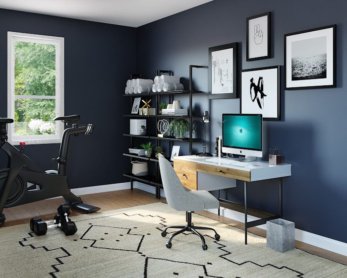
- 5. Charcoal Gray Home Office
- 6. Creamy White Kitchen
- 7. Terracotta Dining Room
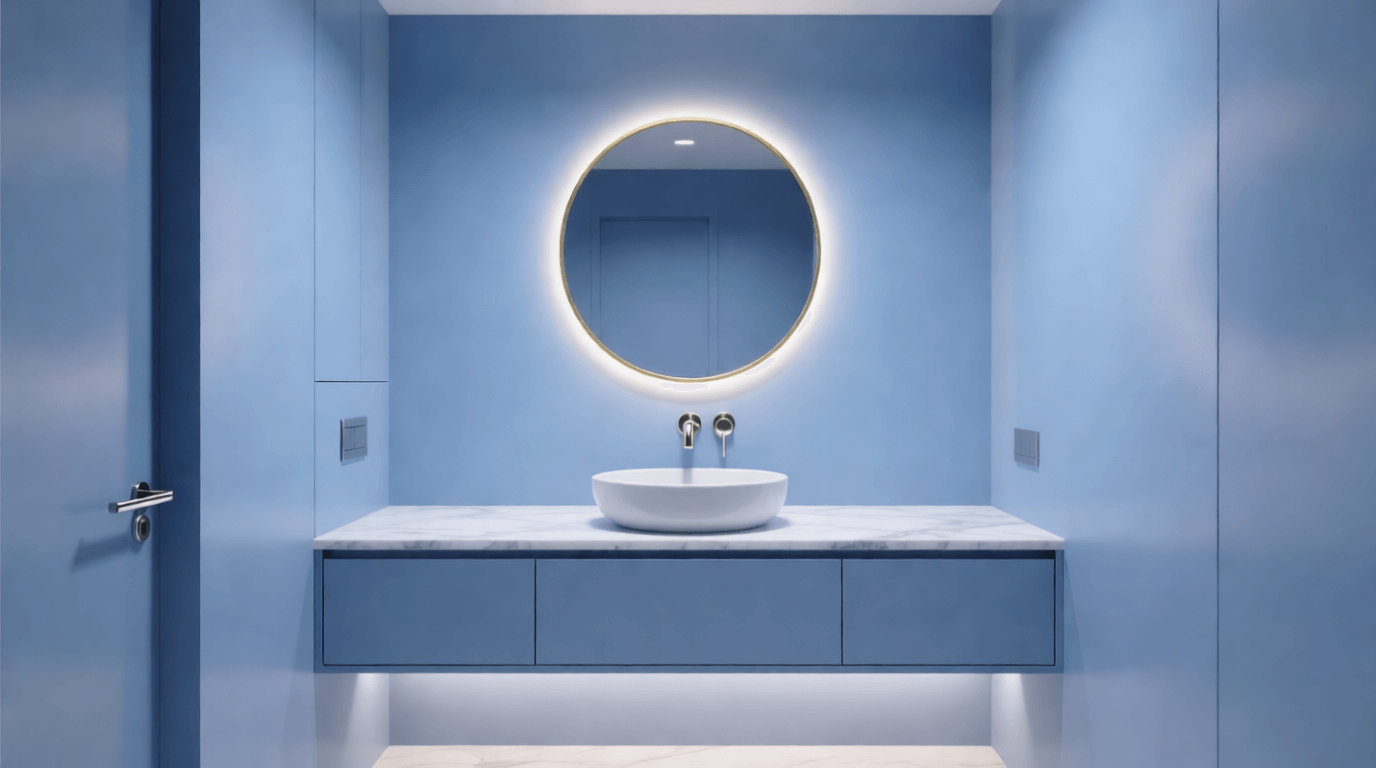
- 8. Periwinkle Blue Powder Room
- 9. Chocolate Brown Study
- 10. Sage Green Bathroom
- 11. Aubergine Wine Tasting Room
- 12. Butter Yellow Breakfast Nook
- 13. Slate Blue Primary Suite
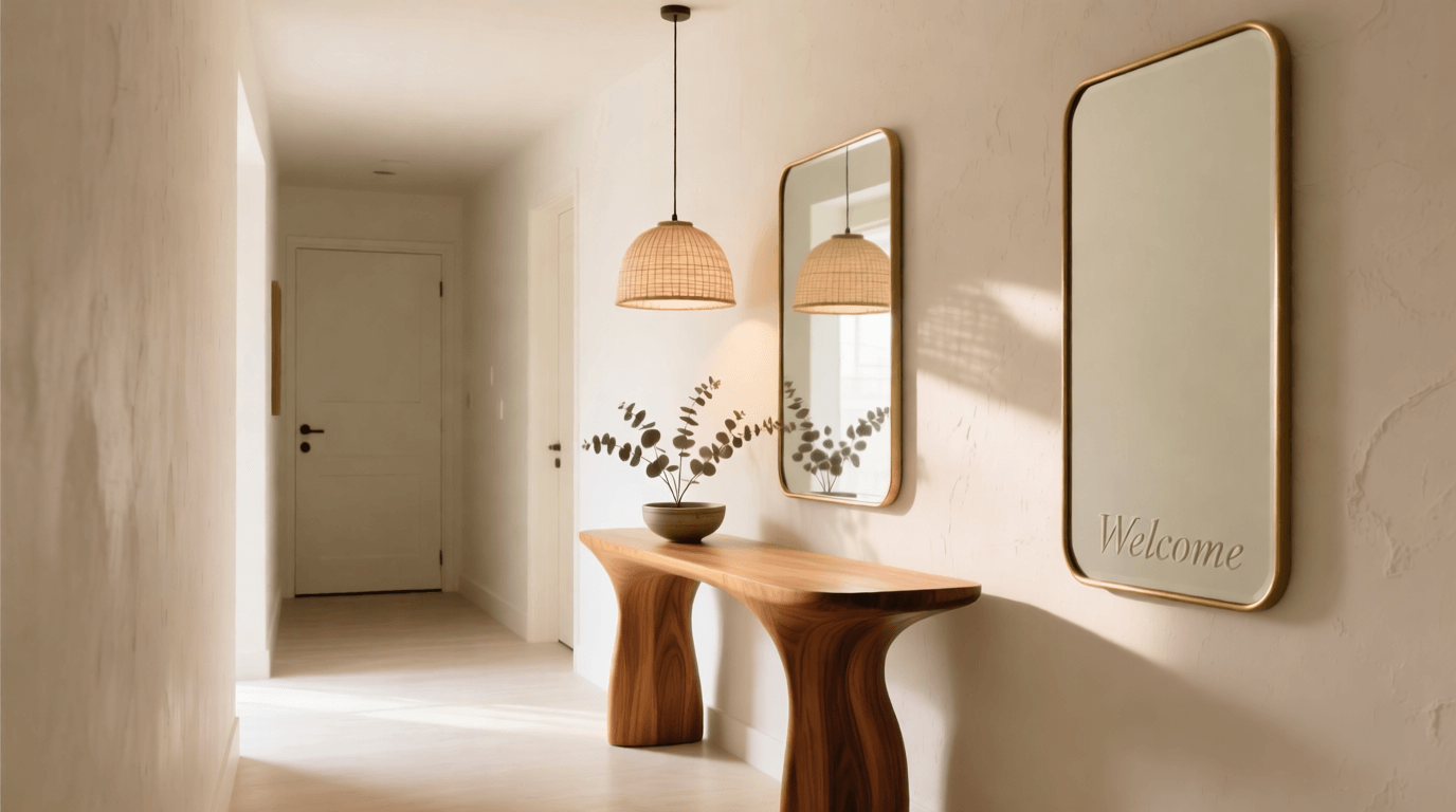
- 14. Warm Ivory Entryway
- 15. Deep Teal Kitchen Cabinets
- 16. Blush Pink Family Room
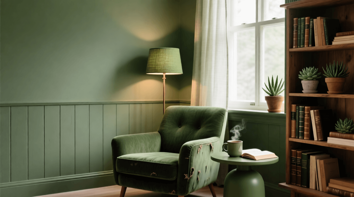
- 17. Olive Green Reading Corner
- 18. Sandy Beige Coastal Bedroom
- 19. Ebony Black Bar Area
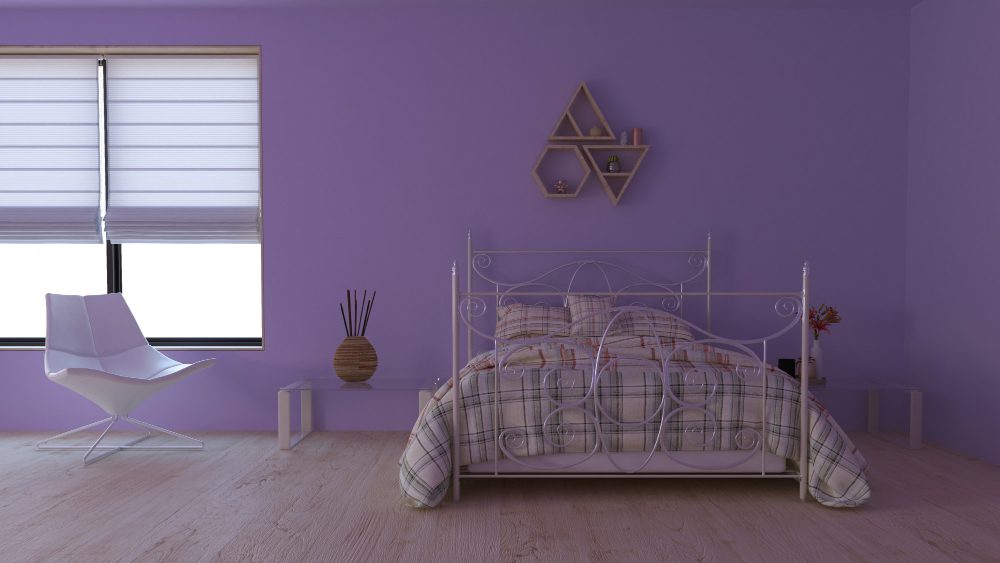
- 20. Lavender Guest Room
- 21. Rust Orange Accent Wall Suite
- 22. Smoky Jade Spa Bathroom
- 23. Caramel Neutral Open Concept
- 24. Sea Green Sunroom
- 25. Rich Burgundy Formal Living Room
- Essential Tips for Perfecting Your Monochromatic Scheme
- Frequently Asked Questions
What Monochromatic Color Schemes Actually Mean
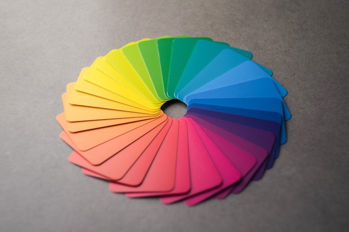
A monochromatic color scheme uses variations of a single hue throughout a space. This doesn’t mean painting everything the exact same shade—that would indeed feel monotonous. Instead, successful monochromatic interior design layers different values of one color: lighter tints created by adding white, darker shades formed by adding black, and muted tones achieved through gray additions.
According to Decorilla’s 2026 trend report, monochromatic rooms have made a significant comeback this year, though with a fresh approach. Designers now push boundaries within single color families, combining navy velvet with powder blue silk and steel blue-gray metallics in the same space. The shade and material contrast creates drama without visual clutter.
The key components of any monochromatic palette include the base color (your dominant hue), various tints and shades of that color, and careful attention to texture since you’re removing chromatic complexity from the equation. Your base color should dominate roughly 80% of the space, with lighter and darker variations filling the remaining 20%.
1. Navy Blue Bedroom Sanctuary
A bedroom painted entirely in deep navy could feel oppressive without proper layering. The secret lies in stretching your navy palette from inky midnight walls to powder blue bedding, with steel gray-blue metallics in your lighting fixtures and hardware. This tonal range adds movement and airiness while maintaining complete color cohesion.
Pair soft matte walls with silky or satin-finish bedding to create textural contrast that catches light differently throughout the day. A high-gloss navy lacquered headboard against matte walls amplifies this interplay. Frame artwork in tones that match—black frames work beautifully with cooler blue palettes, while navy matting reinforces your color story.
For the ultimate navy bedroom, consider carrying the color onto trim, ceiling, and even your radiator covers. This technique, known as color drenching, transforms the space into a cocoon-like environment that feels intentional and immersive. Interior designer Sharon McCormick notes this approach has significant staying power through 2026, allowing homeowners to make bold statements while maintaining visual harmony.
2. Warm Taupe Living Room
Warm neutrals have officially dethroned cool grays as the dominant force in living spaces. A taupe-drenched living room feels both sophisticated and welcoming, providing the perfect backdrop for art, plants, and gathered treasures without competing for attention.
Layer your taupe scheme by starting with the darkest value on floors—perhaps a walnut-stained hardwood—and moving progressively lighter toward the ceiling. Mid-tone taupe walls ground the space while lighter taupe upholstery on sofas and armchairs reflects more natural light. Introduce texture through bouclé throw pillows, linen curtains, and a wool area rug in varying taupe intensities.
The beauty of a neutral monochromatic scheme lies in its flexibility. You can easily refresh the room with different accent colors seasonally without repainting or reupholstering. For now, let the layered taupes speak for themselves—the subtle variations create enough visual interest to stand alone.
3. Emerald Green Library
Saturated jewel tones transform small spaces into stunning statement rooms. A library or home office lacquered entirely in emerald green becomes a jewel box—dramatic, sophisticated, and surprisingly conducive to concentration. Designer Suzanne Kasler demonstrates this approach brilliantly in her Richmond library design, where emerald lacquer covers walls and carries throughout built-in shelving.
Rich, deep colors actually create more intimate and cozy atmospheres rather than making rooms feel cramped. The secret is committing fully—paint the ceiling the same shade, extend the color onto trim work, and choose emerald-toned velvet for seating. A brass desk lamp and warm wood accents provide just enough contrast without breaking your color story.
Books themselves become part of the design when arranged by spine color, grouping green, gold, and cream-covered volumes together. This organizational approach reinforces your monochromatic scheme while creating a curated aesthetic on open shelving.
4. Dusty Rose Nursery
Monochromatic schemes work beautifully in children’s spaces, creating calm environments conducive to sleep and play. A dusty rose nursery avoids the saccharine quality of bright pink while still feeling soft and nurturing. Layer blush walls with deeper mauve textiles and pale pink ceiling paint for a sophisticated take on a feminine palette.
Designer Melanie Turner exemplifies this approach with her apricot-hued nursery featuring faux-tented ceiling and walls in unexpected coral tones. The warmth feels welcoming and youthful without leaning into trends that will quickly feel dated.
Choose furniture in natural wood tones or painted white to provide visual rest within your rose palette. Storage baskets in woven materials add texture while maintaining a soft, cohesive appearance. As your child grows, the room easily transitions—dusty rose reads more sophisticated than obvious pink, aging gracefully alongside its inhabitant.
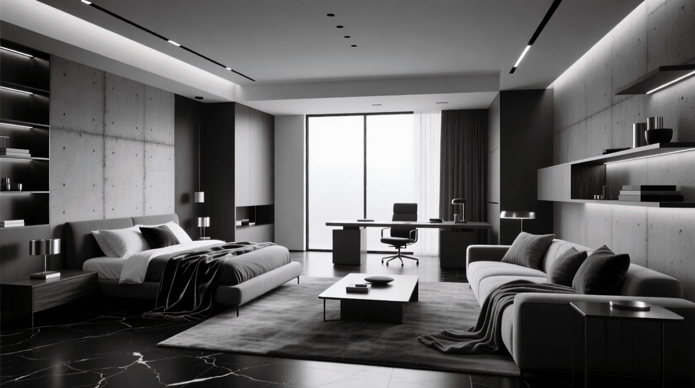
5. Charcoal Gray Home Office
Benjamin Moore’s 2026 Color of the Year, Silhouette, showcases how rich espresso-charcoal tones can elevate a space from ordinary to exceptional. A home office wrapped in charcoal gray promotes focus while feeling undeniably chic. This warm black tone has a rich, earthy quality that makes it function as a dramatic neutral.
Balance darker walls with lighter gray upholstery on your desk chair and lighter stone or concrete accessories. A charcoal velvet sofa for client meetings adds luxurious texture. Metallic accents in warm brass rather than cool chrome complement the warmth inherent in today’s gray-charcoal palettes.
Lighting becomes especially important in darker monochromatic spaces. Layer ambient, task, and accent lighting to prevent the room from feeling cave-like. Consider a statement pendant in smoked glass over your desk, paired with warm-toned LED strips in built-in shelving to highlight books and collected objects.
6. Creamy White Kitchen
All-white kitchens haven’t disappeared—they’ve simply warmed up. Today’s white monochromatic kitchens lean into creamy, ivory, and warm white tones rather than the stark blue-whites of previous decades. Dutch Boy’s 2026 Color of the Year, Melodious Ivory, represents this shift toward soft warmth and timeless comfort.
The key to preventing an all-white kitchen from feeling sterile lies in varying your shades of white slightly and incorporating different finishes throughout. Pair lacquered white upper cabinets with matte white lowers. Choose a creamy white backsplash tile with subtle variation rather than uniform subway tile. Let your countertops feature white-veined marble or quartz that introduces gray and cream tones naturally.
Texture matters enormously in white spaces. Consider fluted cabinet doors, handmade zellige tiles, brushed nickel hardware, and woven pendant lights. These tactile elements create visual interest without introducing competing colors.
7. Terracotta Dining Room
Earthy reds and terracotta shades create warm, convivial dining environments perfect for lingering over meals with friends. A terracotta dining room feels simultaneously rustic and refined—grounded without being heavy. Glidden’s 2026 Color of the Year, Warm Mahogany, exemplifies the bold yet classic quality of these red-earth tones.
Paint walls in your richest terracotta shade, extending the color onto ceiling beams if your architecture supports it. Choose a dining table in warm wood that complements rather than matches—walnut or mahogany pairs beautifully. Upholster dining chairs in a lighter clay or rust tone, introducing burnt orange textiles through table linens and curtains.
Clay pots, terracotta serving pieces, and copper pendant lights reinforce your earthy palette while adding functional beauty. This room invites touch, conversation, and connection—the warmth of the color scheme naturally encourages people to stay.
8. Periwinkle Blue Powder Room
Small spaces provide perfect opportunities to experiment with bold monochromatic schemes. A powder room drenched entirely in periwinkle blue—walls, ceiling, trim, even a painted vanity—creates a memorable moment for guests without overwhelming your entire home with color.
Designer Crosby Studio demonstrates this approach with a periwinkle space where the calming, powdery blue hue covers every surface from curtains to counters. There’s something undeniably modern about using one specific color so comprehensively—it delivers bold quirkiness without taking itself too seriously.
Mirror frames, light fixtures, and even soap dispensers can continue your periwinkle story. Choose hardware in a complementary metallic—aged brass warms the cool blue tones while chrome keeps things crisp. A single bloom in the same color family, perhaps a hydrangea, completes the look.
9. Chocolate Brown Study
Brown is experiencing a dramatic renaissance in interior design. No longer the dull, heavy shade of decades past, today’s chocolate tones feel warm, enveloping, and surprisingly sophisticated. Benjamin Moore’s Silhouette captures this evolution—an espresso brown with charcoal undertones that reads elegant rather than dated.
A chocolate-drenched study creates the perfect environment for reading, writing, and contemplation. Dark walls recede, making bookshelves and artwork pop against the rich backdrop. Layer lighter mochas and café au lait tones through upholstery and textiles, creating contrast while staying within your brown family.
Leather furniture feels particularly at home in brown monochromatic schemes—a cognac leather armchair or saddle-toned ottoman introduces warmth and develops beautiful patina over time. Pair with brass library lamps and warm wood frames for a collected, gentleman’s club aesthetic updated for contemporary living.
10. Sage Green Bathroom
Behr’s 2026 Color of the Year, Hidden Gem, is a smoky jade blue-green that exemplifies the move toward nature-inspired hues in bathroom design. A sage green bathroom creates a spa-like atmosphere—calming, restorative, and perfect for color-drenching a smaller space without overwhelming it.
Tile drenching has emerged as a standout technique for 2026, where entire surfaces receive coverage in solid handmade tiles. Imagine floor-to-ceiling sage zellige tiles, their subtle variations creating movement within your monochromatic scheme. Paint the ceiling and any remaining walls the same sage tone for complete immersion.
Fixtures in brushed nickel or warm brass complement sage beautifully. Choose towels and bath linens in varying green intensities—from pale mint to deeper forest—layered on open shelving. Plants thrive in bathroom humidity and reinforce your green palette naturally.
11. Aubergine Wine Tasting Room
Layered shades like aubergine create intimate, cozy atmospheres that beckon conversation and connection. Designer Ashley Ross of Muse Noire Interiors demonstrates this approach in a moody tasting room inspired by an Élitis wallcovering, where deep purple tones envelop visitors in luxurious comfort.
For your own aubergine space, start with textured wallcovering in your deepest shade—flocked or grasscloth options add dimension. Layer velvet seating in slightly lighter plum tones, introducing mauve and violet through throw pillows and glassware. Crystal decanters catch light beautifully against purple backgrounds.
This color palette naturally suits intimate entertaining spaces—bars, tasting rooms, or small parlors meant for after-dinner drinks. The richness of aubergine feels celebratory while the monochromatic treatment keeps everything sophisticated.
12. Butter Yellow Breakfast Nook
Every day feels sunny in a butter yellow breakfast nook. This cheerful hue, when applied monochromatically, creates spaces that feel optimistic without veering into aggressive brightness. The key lies in choosing the right yellow—mellow and warm rather than acidic or neon.
Designer Anik Pearson uses Farrow & Ball’s Babouche to achieve a yellow that’s both intense and mellow simultaneously. Paint walls, trim, and ceiling in your chosen shade, then introduce paler buttery tones through seat cushions and linens. Woven natural textures—rattan chairs, seagrass placemats—provide neutral breaks without introducing competing colors.
Breakfast nooks often benefit from abundant natural light, which yellow amplifies beautifully. Morning sun streaming through windows turns butter walls golden, making this an ideal spot to start your day. For evening use, warm-toned bulbs maintain the sunny atmosphere after dark.
13. Slate Blue Primary Suite
Blue remains one of the most popular choices for bedrooms, and slate blue offers sophistication beyond typical “bedroom blues.” This gray-inflected blue feels both calming and contemporary, lending itself beautifully to monochromatic treatment in primary suites.
Begin with slate blue walls in a matte finish—the light-absorbing quality creates a serene, cocoon-like environment conducive to sleep. Layer your bed with linens ranging from pale sky blue to deeper denim tones. A slate blue velvet headboard adds texture while an upholstered bench at the foot continues your color story.
Window treatments in linen or silk pick up light differently than your matte walls, creating visual variety within your scheme. Balance cooler blue tones with warm brass hardware, picture frames, and bedside lamps—this prevents the room from feeling cold while maintaining your monochromatic integrity.
14. Warm Ivory Entryway
First impressions matter, and a warm ivory entryway welcomes visitors with understated elegance. C2 Paint’s 2026 Color of the Year, Epernay, exemplifies this approach—a pale ochre yellow inspired by European heritage interiors that feels both timeless and fresh.
Layer your ivory scheme through varying finishes: matte walls, semi-gloss trim, high-gloss painted furniture. A console table lacquered in cream against warm ivory walls creates subtle dimensionality. Add a tufted bench in champagne velvet, an ivory wool runner, and warm brass hardware throughout.
Mirrors with ivory or cream frames expand the space while reflecting light. Choose artwork with ivory mattes, and group creamy ceramics or stone objects on your console. This layered neutral approach creates sophistication through restraint—nothing competes, everything harmonizes.
15. Deep Teal Kitchen Cabinets
Kitchens in 2026 have moved confidently away from all-white toward painted cabinets in rich, saturated colors. Deep teal represents a particularly striking choice—sophisticated enough for resale yet bold enough to feel personal. According to interior design experts, mixing painted cabinets with natural wood finishes adds warmth while maintaining color impact.
For a teal monochromatic kitchen, paint lower cabinets in your deepest shade while using a lighter teal or teal-gray on uppers. Extend the color onto your island, choosing a slightly different finish (matte versus satin) to create variation. Backsplash tiles in seafoam, turquoise, and teal glazes provide handcrafted texture within your color family.
Counter stools upholstered in teal velvet or leather continue the scheme into seating areas. Copper or brass hardware warms the cool blue-green tones, while open shelving displays collected pottery in complementary aqua shades.
16. Blush Pink Family Room
Pink has earned its place as a sophisticated neutral when executed thoughtfully. Designer Lisa Frantz proves this with her pink family room using Benjamin Moore’s Desert Rose with a high-gloss finish. The dusty pink feels sophisticated rather than juvenile—fleshy undertones almost make it read as a neutral.
A monochromatic pink family room works when you commit fully. Paint walls, trim, and ceiling the same shade, letting the glossy finish reflect light and add depth. Choose sofas in blush velvet, accent chairs in deeper rose, and throw pillows ranging from palest pink to near-mauve.
Ground the space with natural textures—a sisal rug, wood coffee table, rattan baskets for storage. These organic elements prevent pink from feeling precious while maintaining your monochromatic vision. The result is a space that feels welcoming for the whole family, not like a little girl’s fantasy room.
17. Olive Green Reading Corner
Olive green reads simultaneously fresh and timeless, making it perfect for creating a reading nook that won’t feel trendy in five years. This earthy green connects to nature without the intensity of emerald, providing a restful backdrop for hours spent with books.
Designate a corner with floor-to-ceiling olive green paint—don’t stop at chair rail height. Add an oversized armchair in moss velvet, positioned beside a window for natural reading light. A floor lamp with an olive-toned shade provides evening illumination while reinforcing your color story.
Built-in shelving painted the same shade as walls creates a seamless backdrop for books. Arrange volumes loosely, incorporating olive and cream pottery, small plants, and collected objects. A wool throw in forest green and olive-striped pillow complete the invitation to curl up and read.
18. Sandy Beige Coastal Bedroom
Coastal style benefits enormously from monochromatic treatment—too many blues, whites, and sandy tones competing creates visual chaos. A bedroom limited to sandy beige variations achieves beachy tranquility without cliché seashell accessories.
Start with walls in warm sand, ceiling in cream, and trim in slightly darker taupe. Layer bedding in natural linen ranging from cream to darker wheat tones. Jute rugs, rattan furniture, and driftwood accessories reinforce your sandy palette through texture rather than pattern.
Sheer linen curtains filter light while maintaining your monochromatic scheme. A woven headboard adds dimension, and ceramic lamps in sandy glazes flank the bed. This restrained approach captures coastal essence through color family rather than literal ocean references.
19. Ebony Black Bar Area
Few colors make a stronger statement than ebony black applied monochromatically. Designer Sarah Blank demonstrates this in a butler’s pantry where lacquered ebony paint covers original woodwork and newly milled appliance fronts, connecting seamlessly with black-and-white marble flooring.
An ebony bar area feels sophisticated, glamorous, and undeniably dramatic. Lacquer walls in deepest black, then introduce charcoal and dark gray through textiles and accessories. Crystal glassware catches light against dark backgrounds, while brass bar tools provide warm metallic punctuation.
Black absorbs light rather than reflecting it, so strategic lighting becomes essential. Under-cabinet LED strips illuminate work surfaces, while statement pendants in smoked glass or brass create ambiance. Mirror backing on shelves reflects bottles and glassware while adding depth to the dark space.
20. Lavender Guest Room
Purple often intimidates homeowners, but softer lavender tones feel welcoming and restful—perfect for a guest room that pampers visitors. Sandra Jordan’s California den took inspiration from lavender-covered hillsides for its muted purple palette, proving the color family works beautifully in residential settings.
Paint walls in soft lavender, ceiling in palest violet-white, and introduce deeper purple through textiles and accessories. A lavender upholstered headboard anchors the bed while violet-gray linens create layered comfort. Curtains in washed linen filter light with a purple-gray cast.
Fresh lavender stems in a simple vase connect to nature while reinforcing your color scheme. Silver or pewter accents complement the cool purple tones, while touches of cream provide visual rest. Your guests will feel embraced by color without being overwhelmed.
21. Rust Orange Accent Wall Suite
Burnt orange and rust tones bring warmth without the intensity of true red. Designer Katie Ridder’s approach to color transitions between rooms shows how rust orange creates seamless flow—a blood orange butler’s pantry leading into an apricot-colored library feels cohesive despite the transition.
For a rust-toned suite, vary your orange intensity throughout connected spaces. Paint an accent wall in deepest rust, surrounding walls in lighter terra cotta, and ceilings in warm cream with orange undertones. Upholstery in cognac leather and terracotta velvet extends the warmth through furnishings.
Copper and brass metals complement rust naturally—use them in lighting, hardware, and decorative objects. Wood tones should lean warm (walnut, mahogany) rather than cool (gray-washed oak). The result feels simultaneously bold and harmonious.
22. Smoky Jade Spa Bathroom
Valspar’s 2026 Color of the Year, Warm Eucalyptus, encourages color-drenching entire spaces in restorative, nature-inspired design—particularly bathrooms meant for restoration. A smoky jade spa bathroom feels like bathing in a forest clearing, connecting you to nature even in urban environments.
Tile walls and floors in varying jade tones—mix matte and glossy finishes for textural interest. Paint remaining surfaces (ceiling, trim around mirrors) the same jade family. Choose a freestanding tub in white or stone to provide visual rest within your green scheme.
Eucalyptus branches arranged in a vase reinforce both color and scent. Towels in sage, moss, and forest green layer on open shelving. Warm brass fixtures and a teak bath mat introduce warmth without departing from your nature-inspired vision.
23. Caramel Neutral Open Concept
Open floor plans challenge monochromatic approaches since one color must flow through multiple functional zones. Caramel neutrals solve this beautifully—warm enough to feel intentional, neutral enough to flex across living, dining, and kitchen spaces.
According to Decorilla’s trend analysis, interior design color trends for 2026 embrace creamy and caramel shades that deliver more personality than white while remaining neutral enough to complement existing furniture. These tones work naturally with the warm brass hardware and natural wood elements currently popular.
Vary your caramel intensity by zone—slightly darker in the living area for coziness, lighter in the kitchen to reflect prep surface lighting, mid-tone in dining spaces. Furniture and textiles can range from cream to deep cognac within your caramel family, creating distinct moments while maintaining overall cohesion.
24. Sea Green Sunroom
Sunrooms filled with natural light benefit from colors that connect indoors to outdoors. Sea green achieves this connection naturally, varying from pale aqua to deeper teal as light shifts throughout the day. Designer Richard Keith Langham’s Mississippi guest room in sea green demonstrates how the color creates humble beauty that feels warm and inviting.
Paint sunroom walls in mid-tone sea green, letting abundant natural light do the work of creating variation. Wicker furniture painted a shade lighter provides seating, while cushions in deeper teal and aqua add comfort. Sheer curtains in pale green filter harsh afternoon sun without blocking views.
Potted plants thrive in sunroom conditions and reinforce your green palette naturally. Choose ceramics in blue-green glazes for plant vessels, and incorporate glass accessories in sea glass tones. The boundary between interior and garden blurs beautifully.
25. Rich Burgundy Formal Living Room
Full-bodied reds are emerging prominently in 2026 palettes, with designers gravitating toward subdued cranberry reds that feel sophisticated rather than aggressive. A burgundy living room makes an undeniable statement—dramatic, warm, and perfect for evening entertaining.
Begin with walls in your richest burgundy, extending the color onto ceiling for complete immersion. Velvet sofas in slightly lighter wine tones provide seating, while accent chairs in deeper oxblood add dimension. Layer throw pillows in rose, mauve, and deep plum to create movement within your red family.
Warm metals—brass, copper, gold—complement burgundy’s warmth while adding glamour. Wood tones should be dark and rich (mahogany, cherry) to continue the warm atmosphere. Crystal glassware and metallic frames catch light against dark walls, creating sparkle without introducing competing colors.
Essential Tips for Perfecting Your Monochromatic Scheme
Texture carries enormous weight when you remove chromatic complexity from a space. According to FCI London’s design experts, combining rustic wooden finishes with sleek aluminum structures, or warm woolen fabrics with glistening marble tops, creates the bold visual interest that monochromatic interiors require.
Consider these guidelines for successful single-color rooms:
- Vary your finishes: Mix matte walls with glossy furniture, brushed metals with polished accents, smooth ceramics with textured textiles
- Use the 80-20 rule: Your base color should dominate approximately 80% of the space, with lighter and darker variations filling the remaining 20%
- Layer lighting thoughtfully: Warm lighting softens cool-toned designs while daylight LEDs sharpen warm hues—use directional lighting to highlight textured elements
- Stick to one manufacturer: Paint undertones vary across brands, so choose all your tints and shades from a single source for consistency
- Add pattern within your palette: Striped pillows, textured wallcovering, or patterned rugs in your color family prevent flatness without introducing competing hues
Planning your monochromatic scheme becomes easier with visualization tools. Our monochromatic image generator helps you explore different color families before committing to paint. You can also use our AI art generator to visualize specific room concepts or try our free AI tools for design inspiration across various styles.

Frequently Asked Questions
Does a monochromatic room have to use only one exact color?
Not at all. Monochromatic schemes use variations within a single color family—different tints (lighter values), shades (darker values), and tones (muted values) of one base hue. A blue monochromatic room might include navy, powder blue, slate, and sky blue while remaining entirely within the blue family.
Will a monochromatic room look boring or flat?
Only if you neglect texture and variation. The most successful monochromatic spaces layer multiple finishes (matte, glossy, brushed), materials (velvet, linen, wood, metal), and values (light to dark). When chromatic complexity decreases, textural complexity must increase to maintain visual interest.
Can I add accent colors to a monochromatic scheme?
Purists maintain strict single-color adherence, but most designers allow small metallic accents (brass, silver, copper) and natural materials (wood, stone, plants) without considering the monochromatic scheme broken. Introducing a true secondary color moves you toward an analogous or complementary scheme instead.
Which rooms work best for monochromatic treatment?
Every room can succeed with monochromatic color—the key lies in choosing appropriate colors for each function. Bedrooms benefit from calming blues and greens or warm neutrals. Dining rooms feel welcoming in warm reds, terracottas, and oranges. Home offices work well in focused grays and blues. Bathrooms shine in spa-like greens and warm neutrals.
How do I choose the right base color for my monochromatic room?
Start by considering the room’s purpose and the mood you want to create. Think about existing elements that won’t change—flooring, views from windows, adjacent room colors. Test paint samples at different times of day since colors shift dramatically between morning and evening light. Choose a color you genuinely love since you’ll be surrounding yourself with variations of it entirely.
Is the color drenching trend the same as monochromatic design?
Color drenching refers specifically to painting an entire room—walls, ceiling, trim, and often furnishings—in the same color. It represents one approach to achieving a monochromatic look, but monochromatic design more broadly includes any scheme that stays within a single color family while varying values and tones throughout.