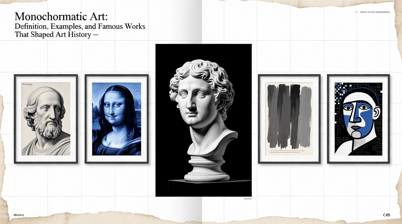
Monochromatic artworks are created using one hue and its variations. A single color which can tell a story more powerfully than a rainbow. This form of art has captivated artists and audiences for centuries, from medieval monasteries to modern galleries. Monochromatic artistic approach strips away the complexity of multiple colors to focus purely on form, emotion, and the subtle interplay of light and shadow.
You might be an aspiring artist curious about color theory or an art enthusiast seeking to understand why Picasso painted in blue for four years, this guide walks you through everything about monochromatic artwork. In it, you’ll discover monochromatic art origins, landmark pieces that defined movements, and learn practical techniques for creating your own single-hue masterpieces.
Table of Contents
- What Is Monochromatic Art?
- The Four Components of a Monochromatic Color Scheme
- A Brief History of Monochrome in Art
- Famous Monochromatic Artworks and Their Artists
- Why Artists Choose to Work in One Color
- How to Create Your Own Monochromatic Artwork
- Monochromatic vs. Achromatic Art
- Modern Applications Beyond Canvas
- Frequently Asked Questions
What Is Monochromatic Art?
Monochromatic art refers to artwork created using only one color or hue. The term comes from the Greek words “mono” (one) and “chroma” (color). Rather than being limited to a single flat shade, monochromatic pieces employ the full range of that color’s tints, tones, and shades to build depth, dimension, and visual interest.
Consider a painting done entirely in blue. The artist might use deep navy for shadows, pure cobalt for mid-tones, and pale sky blue for highlights. Despite using dozens of variations, the work remains monochromatic because every brushstroke derives from a single base hue. Black and white artwork—often called grayscale—falls under this category too, since it uses variations of one neutral color.
According to the Tate Modern, monochromatic works have served two primary purposes throughout art history: communicating spiritual purity through total abstraction, and reducing painting to its fundamental physical elements of color, form, and texture.
The Four Components of a Monochromatic Color Scheme
Every monochromatic palette builds from four essential elements. Understanding these components helps artists create dynamic work within a single-color framework.
- Hue: The base color itself—pure blue, red, green, or any other color on the color wheel. This serves as the foundation from which all other variations develop.
- Tint: Created by adding white to the hue, producing lighter versions. A tint of blue might resemble the pale morning sky or fresh ice.
- Shade: Formed by mixing black with the hue, resulting in darker versions. Navy blue exemplifies a shade of standard blue.
- Tone: Produced by adding gray to the hue, which reduces saturation without dramatically changing lightness. Tones appear more muted and sophisticated than pure hues.
Artists typically work with between three and seven distinct values when creating monochromatic pieces. Using fewer values produces bold, graphic compositions, while employing more subtle gradations allows for realistic rendering of form and light.

A Brief History of Monochrome in Art
Monochromatic expression predates modern art movements by thousands of years. The earliest cave paintings were inherently monochrome, created using charcoal and natural pigments long before humans developed diverse color technology.
Medieval Origins: Bernard of Clairvaux
One of the first documented intentional uses of monochrome aesthetics came from an unexpected source. In 1134, Bernard of Clairvaux—head of the Cistercian monastic order—compiled regulations stipulating that all decoration in his monasteries would use only black and white. He believed color was superfluous and over-stimulated the senses, preferring tranquil spaces where monks could focus on prayer and meditation.
The Rise of Grisaille
By the 1600s, appreciation for single-color paintings grew significantly across Europe. The French named this technique “grisaille” (from “gris,” meaning gray), referring to paintings executed entirely in gray tones. Master painters like Jean Auguste Dominique Ingres created grisaille versions of their famous color works, using the technique to study form and spatial relationships without the distraction of multiple hues.
The 20th Century Revolution
The European avant-garde transformed monochromatic painting in the early 1900s. What began as a technique became a philosophical statement. Artists explored the non-representational possibilities of a single color, using it as a vehicle for conceptual exploration and visual investigation of painting’s fundamental characteristics.
According to Wikipedia, the first monochrome painting exhibited publicly appeared at the Incoherents exhibition in Paris in 1882—a black painting by poet Paul Bilhaud. This work was classified as a National Treasure by the French state after its rediscovery in 2017-2018.
Famous Monochromatic Artworks and Their Artists
Several landmark works have defined monochromatic art across different movements and eras. These pieces demonstrate how limiting color can paradoxically expand artistic expression.
Kazimir Malevich: White on White (1918)
Russian artist Kazimir Malevich created one of art history’s most radical statements with his “Suprematist Composition: White on White.” A tilted white square floats against a slightly different white background, challenging viewers to perceive form through the subtlest tonal variations. Malevich founded the Suprematist movement, one of the first geometric abstract art movements, and this piece represented his belief in art freed from objective representation.
Pablo Picasso: The Blue Period (1901-1904)
Perhaps the most famous extended monochromatic exploration in art history, Picasso’s Blue Period produced masterpieces drenched in melancholy blues and blue-greens. Triggered by the suicide of his close friend Carlos Casagemas and his own struggles with poverty, Picasso turned to blue as the color of his despair.
“The Old Guitarist” (1903) stands as the period’s most recognized work—an emaciated blind musician hunched over his instrument, rendered almost entirely in shades of blue. According to the Musée Picasso Paris, Picasso’s depression during this period led him to paint subjects including prostitutes, beggars, and the blind, giving them an elongated supernatural grace that has fascinated viewers for over a century.
Other significant Blue Period works include “La Vie” (1903), considered the pinnacle of this era, now housed at the Cleveland Museum of Art, and “The Blindman’s Meal” (1903) at the Metropolitan Museum of Art.

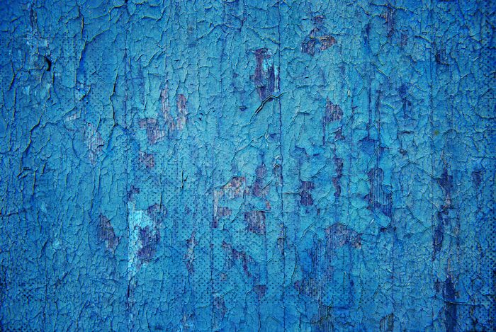
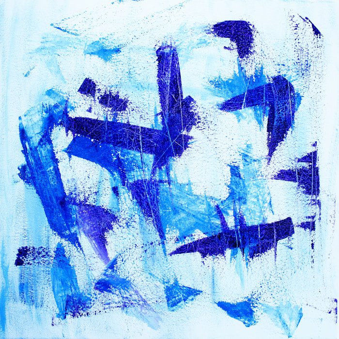
Yves Klein: International Klein Blue
French artist Yves Klein became synonymous with a single shade of ultramarine blue so distinctive that he registered its formula. In 1960, Klein deposited the technique for International Klein Blue (IKB) with France’s National Institute of Industrial Property—not patenting the color itself (impossible under French law) but protecting his unique application method.
Klein declared in 1957 that “the world is blue,” and the Centre Pompidou notes that for Klein, blue carried unique sensitivity as a vehicle for passage from the material to the immaterial. “Blue has no dimensions, it is beyond dimensions,” he stated.
His widow Rotraut Klein-Moquay numbered all known blue monochromes from IKB 1 to IKB 194 after his death in 1962. Klein also created the famous Anthropometries series, where nude models covered in IKB pressed their bodies against canvas, leaving ethereal blue imprints.
Ad Reinhardt: Black Paintings
American abstract expressionist Ad Reinhardt devoted the final fifteen years of his career (1952-1967) to near-pure monochromes in red, blue, and most famously, black. His black paintings appear uniformly dark at first glance, but extended viewing reveals subtle cruciform patterns in slightly different black tones. Reinhardt aimed for what he called “art as art,” stripped of representation and emotion—paintings that do not reflect life.
Robert Rauschenberg: White Paintings
In 1951, Robert Rauschenberg challenged the art world with his “White Paintings” series—canvases covered entirely in white house paint applied with rollers for perfectly smooth, blank surfaces. Displayed alone or in modular groupings, these works anticipated minimalism and conceptual art. Rauschenberg famously stated, “A canvas is never empty,” inviting viewers to see how light, shadow, and their own reflections activated seemingly blank surfaces.
Agnes Martin: Subtle Grids
Canadian-American artist Agnes Martin created meditative monochromatic works on six-foot-square canvases throughout her career. Her signature freehand grids, rendered in pale colors with graphite lines, offered spaces for quiet contemplation. Unlike other minimalists, Martin’s loosely geometric approach engaged with organic and natural qualities, creating environments for deep reflection.
Why Artists Choose to Work in One Color
Working within a single-color limitation might seem restrictive, but artists throughout history have found this constraint liberating for several compelling reasons.
Sharpening Focus on Form and Value
Without the “distraction” of multiple hues competing for attention, artists can concentrate entirely on light, shadow, shape, and composition. This makes monochromatic study particularly valuable for developing technical skills—many art instructors assign monochrome exercises specifically to train students in understanding tonal values.
Conveying Specific Emotions
Color psychology becomes intensified when a single hue dominates. Blue evokes calm or melancholy, red suggests passion or danger, and green implies nature or growth. By committing entirely to one emotional frequency, artists create immersive experiences that resonate deeply with viewers.
Achieving Visual Unity
A monochromatic palette guarantees harmony. Interior designers frequently employ this approach because single-color schemes create cohesive, welcoming environments where nothing clashes. The same principle applies to paintings—every element relates to every other element through their shared color DNA.
Exploring Spiritual and Conceptual Ideas
For artists like Klein and Malevich, restricting color became a philosophical statement. The monochrome allowed exploration of pure abstraction, immateriality, and concepts beyond physical representation. This reductive approach paradoxically opened vast conceptual territory.
How to Create Your Own Monochromatic Artwork
Ready to explore single-color expression? Here’s a practical approach for creating compelling monochromatic pieces, whether you work in paint, digital media, or other materials.
Step 1: Select Your Color Intentionally
Choose a hue that aligns with the mood you want to convey. Cool colors like blue and purple tend toward calm or melancholic atmospheres. Warm colors like red, orange, and yellow create energetic or passionate feelings. Consider also the practical aspects: some pigments layer and blend more easily than others.
Step 2: Create a Value Scale
Before starting your main piece, mix 5-7 distinct values of your chosen color—from the lightest tint (adding white) to the darkest shade (adding black). Swatch these on paper and let them dry, since many paints (especially watercolors) dry lighter than they appear wet. This reference strip guides your value decisions throughout the painting process.
Step 3: Plan Your Composition
Sketch your subject, paying special attention to where the lightest lights and darkest darks will fall. Converting a reference photo to grayscale helps identify the essential value structure without color information confusing your perception.
Step 4: Build in Layers
Start with the lightest values and progressively add darker tones. This layering approach (called glazing in transparent media like watercolor) creates depth and allows for adjustments along the way. Each layer adds complexity and richness to your final work.
Step 5: Vary Your Application
Create visual interest through varied brushwork. Bold strokes produce graphic, poster-like effects. Subtle blending yields lifelike rendering. Impressionist dabs offer texture. Mix approaches within a single piece to keep the eye engaged.
If you want to experiment with AI-generated monochromatic imagery, the monochromatic image generator can help you visualize concepts before committing to physical materials.
Monochromatic vs. Achromatic Art
These terms are often confused, but they describe distinct color approaches. Understanding the difference clarifies what “monochromatic” actually means.
Monochromatic art uses one color and its variations (tints, tones, shades). A monochromatic blue painting might range from navy to sky blue but always derives from blue.
Achromatic art uses no color at all—only black, white, and gray. True achromatic work contains zero hue; it exists entirely on the value scale without any chromatic content.
In practice, black and white artwork is sometimes categorized under “monochromatic” since it uses variations of a single neutral. But strictly speaking, if there’s no hue present, the work is achromatic rather than monochromatic.
Modern Applications Beyond Canvas
Monochromatic principles extend far beyond traditional painting into contemporary creative fields.
Photography
Black and white photography strips away chromatic distraction to spotlight texture, contrast, and pure composition. From Ansel Adams’ sweeping landscapes to contemporary street photography, grayscale remains a deliberate artistic choice. Sepia tones and cyanotype “blueprints” offer warmer or cooler single-color alternatives dating back to the medium’s origins.
Interior Design
Step into a room decorated in varying shades of sage green, and you immediately sense its intentional harmony. Monochromatic schemes dominate luxury interiors precisely because they guarantee cohesion while allowing personality through texture, pattern, and material variation. Velvet, linen, and leather in the same blue family, for instance, create visual richness without color conflict.
Web and Graphic Design
Brand consistency often depends on monochromatic thinking. When a website uses only shades of a signature brand color, it communicates professionalism and focus. The AI image generators available today offer various style outputs including single-hue options that help designers prototype quickly.
Fashion
Head-to-toe dressing in one color family elongates the silhouette and projects effortless sophistication. This styling technique has remained popular across decades precisely because it works—varied textures in the same hue create interest without visual interruption.
Frequently Asked Questions
What is monochromatic art in simple terms?
It’s artwork that uses just one color from start to finish. The artist creates variety through lighter versions (adding white), darker versions (adding black), and muted versions (adding gray). Even with a single hue, these variations produce paintings and designs with full depth and dimension.
Is black and white considered monochromatic?
Generally yes, though some prefer the term “achromatic” (meaning without color) for true grayscale work. The technical difference: monochromatic requires one hue, while achromatic uses only neutral values. Most people don’t make this distinction in everyday conversation.
What is the most famous monochromatic painting?
Three works consistently appear in this conversation. Picasso’s “The Old Guitarist” (1903) from his Blue Period enjoys widespread recognition. Kazimir Malevich’s “White on White” (1918) changed the trajectory of abstract art. And Yves Klein’s IKB monochromes continue to captivate contemporary audiences.
Why did Picasso have a Blue Period?
Personal tragedy and financial hardship converged in 1901. His close friend Carlos Casagemas committed suicide, and Picasso himself was struggling with poverty in Paris. Blue—long associated with melancholy in Spanish and French Symbolist traditions—became his visual language for this psychological state.
Can I create monochromatic art digitally?
Digital tools actually make single-color work more accessible than ever. Color pickers help you select precise variations of your chosen hue, and filters can convert existing work to monochrome. For AI-assisted creation, the AI art generator offers single-color output options.
What colors work best for monochromatic painting?
Blues and grays blend and layer predictably, making them forgiving for beginners. Earth tones like burnt sienna produce rich ranges from pale tan to near-black. One caution: mixing black into yellow creates green rather than a darker yellow, so choose your primary hue with chemistry in mind.
How is monochromatic art different from minimalist art?
These terms describe different dimensions of artwork. “Monochromatic” addresses color strategy—one hue throughout. “Minimalism” names a philosophy of reduction and simplicity. A highly detailed monochromatic portrait wouldn’t qualify as minimalist, even though many minimalist pieces happen to be monochromatic.
What is International Klein Blue?
French artist Yves Klein developed this intensely saturated ultramarine blue with Parisian chemist Edouard Adam. In 1960, Klein registered the unique formula—the synthetic resin binder preserved the pigment’s intensity in ways traditional oil couldn’t match. Before his death at 34 in 1962, Klein created nearly 200 paintings in this signature shade.
Working with a single color reveals depths that busy palettes can obscure. Whether you’re studying classic masters or experimenting with your own monochromatic vision, this approach offers a pathway to understanding value, form, and the emotional power inherent in color itself. For those interested in exploring related artistic styles, check out the black and white image generator or experiment with minimalist image generation. Pick a hue, explore its variations, and discover what stories one color can tell.