Monochromatic images strip away the distraction of multiple colors and force viewers to focus on what matters most—composition, texture, light, and shadow. Whether you want a classic black-and-white conversion, a sepia-toned vintage look, or a bold single-color effect, Photoshop gives you complete control over the process.
This guide walks you through five proven methods for creating monochromatic images, from quick one-click solutions to advanced techniques that offer pixel-level precision. Each approach produces different results, so understanding when to use which method will dramatically improve your editing workflow.
Table of Contents
- What Makes an Image Monochromatic?
- Method 1: Black and White Adjustment Layer (Best for Most Users)
- Method 2: Solid Color Fill Layer with Blend Mode
- Method 3: Gradient Map for Creative Monochrome Effects
- Method 4: Channel Mixer for Advanced Control
- Method 5: Hue/Saturation Layer for Quick Tinting
- Comparing All Five Methods
- Pro Tips for Better Monochromatic Results
- Frequently Asked Questions
What Makes an Image Monochromatic?
A monochromatic image uses variations of a single hue rather than the full color spectrum. Black-and-white photography is the most recognizable example—it relies entirely on shades of gray. But monochromatic doesn’t have to mean grayscale. You can create stunning images using only shades of blue, sepia, teal, or any color you choose.
The key distinction is that all tonal values in the image derive from one base color. Shadows become darker versions of that color, highlights become lighter versions, and midtones fall somewhere between. This unified palette creates visual harmony and often evokes specific moods—cool blues feel calm or melancholic, warm sepias suggest nostalgia, and deep greens can feel natural or mysterious.
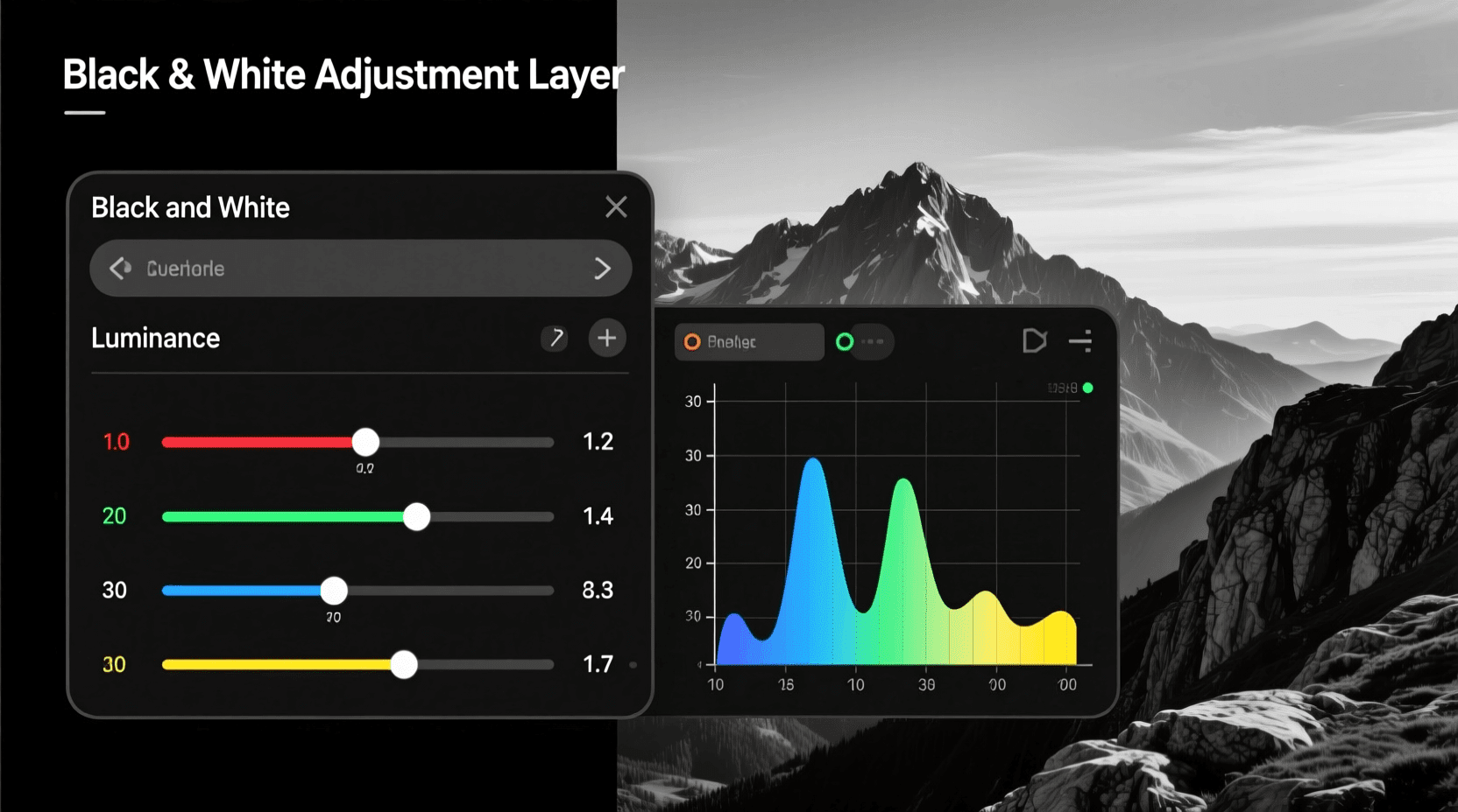
Method 1: Black and White Adjustment Layer (Best for Most Users)
The Black and White adjustment layer should be your starting point for most monochromatic conversions. It offers excellent control over how individual colors translate into grayscale values, and you can add tinting for single-color effects.
Step-by-Step Instructions
- Open your image in Photoshop and navigate to the Layers panel.
- Click the “Create new fill or adjustment layer” icon at the bottom of the Layers panel (the half-filled circle).
- Select “Black & White” from the dropdown menu.
- Photoshop applies a default grayscale conversion immediately. Your Properties panel now displays six color sliders: Reds, Yellows, Greens, Cyans, Blues, and Magentas.
- Drag each slider to control how bright or dark that original color appears in your monochrome result. Moving Reds to the right brightens skin tones in portraits; moving Blues to the left darkens skies.
- For a tinted monochromatic effect, check the “Tint” box and click the color swatch to choose your desired hue.
Adobe’s official documentation confirms that the Black & White adjustment layer includes preset options that simulate traditional photography filters. You’ll find presets like High Contrast Red Filter, which darkens blues and greens while brightening reds—exactly what landscape photographers used with actual glass filters on black-and-white film.
When to Use This Method
Choose the Black and White adjustment layer when you need fine control over tonal separation between different colored elements in your original image. Portrait photographers benefit from adjusting skin tones independently from background colors. Landscape shooters can darken skies while keeping foliage bright.
Method 2: Solid Color Fill Layer with Blend Mode
This technique produces true single-color monochromatic effects where every pixel in your image becomes a shade of one chosen color. It’s particularly effective for creating stylized images that match specific brand colors or interior decor schemes.
Step-by-Step Instructions
- Open your image and go to Layer > New Fill Layer > Solid Color.
- In the New Layer dialog box, change the Mode dropdown from “Normal” to “Color” before clicking OK. This step matters because setting the blend mode now saves you from seeing an entirely blocked-out image.
- The Color Picker opens. Select your desired monochromatic color—perhaps a deep teal (#008080), warm sepia (#704214), or any shade you prefer.
- Click OK, and your image transforms into a monochromatic version using only shades of your selected color.
- Adjust the fill layer’s opacity in the Layers panel if you want to blend some of the original colors back into the image.
The Color blend mode works by replacing the hue and saturation of every pixel while preserving the original luminosity values. Your image retains its full tonal range—shadows stay dark, highlights stay bright—but every tone now exists within your chosen color family.
Creating Variations
Experiment with different blend modes for alternative effects. Soft Light creates a subtler tint that preserves more of the original image character. Overlay intensifies contrast while applying the color. Multiply darkens the overall image while tinting it, which works well for moody atmospheric shots.
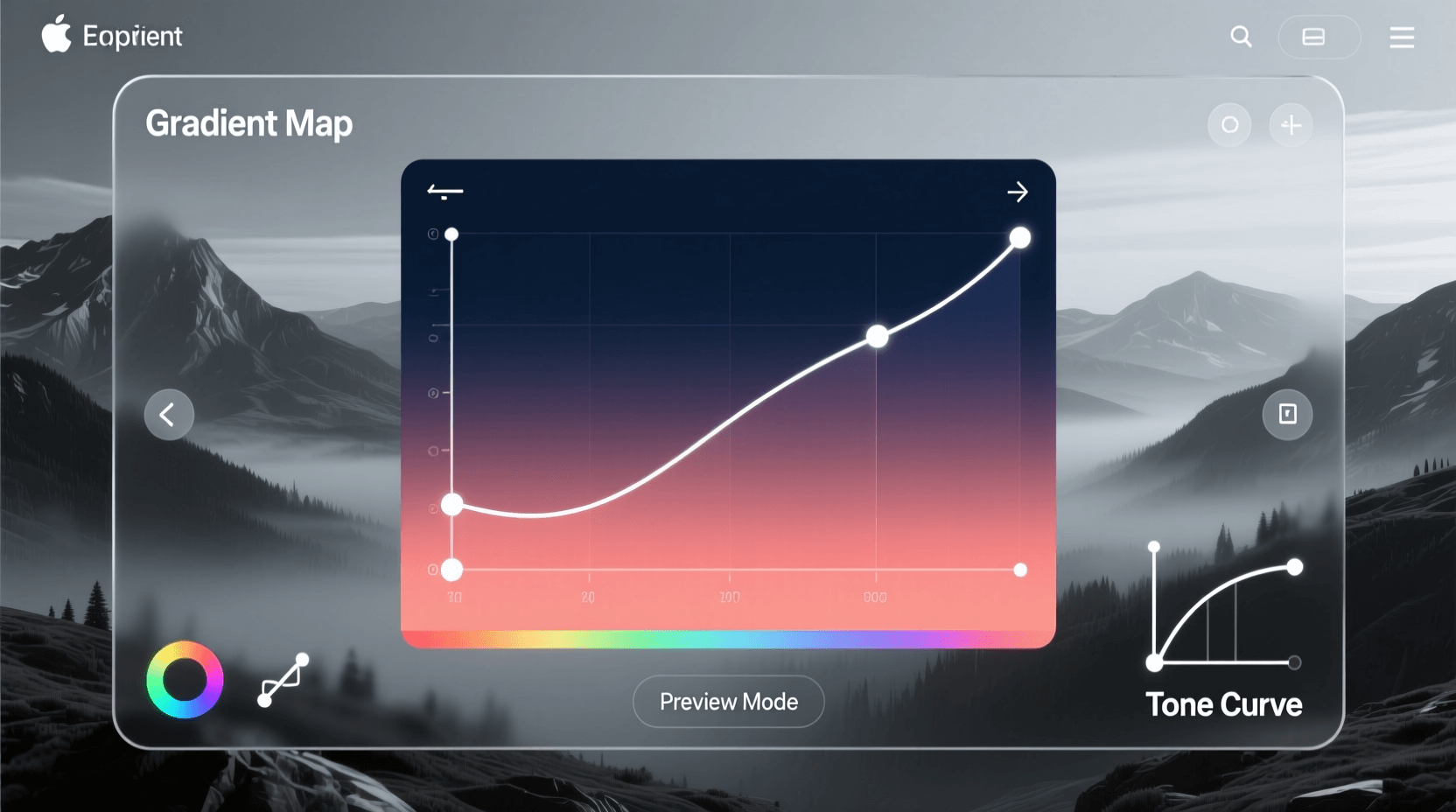
Method 3: Gradient Map for Creative Monochrome Effects
Gradient Maps offer the most creative flexibility for monochromatic conversions. Instead of simply desaturating or tinting, a Gradient Map remaps the luminosity values of your image to colors along a gradient you define. Shadows take on the color from the left side of your gradient, highlights adopt the right side, and midtones receive colors from the center.
Step-by-Step Instructions
- Click the “Create new fill or adjustment layer” icon in your Layers panel.
- Select “Gradient Map” from the menu.
- By default, Photoshop applies a black-to-white gradient, which creates a high-contrast black-and-white conversion.
- Click directly on the gradient bar in the Properties panel to open the Gradient Editor.
- For a monochromatic effect, click on the left color stop (the small square below the gradient bar) and choose a dark shade of your desired color.
- Click the right color stop and choose a light shade of the same hue.
- Optionally, click below the gradient bar to add additional color stops for more nuanced tonal mapping.
The Photographic Toning preset library in Photoshop includes professionally designed gradient maps for sepia, selenium, cyanotype, and other classic darkroom toning effects. Access these by clicking the gear icon in the Gradient Editor and selecting “Photographic Toning” from the list.
Advanced Gradient Map Techniques
For images that feel too saturated after applying a Gradient Map, change the layer’s blend mode to Soft Light and reduce opacity to around 40-60%. This approach blends your gradient colors with the original image tones rather than replacing them entirely. The result feels more natural while still achieving a cohesive monochromatic palette.
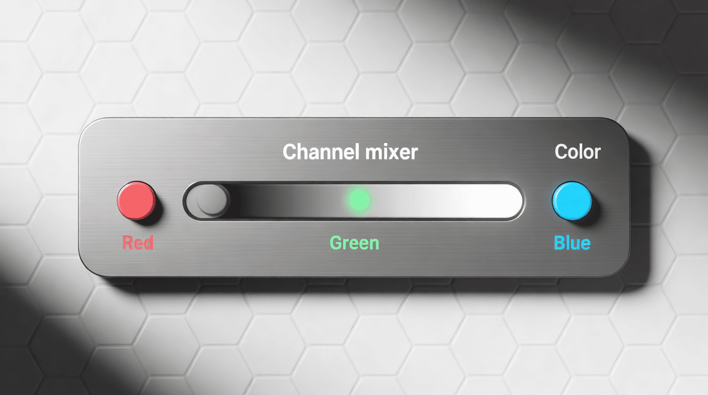
Method 4: Channel Mixer for Advanced Control
The Channel Mixer provides granular control over how RGB color channels contribute to your final monochromatic image. Professional retouchers often prefer this method because it allows precise adjustment of tonal values that other techniques can’t match.
Step-by-Step Instructions
- Add a Channel Mixer adjustment layer from the Adjustments panel or via Layer > New Adjustment Layer > Channel Mixer.
- Check the “Monochrome” checkbox at the bottom of the Properties panel. Your image converts to grayscale.
- Adjust the Red, Green, and Blue source channel sliders to control how each original color contributes to the final grayscale value.
- Keep the total of all three sliders near 100% to maintain proper exposure. Photoshop displays a warning icon if your combined values significantly exceed 100%.
- Use the Constant slider to add overall brightness (positive values) or darkness (negative values) to the output.
According to Adobe’s documentation on channel mixing, the Channel Mixer essentially lets you create custom black-and-white filter effects digitally. Boosting the Red channel while reducing Blue mimics shooting with a red filter on black-and-white film—a technique that dramatically darkens blue skies and makes clouds pop.
Adding Color Tint with Channel Mixer
After checking Monochrome and adjusting your grayscale conversion, you can add color back selectively. Uncheck Monochrome, then adjust individual output channels to tint shadows and highlights differently. This method creates split-toning effects where shadows lean toward one color while highlights lean toward another—technically not pure monochromatic, but visually striking.
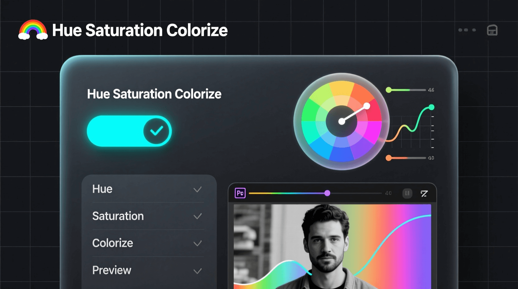
Method 5: Hue/Saturation Layer for Quick Tinting
The Hue/Saturation adjustment layer offers the fastest path to a monochromatic image when you don’t need precise tonal control. Two clicks get you to a usable result, making this ideal for batch processing or quick experiments.
Step-by-Step Instructions
- Add a Hue/Saturation adjustment layer from the Adjustments panel.
- Check the “Colorize” checkbox in the Properties panel.
- Drag the Hue slider to select your monochromatic color.
- Adjust Saturation to control color intensity—lower values create subtler tints, higher values produce more vivid results.
- Use the Lightness slider to brighten or darken the overall image if needed.
The Colorize option forces every pixel in your image to adopt the same hue while preserving luminosity differences. Unlike the Solid Color method, Hue/Saturation with Colorize gives you real-time slider control over the exact color and intensity without opening a color picker repeatedly.
Limitations to Consider
This method doesn’t give you control over how individual colors convert to tonal values. A red apple and a green leaf that happen to have similar brightness will look nearly identical in your monochromatic result. For images where color contrast creates important visual separation, use the Black and White or Channel Mixer methods instead.
Comparing All Five Methods
| Method | Best For | Control Level | Ease of Use |
|---|---|---|---|
| Black & White Adjustment | Classic B&W with tint options | High | Medium |
| Solid Color Fill | Brand-specific color matching | Low | Easy |
| Gradient Map | Creative toning, vintage effects | Very High | Medium |
| Channel Mixer | Professional tonal control | Very High | Advanced |
| Hue/Saturation | Quick colorizing | Low | Very Easy |
Each method produces subtly different results even when targeting the same final color. The Gradient Map typically delivers higher contrast because it remaps tones rather than simply overlaying color. Channel Mixer preserves the most detail in complex images because you control exactly how each original color channel contributes to the output.
Pro Tips for Better Monochromatic Results
Always Work Non-Destructively
Every method in this guide uses adjustment layers rather than direct image edits. This approach means your original color data remains intact beneath the adjustment. You can modify settings, reduce opacity, or delete the layer entirely without losing anything. Avoid Image > Mode > Grayscale for conversions—this method permanently discards color information.
Boost Contrast Before Converting
Monochromatic images rely on tonal contrast rather than color contrast to separate elements. Before applying your conversion, consider adding a Curves or Levels adjustment layer to expand the tonal range. Push shadows darker and highlights brighter so your monochrome result has visual punch.
Use Layer Masks for Selective Effects
Every adjustment layer comes with a built-in layer mask. Paint with black on this mask to reveal the original colors in specific areas. This technique lets you create striking images where most of the frame appears monochromatic while key elements retain their original color—a popular effect for drawing attention to specific subjects.
Consider the Original Colors
Not every photo works equally well as a monochromatic image. Photos with strong compositional elements, interesting textures, or dramatic lighting often succeed in monochrome. Images that rely primarily on color contrast for visual interest may fall flat when converted. Look for shots where the subject would still stand out without color cues.
Frequently Asked Questions
What’s the difference between monochromatic and grayscale?
Grayscale images contain only black, white, and shades of gray—no color information whatsoever. Monochromatic images use shades of a single color, which could be gray but could also be sepia, blue, green, or any other hue. All grayscale images are monochromatic, but not all monochromatic images are grayscale.
Which method produces the best quality results?
Quality depends more on your source image and adjustment settings than on the method itself. For most purposes, the Black and White adjustment layer offers the best balance of control and simplicity. Professional work requiring maximum tonal precision benefits from Channel Mixer. Creative projects exploring unusual color palettes work best with Gradient Maps.
Can I convert back to color after creating a monochromatic image?
If you used adjustment layers as described in this guide, simply delete or hide those layers to reveal your original color image underneath. This non-destructive workflow is exactly why adjustment layers matter. If you converted using Image > Mode > Grayscale and saved the file, your color data is permanently lost.
How do I match a specific Pantone or brand color for my monochromatic effect?
Use the Solid Color Fill method and enter your exact color values in the Color Picker. You can type specific hex codes, RGB values, or CMYK percentages to achieve precise brand color matching. The Color blend mode ensures your image adopts exactly that hue while maintaining natural-looking tonal gradations.
Why does my monochromatic image look flat compared to professional examples?
Most professional monochromatic images include additional contrast adjustments after the initial conversion. Add a Curves adjustment layer above your monochrome layer and create a subtle S-curve to boost contrast. You might also experiment with dodging and burning—selectively lightening and darkening areas to add depth and direct viewer attention.
Is there a keyboard shortcut for black and white conversion?
Photoshop’s default shortcuts don’t include one for creating a Black and White adjustment layer, but you can create your own via Edit > Keyboard Shortcuts. For a quick desaturation (not recommended for final work), press Shift+Ctrl+U (Windows) or Shift+Cmd+U (Mac), but this creates a destructive edit with no tonal control.
Next Steps
Creating monochromatic images in Photoshop opens up creative possibilities that color photography can’t match. The method you choose depends on your specific needs—quick tinting for social media, precise tonal control for fine art prints, or creative effects for graphic design projects.
Start with the Black and White adjustment layer if you’re new to monochromatic conversion. Once you’re comfortable with the basic workflow, explore Gradient Maps for more creative control. The Channel Mixer awaits when you’re ready to take complete command over your tonal conversions.
For those who want to experiment with AI-assisted image generation, our monochromatic image generator creates single-color artwork from text prompts. You can also explore our full collection of AI image generators for various artistic styles, or check out specific tools like the black and white image generator and sepia image generator for classic monochrome effects.