You’ve probably heard the term “monochromatic” tossed around in conversations about art, photography, or interior design. Maybe someone described a room as monochromatic, or you stumbled across the word while searching for image styles. So what does monochromatic actually mean, and why does it matter for creative work?
The term comes from Greek roots: mono (meaning “one” or “single”) and chroma (meaning “color”). Put them together, and you get the literal translation—one color. But there’s more nuance to it than that simple definition suggests.
By the end of this guide, you’ll understand exactly how monochromatic schemes work across art, photography, design, and fashion. You’ll also discover practical ways to apply this concept to your own creative projects.
Table of Contents
- The True Monochromatic Meaning
- Four Building Blocks of Monochromatic Color
- Monochromatic vs. Black and White
- Monochromatic Schemes in Color Theory
- Single-Color Art Through History
- Monochrome Photography Techniques
- Using Monochromatic Palettes in Interior Design
- Single-Color Fashion Choices
- Why Designers Choose Monochromatic Schemes
- How to Create Your Own Monochromatic Images
- Frequently Asked Questions
The True Monochromatic Meaning
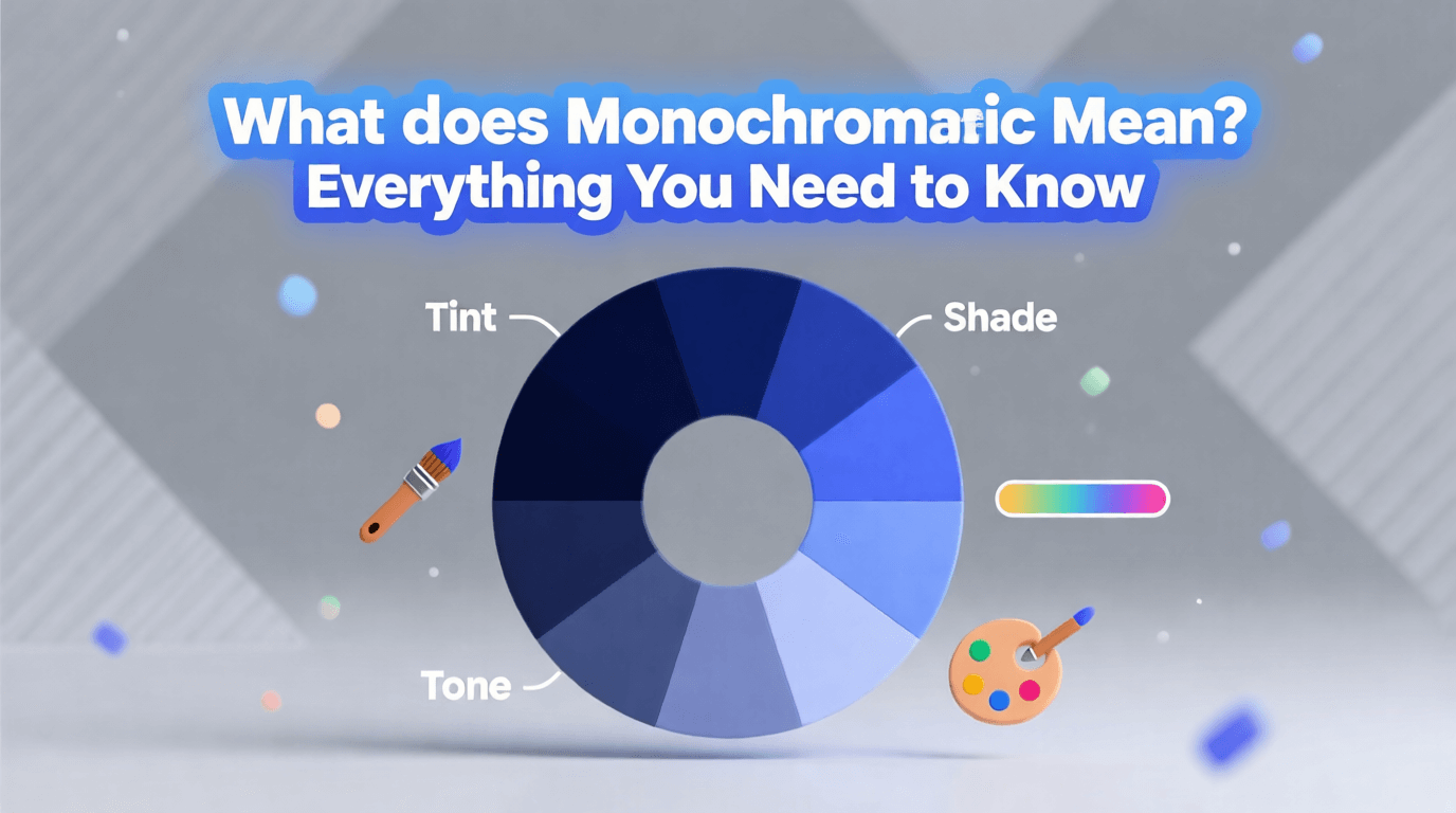
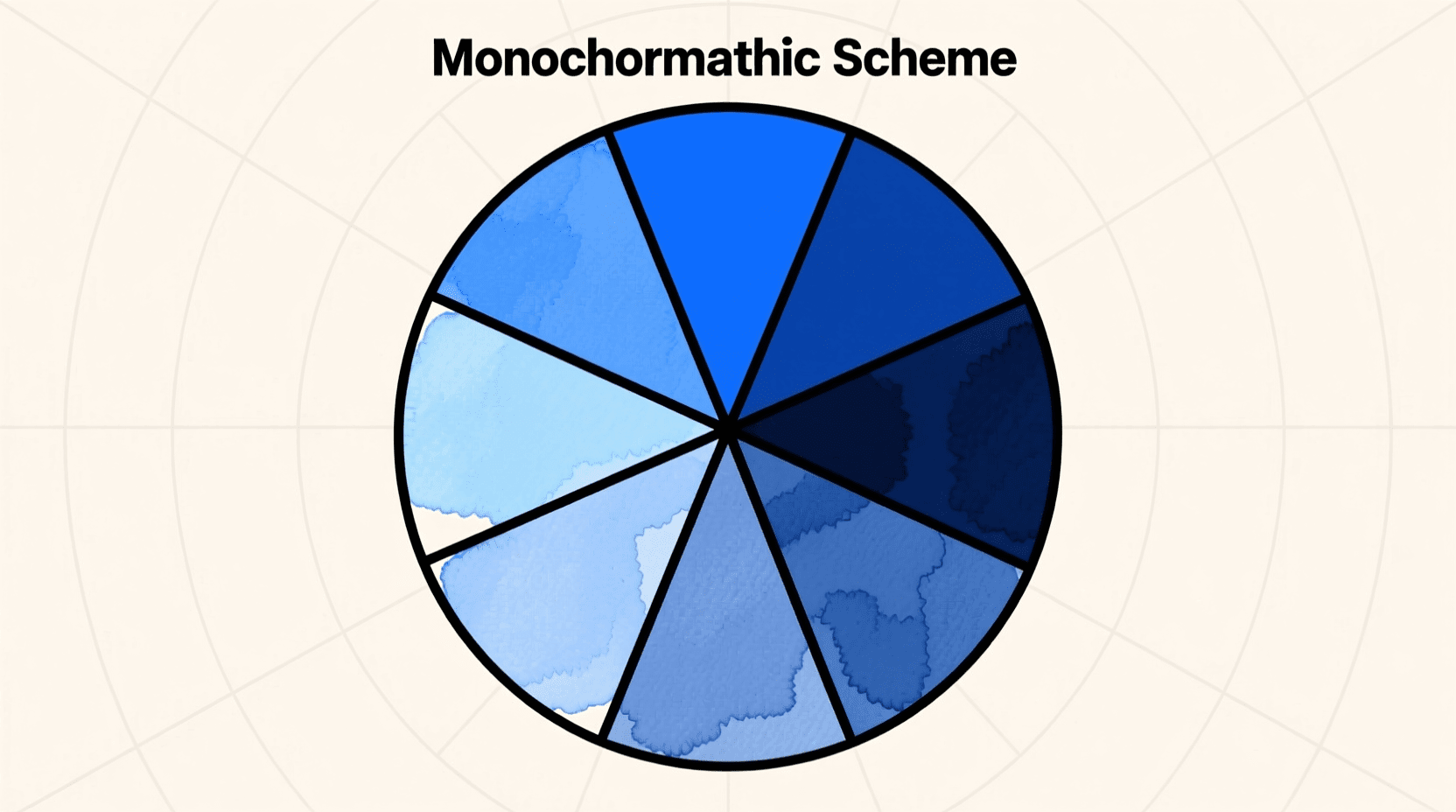
A monochromatic color scheme uses one single hue as its foundation, then builds visual interest through variations of that color. These variations include lighter versions (tints), darker versions (shades), and muted versions (tones). The result is a cohesive visual experience that feels unified yet dynamic.
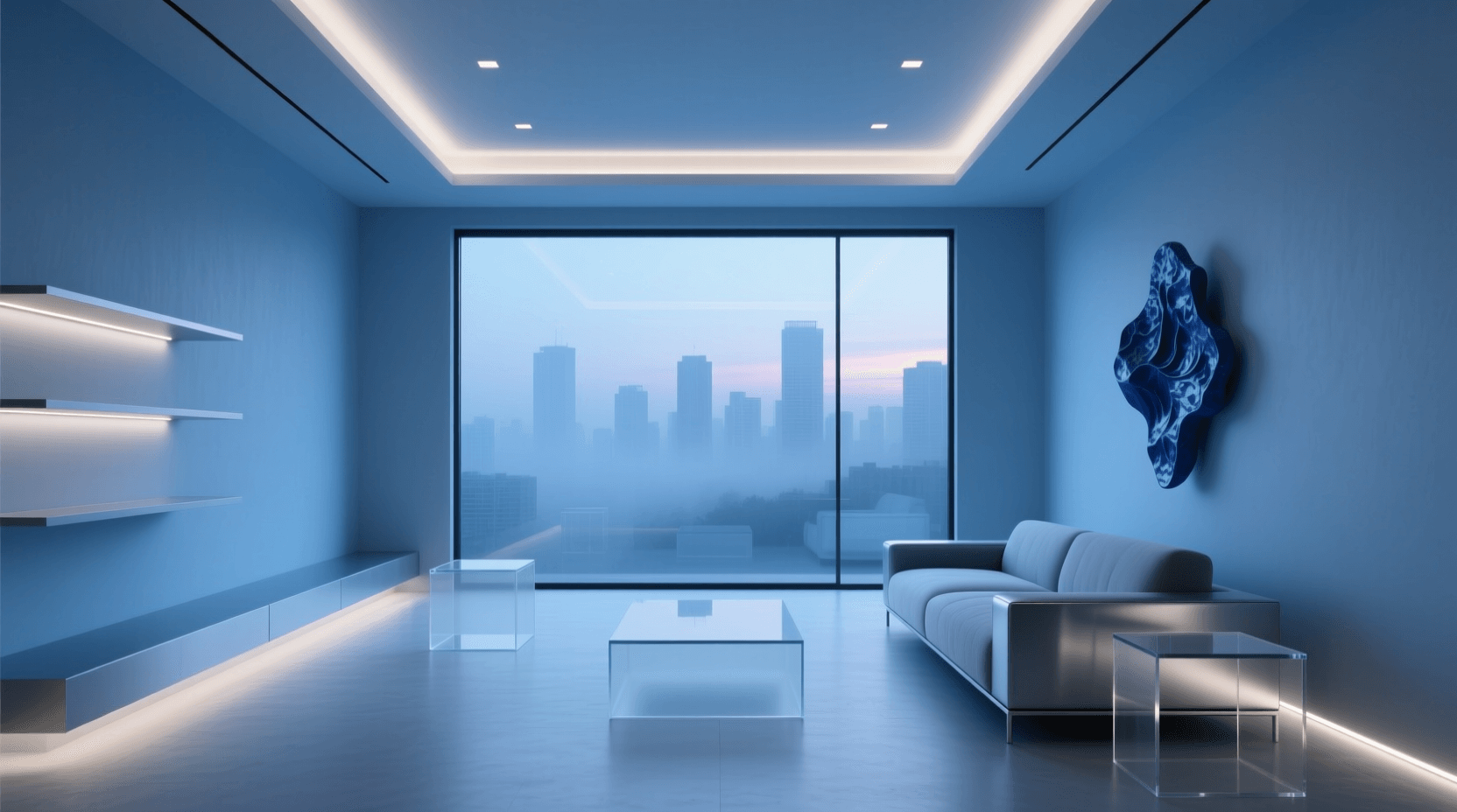
Consider a blue monochromatic scheme. Rather than using just one flat shade of blue everywhere, you’d incorporate sky blue on your walls, navy on your accent furniture, and medium blue tones in your textiles. Every element shares the same underlying hue, but each occupies a different position on the lightness scale.
This approach differs fundamentally from polychromatic designs, which draw from multiple distinct colors across the spectrum. Monochromatic work strips away that complexity to focus attention on other visual elements—texture, form, composition, and the interplay of light and shadow.
Four Building Blocks of Monochromatic Color
Understanding how monochromatic palettes work requires familiarity with four key terms. Each plays a distinct role in creating depth within a single-color scheme.
Hue refers to the pure, original color you select as your base. Think of primary and secondary colors in their purest form—red, blue, green, yellow, orange, purple. This hue becomes the foundation for every other color choice in your monochromatic palette.
Shade emerges when you add black to your base hue. Shades create darker variations that add depth and visual weight to your design. A deep forest green, for instance, is a shade of the green hue family.
Tint appears when you mix white into your base hue. Tints produce lighter, airier versions of the original color. Pastel pink is simply a tint of red, while baby blue represents a tint of the blue hue.
Tone results from adding gray to your base hue. Tones mute the intensity of the original color, creating subtler, more sophisticated variations that work beautifully in professional settings and refined interiors.
Monochromatic vs. Black and White
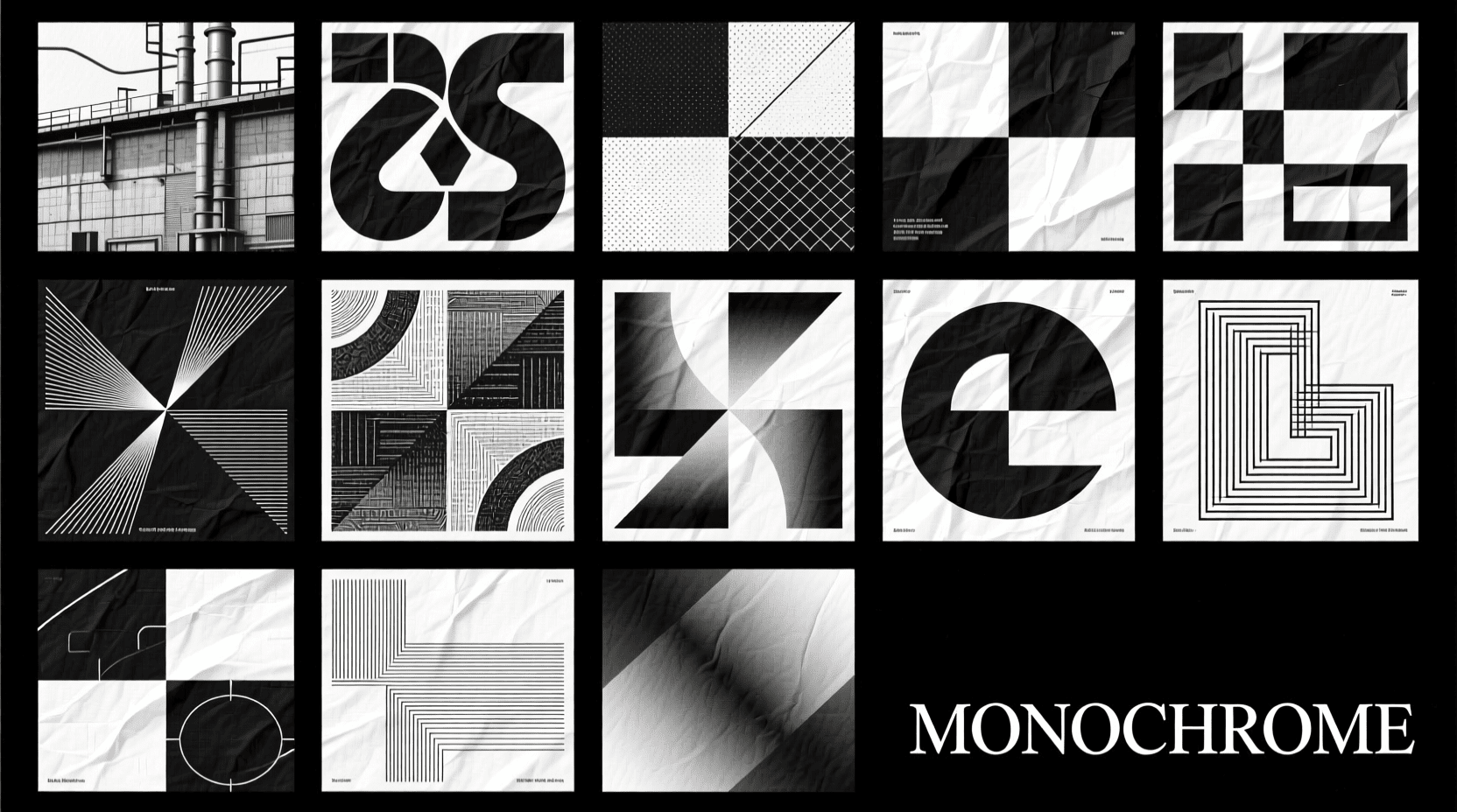
Here’s where many people get confused: black and white photography and imagery fall under the monochromatic umbrella, but monochromatic doesn’t automatically mean black and white. The relationship works in one direction only.
Every black and white image qualifies as monochromatic because it uses variations of a single color (gray, in this case). However, not every monochromatic image is black and white. You can create monochromatic work using shades of blue, variations of sepia brown, different intensities of green, or any other color family you choose.
This distinction matters for photographers entering competitions and artists describing their work. A competition accepting monochromatic entries would welcome sepia-toned photographs, while a strictly black-and-white category would not.
Grayscale represents a specific type of monochromatic scheme that uses only neutral grays—no color tint whatsoever. It’s the purest form of black and white imagery, eliminating even the subtle warm or cool casts that often appear in traditional black and white photographs.
Monochromatic Schemes in Color Theory
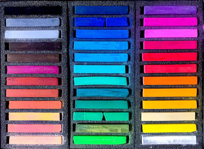
Color theory identifies seven main types of color schemes used in art and design. Monochromatic sits alongside complementary, split complementary, analogous, triadic, rectangular, and square schemes as a fundamental approach to organizing color.
What sets monochromatic apart is its reductive nature. Rather than harmonizing multiple hues, it challenges the creator to build visual interest through value changes alone. This constraint forces artists and designers to master the relationship between light and dark, developing strong skills in creating depth without relying on color variety.
Analogous color schemes present the closest alternative to monochromatic approaches. They use colors that sit next to each other on the color wheel—like blue, blue-green, and green. While more varied than true monochromatic palettes, analogous schemes share that sense of harmony and cohesion.
The complementary color approach moves in the opposite direction, pairing colors from opposite sides of the wheel for maximum contrast and visual energy.
Single-Color Art Through History
Monochromatic painting has shaped modern and contemporary Western visual art since the early twentieth century. According to the Tate, artists have used single-color approaches for centuries, though the practice took on new significance with the rise of abstract art.
Russian artist Kazimir Malevich stands among the pioneers of monochromatic abstraction. Around 1917-1918, he created a series of white-on-white paintings that pushed the boundaries of what art could be. His work explored the non-representational potential of a single color, investigating how value shifts and textural variations could carry meaning without depicting recognizable subjects.
Pablo Picasso’s Blue Period (1901-1904) offers another famous example of monochromatic exploration. During these years, Picasso worked almost exclusively in shades of blue and blue-green, using the restricted palette to convey melancholy, poverty, and isolation. The color choice itself became inseparable from the emotional content of his work.
American painter Ad Reinhardt spent the final fifteen years of his career (roughly 1952-1967) creating near-pure monochrome paintings in red, blue, and most famously, black. His black paintings appear completely uniform at first glance, but reveal subtle variations in tone and texture upon closer inspection.
The tradition continues today. Artists use monochromatic approaches to explore spiritual purity, reduce paintings to their essential physical elements, or create starting points for conceptual work. The single-color canvas serves as both limitation and liberation.
Monochrome Photography Techniques
Photography has embraced monochromatic approaches since its earliest days. The first permanent photograph, created by Joseph Nicéphore Niépce in the 1820s, was monochromatic by necessity—early photo-sensitive materials couldn’t capture color. Throughout the nineteenth century, processes like daguerreotypes and albumen prints produced inherently single-color images.
Even after color photography became widely available in the mid-twentieth century, many photographers continued choosing monochrome for artistic reasons. Masters like Ansel Adams and Henri Cartier-Bresson used black-and-white photography to emphasize light, composition, and emotional clarity without the distraction of color.
Creating monochrome photographs today typically involves post-processing. Most modern cameras capture full-color images that photographers then convert using software like Adobe Photoshop or Lightroom. The conversion process allows precise control over how different original colors translate into shades of gray or your chosen monochromatic hue.
Some photographers hunt for naturally monochromatic scenes—early morning fog that turns everything blue, golden hour light that bathes landscapes in amber, or snow-covered scenes that reduce the world to white and gray. These images require minimal processing to achieve their single-color effect.
If you want to experiment with monochromatic imagery without mastering complex editing techniques, our monochromatic image generator offers an easy starting point. You can also explore black and white styles or try sepia tones for a vintage aesthetic.

Using Monochromatic Palettes in Interior Design
Interior designers frequently turn to monochromatic schemes for their ability to create sophisticated, unified spaces. The approach works equally well in compact apartments seeking visual expansion and grand rooms requiring cohesion.
According to design experts at AND Academy, monochromatic interior design is emerging as a top trend for 2025-2026. The “quiet luxury” aesthetic driving current design preferences aligns perfectly with the understated elegance of single-color rooms.
Successful monochromatic interiors depend heavily on texture. When color variety disappears, textural variation becomes essential for preventing spaces from feeling flat. Interior designers recommend incorporating diverse materials—velvet, linen, wood, metal, glass—each reflecting light differently and adding tactile interest.
Cool colors like blues, greens, and purples tend to create calming atmospheres, making them popular choices for bedrooms and spaces intended for relaxation. Warm colors—yellows, oranges, reds—generate more energetic environments suited to social spaces, kitchens, and home offices.
The psychological impact of color choice extends beyond simple mood associations. Flooring America notes that blue tones often promote calm, while warmer hues like mustard yellow evoke energy and optimism.
For those wanting to visualize monochromatic room concepts before committing, AI tools can help. Try our minimalist image generator for clean, single-color design inspiration, or explore moody atmospheres with darker palettes.
Single-Color Fashion Choices
Fashion embraced monochromatic dressing long before it became a social media trend. The approach simplifies outfit coordination while creating a sleek, intentional appearance that draws attention to silhouette and texture rather than pattern matching.
Monochromatic outfits don’t require every piece to be identical in color. A navy blazer pairs beautifully with light blue trousers and a medium blue shirt, creating visual interest through value variation while maintaining color harmony. The same principle applies to all-black ensembles that mix matte, glossy, and textured fabrics.
Interior designers at Elle Decor report that fashion trends increasingly influence home décor choices. Benjamin Moore’s 2026 Color of the Year drew inspiration directly from the resurgence of classic, tailored suiting—demonstrating how monochromatic thinking crosses creative boundaries.
Why Designers Choose Monochromatic Schemes
Beyond aesthetic appeal, monochromatic approaches offer practical advantages for designers and artists across disciplines.
Simplified decision-making tops the list. Once you select a base hue, every subsequent color choice becomes straightforward—you’re simply moving up or down the value scale within your chosen color family. This constraint paradoxically frees creativity by eliminating analysis paralysis.
Natural cohesion emerges automatically in monochromatic work. Every element shares the same underlying hue, eliminating the risk of clashing colors and creating unity without conscious effort.
Emphasis on other elements becomes possible when color variation disappears. Texture, form, composition, and the interplay of light and shadow take center stage. Many artists find this restriction helps them develop stronger fundamental skills.
Emotional consistency strengthens communication. A single-color palette reinforces whatever mood you’re trying to convey, whether that’s the calm of blue, the warmth of orange, or the sophistication of gray.
Space manipulation works effectively in interior design. Light monochromatic schemes can make small rooms appear larger and more open, while darker single-color approaches create intimate, cozy atmospheres in larger spaces.
How to Create Your Own Monochromatic Images
Ready to experiment with monochromatic design? Several approaches can help you get started, regardless of your technical skill level.
Traditional photography offers the most hands-on approach. Look for naturally occurring monochromatic scenes—foggy mornings, sunset hour, snow-covered landscapes, or urban environments dominated by a single material like brick or concrete. Capture these scenes, then refine them in post-processing by desaturating competing colors.
Digital editing software like Adobe Photoshop provides complete control over the conversion process. You can transform any color photograph into a monochromatic image by first converting to grayscale, then applying your chosen hue through duotone or colorization tools. This method lets you experiment with different color choices before committing.
AI image generators offer the fastest path from concept to finished image. Our monochromatic image generator creates single-color artwork based on your text descriptions, handling all the technical complexity automatically.
For related styles that share monochromatic characteristics, explore these options:
- Duotone images for two-color variations
- Film noir style for dramatic black and white
- Vintage aesthetics for sepia-toned effects
- Gradient effects for smooth color transitions
Frequently Asked Questions
What does monochromatic mean in simple terms?
Monochromatic means using one color in various shades, tints, and tones. Rather than combining different colors, a monochromatic scheme explores all the variations possible within a single hue—from its lightest version to its darkest shade.
Is black and white the same as monochromatic?
Black and white is one type of monochromatic scheme, but they’re not identical terms. All black and white images are monochromatic (using variations of gray), but monochromatic images can use any color—sepia, blue, green, or any other hue.
What is an example of monochromatic color?
A monochromatic blue palette might include navy (dark shade), royal blue (pure hue), sky blue (light tint), and dusty blue (muted tone). All of these colors share the same underlying blue hue but differ in lightness, darkness, or saturation.
Why do artists use monochromatic schemes?
Artists choose monochromatic approaches to focus attention on composition, texture, and form rather than color relationships. The restriction simplifies certain decisions while challenging creators to develop stronger skills in value and tonal work.
What is the difference between monochrome and monochromatic?
These terms are synonyms and can be used interchangeably as adjectives. “Monochrome” can also function as a noun, referring to an actual black and white photograph or single-color painting.
How do I create a monochromatic color palette?
Start by selecting a base hue you want to work with. Then create variations by adding white (for tints), black (for shades), or gray (for tones). Tools like Adobe Color can generate monochromatic palettes automatically from any starting color.
Is monochromatic design boring?
Not when executed thoughtfully. Successful monochromatic designs rely on varied textures, interesting compositions, and thoughtful use of light and shadow to create visual interest without color variation. The technique can produce some of the most sophisticated and striking designs across all creative fields.
What colors work best for monochromatic schemes?
Any color can form the basis of an effective monochromatic scheme. Blue and green tend toward calming effects, while red, orange, and yellow create more energetic atmospheres. Neutral tones like gray and beige offer timeless sophistication. Choose based on the mood you want to create.