
A monochromatic color palette might sound limiting at first. One color? Really? Yet some of the most memorable brands, interiors, and artworks rely on this deceptively simple approach. Nike’s bold black, Coca-Cola’s iconic red, and Apple’s sleek silver all demonstrate how powerful a single-hue strategy can be when executed thoughtfully.
This guide walks you through everything you need to know about monochromatic colors—from the fundamentals of tints, shades, and tones to practical techniques for building palettes that captivate without overwhelming. You’ll discover why designers across industries keep returning to this timeless color strategy, plus get actionable steps for creating your own monochromatic color images and designs.
Table of Contents
- What Are Monochromatic Colors?
- Understanding Tints, Shades, and Tones
- The Psychology Behind Monochromatic Palettes
- Step-by-Step Guide to Creating Monochromatic Palettes
- Monochromatic Color Examples by Hue
- Design Applications and Use Cases
- Common Mistakes to Avoid
- Tools and Resources for Monochromatic Design
- Frequently Asked Questions
What Are Monochromatic Colors?
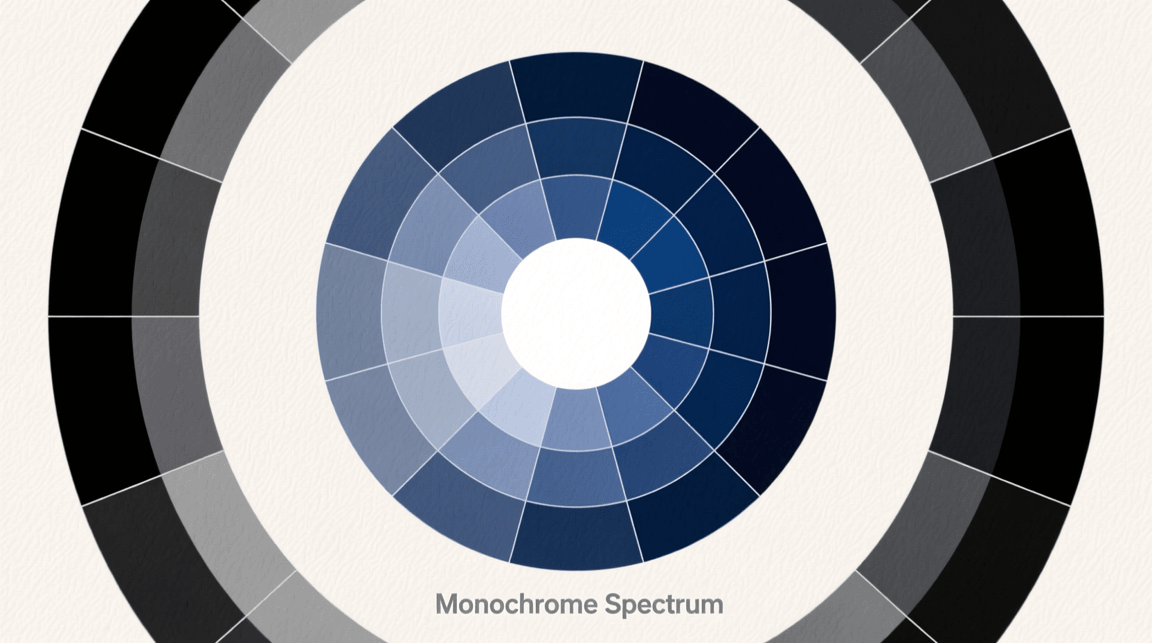
The term “monochromatic” comes from the Greek words “monos” (one) and “chroma” (color). A monochromatic color scheme uses variations of a single hue to create a unified, harmonious look. Rather than combining multiple distinct colors from around the color wheel, you work exclusively with one base hue and adjust its lightness, darkness, and intensity.
Think of a forest at dawn. The scene isn’t just one flat shade of green—you see pale mist-washed greens in the distance, rich emerald foliage in the midground, and deep shadowy greens beneath the canopy. That entire spectrum comes from one color family, creating depth while maintaining visual cohesion.
According to Figma’s design resource library, designers reference color theory to choose a base color for their project, then apply different shades, tints, and tones to create a modern, minimalist palette. The result? Designs that feel polished and intentional without the complexity of managing multiple competing hues.
Why Designers Keep Choosing Monochrome
The enduring popularity of monochromatic schemes across industries stems from several practical advantages. Decision-making becomes dramatically simpler. When you’re adjusting only one variable—the lightness or saturation of a single hue—debates about which colors complement each other simply evaporate.
Visual harmony emerges naturally from this approach. Every color in your design shares the same underlying hue, which eliminates clashing. Viewers experience reduced cognitive load, freeing them to focus on your actual content rather than processing a rainbow of competing elements.
Brand identity strengthens considerably too. Audiences who consistently encounter variations of one signature color across your website, packaging, and advertisements begin associating that hue directly with your brand. The connection becomes almost instinctive.
Understanding Tints, Shades, and Tones
Before you can build effective monochromatic palettes, you need to understand the three primary ways to modify any base hue. Each adjustment creates a distinct visual effect and serves different purposes in your designs.
Tints: Adding White
A tint is created when white is mixed with your base color. The result is a lighter, softer version of the original hue. Adding white to red, for example, produces pink. Adding white to blue yields sky blue or powder blue, depending on the proportion.
Tints work beautifully for backgrounds, creating airy and inviting spaces that don’t compete with foreground elements. In interior design, tints help rooms feel larger and more open. In digital design, light tints provide breathing room and improve readability when used behind darker text.
Shades: Adding Black
Shades move in the opposite direction—adding black to your base color produces a deeper, richer version. Navy is a shade of blue. Burgundy is a shade of red. Forest green is a shade of pure green.
Shades convey sophistication, drama, and authority. They work well for headlines, calls to action, and any element you want viewers to notice immediately. In the context of branding, darker shades often signal premium quality or professionalism.
Tones: Adding Gray
Tones are perhaps the most overlooked variation, yet they’re essential for creating nuanced, contemporary palettes. Adding gray to your base color mutes its intensity, producing subtler, more sophisticated versions. A pure red becomes dusty rose; a vivid blue becomes slate blue.
Tones are particularly useful in modern design because they feel neither too bright nor too dark. They create visual interest without overwhelming the viewer, making them ideal for large surface areas like backgrounds, cards, and sections that need differentiation without drama.

The Psychology Behind Monochromatic Palettes
Colors influence emotions, guide attention, and shape behavior—core principles of color theory and psychology. A monochromatic palette amplifies these effects by concentrating them. Instead of diluting your message across multiple hues, you deliver a focused emotional punch through one color family.
Emotional Associations by Color
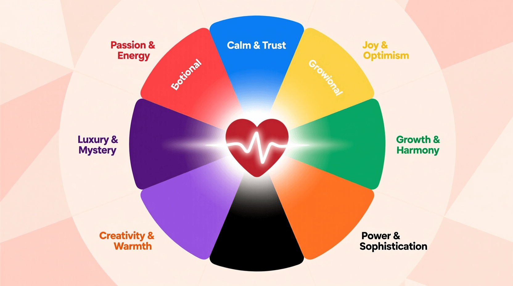
Your choice of base hue sets the emotional tone for your entire design. According to research compiled by Park University’s color theory guide, different colors trigger distinct psychological responses:
Blue monochromatic schemes evoke trust, reliability, and calm. Financial institutions, healthcare organizations, and technology companies frequently lean on blue because it suggests stability and competence. Blue is also unique in having almost exclusively positive psychological associations.
Red and orange palettes generate energy, excitement, and urgency. These warm hues accelerate heart rates and stimulate appetite, explaining why food brands and clearance sales gravitate toward them.
Green monochrome designs communicate growth, health, and environmental consciousness. Wellness brands, organic products, and sustainability-focused companies harness green’s associations with nature and renewal.
Gray and neutral schemes project professionalism, modernity, and sophistication. Tech companies like Apple have built entire brand identities around neutral monochromatic palettes, signaling sleek innovation and premium quality.
Cultural Considerations
Color psychology isn’t universal. White represents purity and innocence in Western cultures but signifies mourning in some Eastern traditions. Red symbolizes luck and prosperity in China while carrying associations with danger or passion in Western contexts. Before finalizing your monochromatic palette, research how your chosen hue resonates with your target audience’s cultural background.
Step-by-Step Guide to Creating Monochromatic Palettes
Building a monochromatic color palette requires more intention than complexity. These steps help you create palettes that perform well across web, print, and environmental applications.
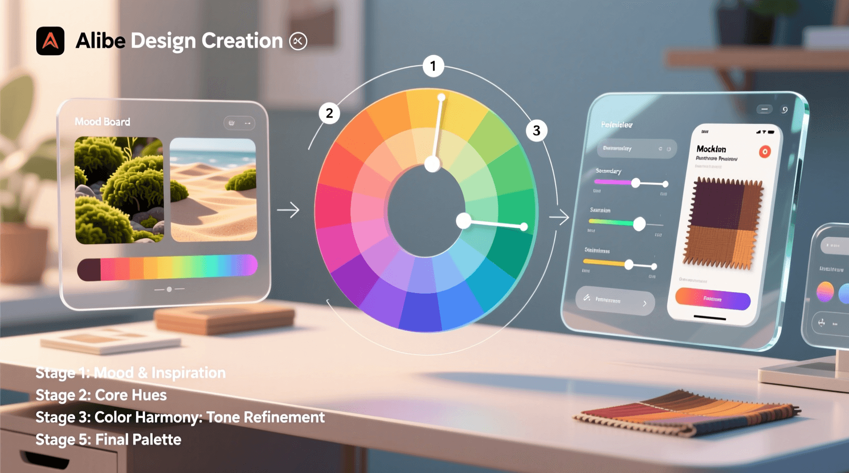
Step 1: Select Your Base Color
Your base color anchors the entire palette. Three factors deserve consideration when making this choice:
What emotion or message should your design convey? Match your hue to that intent. A meditation app calls for calming blues or greens; a fitness brand might demand energizing oranges or reds.
Does your brand already have established colors? Work within those parameters to maintain consistency across all touchpoints.
Who is your audience? A palette targeting corporate executives differs from one aimed at teenagers. Research your audience’s preferences and expectations.
Step 2: Generate Your Variations
With your base color chosen, develop a range of tints, shades, and tones. Effective monochromatic palettes typically contain between three and seven variations. Fewer than three lacks sufficient contrast; exceeding seven becomes unwieldy to manage.
Begin by creating two or three tints (progressively lighter versions), two or three shades (progressively darker versions), and one or two tones (muted versions). This spectrum provides versatility for most design challenges.
Generate these variations manually in any design software by adjusting HSB (Hue, Saturation, Brightness) values. Keep the hue constant while modifying saturation and brightness. Online tools like Coolors or Adobe Color can also generate monochromatic palettes automatically from any starting color.
Step 3: Test for Contrast
Accessibility cannot be an afterthought. Ensure your palette includes enough contrast between light and dark variations so text remains readable and interactive elements stay distinguishable. For web design, the Web Content Accessibility Guidelines (WCAG) recommend a minimum contrast ratio of 4.5:1 between text and background.
Place your darkest shade against your lightest tint—can you read body text comfortably? If not, adjust your extremes to increase contrast.
Step 4: Assign Colors to Elements
Establish a clear hierarchy by assigning colors with purpose:
- Lightest tints work best for backgrounds and large surface areas
- Medium tones serve secondary elements, cards, and containers
- Darkest shades command attention on headlines, key text, and important actions
- Your pure base color deserves strategic deployment on accent elements you want to highlight
This structure creates visual rhythm and guides viewers’ eyes through your design logically.
Monochromatic Color Examples by Hue
Different base hues lend themselves to different applications and moods. Here’s how several popular monochromatic families function in practice.
Blue Monochromatic Palette
Blue remains the most widely used monochromatic scheme in professional contexts. A blue palette might include pale sky blue (#87CEEB) for backgrounds, cornflower blue (#6495ED) for secondary elements, and navy (#001F3F) for headlines and primary actions.
This scheme works exceptionally well for corporate websites, financial applications, and healthcare platforms. The psychological associations with trust and calm translate seamlessly across these industries.
Green Monochromatic Palette
Green monochrome designs tap into associations with nature, growth, and wellness. Palette possibilities range from pale mint (#98FF98) through emerald (#50C878) to deep forest green (#228B22).
Environmental organizations, organic food brands, and wellness companies frequently employ green palettes. The color family also works well for productivity and finance applications, where green symbolizes positive outcomes and forward progress. Want to visualize green monochromatic concepts? Our monochromatic image generator can help you explore these palettes in action.
Warm Neutrals: Browns and Beiges
A brown monochromatic palette provides warmth and groundedness without the intensity of saturated hues. Ranging from cream (#FFFDD0) through camel (#C19A6B) to espresso (#3C2415), these earthy tones convey authenticity and reliability.
Coffee shops, artisanal brands, law firms, and heritage companies leverage brown palettes to signal tradition and trustworthiness. According to Benjamin Moore’s color experts, layering shades of beige and brown infuses spaces with sophistication.
Gray Monochromatic Palette
Gray shouldn’t be dismissed as drab. A thoughtful gray palette—from near-white (#F5F5F5) through medium gray (#808080) to charcoal (#36454F)—creates clean, sophisticated designs that never date.
Tech companies, architecture firms, and luxury brands frequently deploy gray monochrome schemes. The neutrality allows photography, products, or content to take center stage while the palette provides structure without distraction. For generating grayscale imagery with dramatic lighting, consider our black and white image generator or silhouette image generator.
If you want to experiment with creating monochromatic images using various styles and aesthetics, our monochromatic image generator offers a straightforward way to explore these palettes visually.

Design Applications and Use Cases
Monochromatic color schemes prove versatile across numerous design disciplines. Each context presents unique opportunities and considerations.
Web and Digital Design
Monochromatic web design creates unified, professional experiences. The single-hue approach works particularly well for portfolios, landing pages, and applications where you want content (photography, products, text) to dominate rather than the interface itself.
A practical strategy involves using your base hue for interactive elements (buttons, links) while reserving tints and shades for backgrounds and containers. This creates clear visual hierarchies that guide users intuitively through your interface.
Interior Design
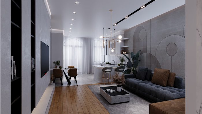
In physical spaces, monochromatic schemes make rooms feel larger and more cohesive. The absence of abrupt color breaks prevents visual fragmentation, allowing spaces to flow seamlessly.
Texture becomes critical in monochromatic interiors. Since you’re working with limited color variation, incorporating diverse textures—matte walls against glossy tiles, woven fabrics beside smooth leather—adds the visual interest that multiple colors would otherwise provide.
As interior designer Kristyn Harvey notes, layering monochromatic colors allows the eye and brain to rest, creating feelings of peacefulness. This makes monochrome particularly effective in bedrooms, bathrooms, and other spaces intended for relaxation.
Branding and Logo Design
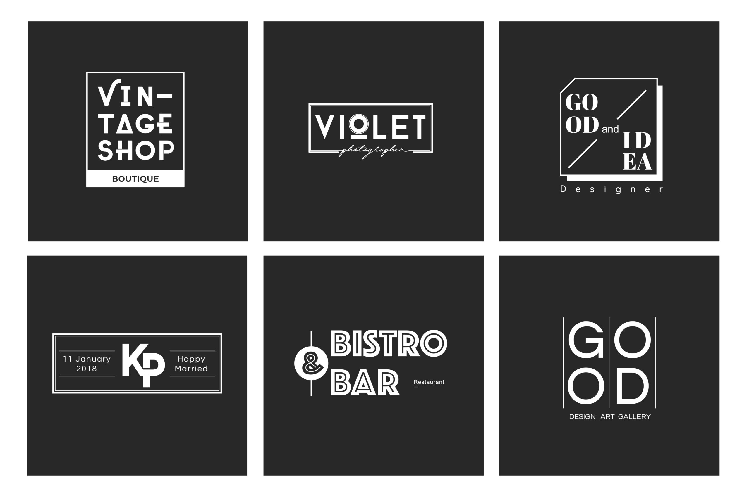
Many of the world’s most recognizable brands employ monochromatic or near-monochromatic identities. The simplicity aids memorability—when consumers think of your brand, a single color comes immediately to mind.
Nike’s black swoosh, Coca-Cola’s red wordmark, and Starbucks’ green siren demonstrate how single-color logos remain instantly recognizable across any context or size. The constraint forces focus, resulting in designs that communicate efficiently.
Photography and Film
Monochromatic approaches in visual media create powerful emotional impact. The Wachowskis’ signature green tint in The Matrix defined an entire generation’s visual vocabulary for digital dystopia. Zhang Yimou’s Hero uses shifting monochromatic palettes—red for passion, blue for truth, white for resolution—to differentiate narrative segments.
Even in still photography, monochromatic overlays on black-and-white images create striking, stylized results. The technique unifies diverse subjects under a cohesive visual identity. Our film noir image generator and sepia image generator demonstrate how single-color treatments transform ordinary photographs into evocative artwork.
Common Mistakes to Avoid
While monochromatic palettes simplify color decisions, several pitfalls can undermine their effectiveness.
Insufficient Contrast
The most common error is selecting variations too similar in value. When your tints, shades, and tones cluster too closely together, the design becomes muddy and illegible. Text blends into backgrounds, buttons disappear into cards, and the visual hierarchy collapses.
Solution: Always test your palette in actual use cases. Place text on backgrounds, buttons on containers, and graphics on surfaces. If elements don’t separate clearly, push your extremes further apart.
Ignoring Texture and Pattern
A monochromatic design lacking textural variety feels flat and lifeless. Without multiple colors to create visual interest, texture and pattern must carry that responsibility.
Solution: Introduce gradients, subtle patterns, varying opacities, and different surface treatments (matte versus gloss, smooth versus rough). These elements add depth without adding colors.
Forgetting About Functionality
Aesthetic goals shouldn’t override usability. If your monochromatic palette makes it difficult to distinguish interactive elements, identify states (hover, active, disabled), or locate important information, the design fails its fundamental purpose.
Solution: Consider supplementing your monochromatic palette with black, white, or a single accent color for critical functional elements. Many designers treat pure black and white as “neutral” additions that don’t violate the monochromatic principle.
Overlooking Accessibility
Color blindness affects approximately 8% of men and 0.5% of women globally. If your design relies solely on color variation to convey meaning—using different shades to indicate different states, for instance—some users won’t perceive those differences.
Solution: Supplement color with additional visual cues: icons, labels, patterns, or text. Test your palette using color blindness simulators to identify potential issues before launch.

Tools and Resources for Monochromatic Design
Numerous tools can accelerate your monochromatic palette creation and ensure professional results.
Color Palette Generators
Adobe Color: Set the color harmony rule to “monochromatic” and adjust your base hue. The tool generates a balanced palette automatically.
Coolors: This popular generator includes a monochromatic mode and offers color blindness testing to verify accessibility.
Paletton: Provides fine-grained control over how many variations you want and the spacing between them.
Design Software Built-In Tools
Most professional design applications include color picker tools that let you create monochromatic variations by adjusting HSB values. In Figma, Sketch, Adobe Illustrator, or Photoshop, select your base color, then modify only the saturation and brightness while keeping hue constant.
AI-Powered Image Generation
Modern AI tools can generate monochromatic images directly. If you’re exploring visual concepts or need consistent single-hue imagery, tools that support style specification can produce cohesive monochromatic visuals efficiently.
Our platform offers several specialized generators that work well for creating monochromatic content. The AI art generator allows you to specify color constraints, while the minimalist image generator naturally lends itself to monochromatic aesthetics. For exploring specific color families, try our duotone image generator or the gradient image generator for smooth color transitions within a single hue.
Inspiration Resources
Studying existing monochromatic designs accelerates your learning. Pinterest boards dedicated to single-color interiors, Dribbble’s monochrome tag, and Awwwards’ minimalist website collections all provide excellent reference material.
Frequently Asked Questions
What are monochromatic colors exactly?
Monochromatic colors are all the tints, tones, and shades derived from a single base hue. For example, a blue monochromatic palette includes everything from pale sky blue through vivid cobalt to deep navy—all variations of blue without introducing other hues like red or yellow.
Is black and white considered monochromatic?
Yes. Grayscale—comprising black, white, and all grays between them—qualifies as a monochromatic scheme. It’s a special case where the “hue” is neutral, containing no color saturation at all. Many designers consider grayscale the purest form of monochrome.
How many colors should a monochromatic palette include?
Most effective monochromatic palettes contain three to seven variations. Three provides enough contrast for basic designs; seven offers flexibility for complex layouts. Beyond seven, distinctions between adjacent colors become imperceptible, adding complexity without benefit.
Can I add an accent color to a monochromatic scheme?
Technically, adding a different hue creates a different type of color scheme. However, many designers treat a “monochromatic plus accent” approach as an extended monochrome strategy. If 90% of your design uses variations of one hue, a single contrasting accent for calls-to-action maintains the scheme’s cohesive feel while improving functionality.
What’s the difference between monochromatic and analogous color schemes?
Monochromatic schemes use only one hue in various tints, shades, and tones. Analogous schemes use three colors positioned adjacent to each other on the color wheel—for example, blue, blue-green, and green. Both approaches create harmony, but analogous schemes offer more hue variety.
Are monochromatic designs boring?
Not at all. The constraint of working with one color family forces creativity in other areas: texture, typography, composition, imagery, and negative space become more important. Many award-winning, visually striking designs employ monochromatic palettes precisely because they create focused, intentional visual experiences.
How do I choose the right base color for my project?
Consider your project’s goals, your audience’s expectations, any existing brand guidelines, and the psychological associations of different hues. Blue conveys trust, green suggests growth, red generates energy. Match your base hue to the emotion or message you want to communicate.
What if my monochromatic design looks flat?
Flatness usually results from insufficient contrast or lack of texture. Increase the difference between your lightest and darkest values. Introduce visual texture through patterns, gradients, shadows, and varied surface treatments. Consider photography or illustrations that provide depth without adding colors.