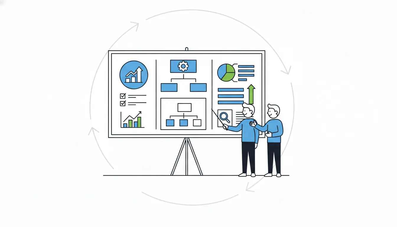
Presenting campaign results to clients can often feel like a dry task, something that turns into a long slog through endless spreadsheets and confusing charts. But it doesn’t have to be that way. Imagine instead turning all that data into a lively story that grabs their attention, shows real value, and leaves them excited about what comes next. The good news is that with a few smart changes to how you prepare and deliver, you can make these sessions engaging and memorable.
Clients are busy people who hear a lot of pitches, so standing out means focusing on what matters to them, using simple visuals, and keeping things human. In this guide, we’ll walk through practical steps drawn from proven marketing strategies, helping you avoid common pitfalls and build stronger client relationships every time. Whether you’re sharing wins from a social media push or email campaign, these tips will help you connect better and drive action.
Why Clients Tune Out and How to Hook Them
Clients often sit through many presentations, and their attention spans are getting shorter, so they tend to lose focus after just a few minutes. Data from a large number of presentation sessions shows that many viewers leave early if the start doesn’t grab them right away, but those who stick past the first few slides usually see it through to the end.
To start strong, personalize the cover slide with the client’s logo, their name, and a short note about what you’ve heard from them regarding their goals; this helps them feel understood right away. The most important thing is to make it relevant by tailoring the content to what they care about most, such as quick overviews of return on investment for executives or detailed metrics like click-through rates for marketing teams. Skip generic introductions and jump straight into their specific situation to keep them engaged from the beginning.
Know Your Audience
Since every client has unique needs, generic reports usually fail to impress. Executives typically want a high-level view of return on investment that connects directly to their business goals, for example, explaining how the campaign brought in new business through targeted content. On the other hand, marketing leads often prefer in-depth looks at traffic sources, conversions, and cost-per-lead compared to previous campaigns.
Studies indicate that decks customized with slides specific to the prospect get more engagement and get shared internally more frequently, which matters a lot in business-to-business settings where decisions involve several stakeholders. Before you create your presentation, think about what worries them most and frame the results around those issues, such as describing a traffic increase as “more qualified leads ready to fill your sales pipeline.”
Craft a Compelling Story, Not Just a Data Dump
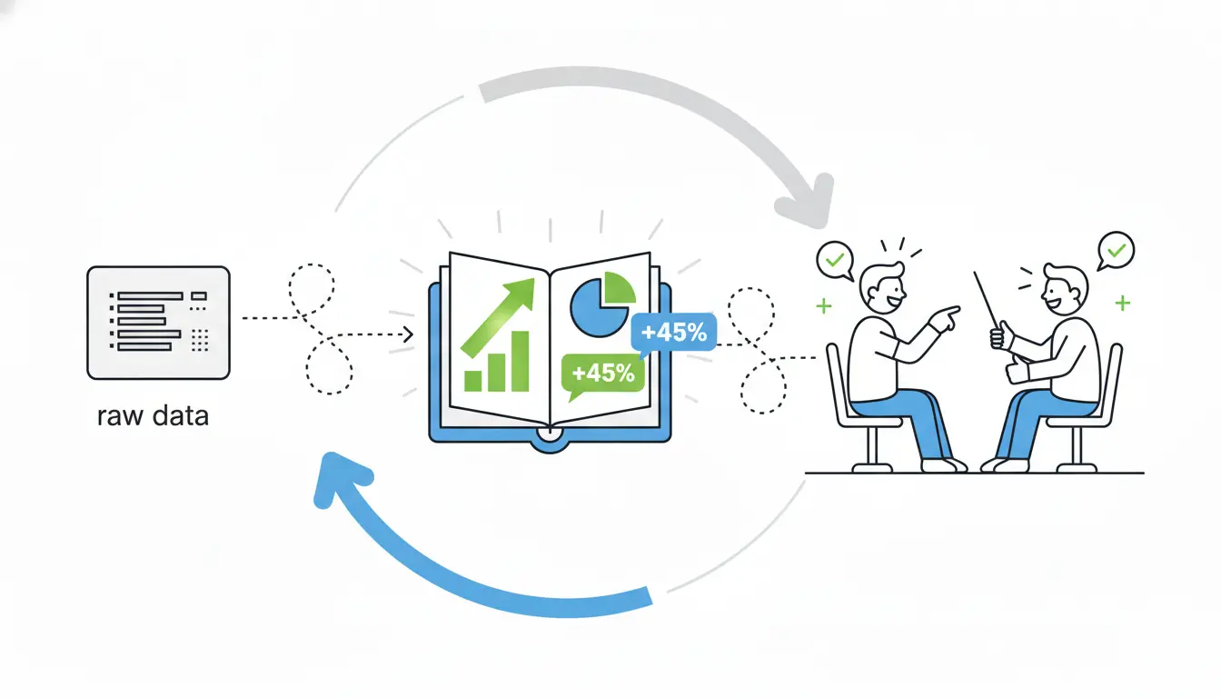
While raw data can bore people quickly, stories help everything stick in their minds. Build your presentation as a narrative that begins with the original objectives, moves through the tactics you used and any challenges faced, highlights the key wins, and finishes with opportunities ahead; this storytelling approach helps people remember much more than plain numbers.
Here’s a simple structure to follow for the best results:
- Put an executive summary at the top with the biggest wins explained in everyday language.
- Review the objectives and show which key performance indicators were met or missed.
- Share performance metrics alongside year-over-year comparisons.
- Offer insights into why things happened the way they did.
- Close with clear next steps to maintain momentum.
Always be upfront about any misses because honesty builds trust, whereas trying to hide problems can damage it over time. For instance, one business-to-business content campaign generated many leads through whitepapers, webinars, and infographics, and presenting it as a complete journey from planning to strong return on investment made it memorable.
Make Data Pop
Spreadsheets full of numbers can overwhelm anyone, but good visuals make the information clear and easy to grasp. Choose graphs to show traffic trends over time and bar charts to compare different channels, since visual presentations prove more convincing. Aim to keep your decks concise, with fewer slides for pitches helping more people finish them.
One common mistake is overloading slides with too many bullets and charts, so instead, focus on just one main metric per slide, along with a bit of context to explain it.
Here are some quick tips for visuals that work well:
- Add interactive features like sliders or tabs, which can encourage people to explore more and spend extra time on the deck.
- Keep text to short, key phrases only.
Essential Tools for Stunning Presentations
You can use modern tools to quickly improve your presentations without building everything from zero. Adobe Express stands out because it offers thousands of templates, brand kits to keep everything consistent, smooth animations, and a presenter mode for your notes, making it perfect for fast, polished campaign visuals.
| Tool | Key Strengths | Best For | Pricing (2026 est.) |
| Adobe Express | Templates, animations, brand sync, mobile-friendly | Branded client reports | Free tier; Premium $9.99/mo |
| Google Looker Studio | Real-time dashboards, auto-pulls from Analytics | Live metrics sharing | Free |
| Pitch | Collaborative editing, startup templates | Team-reviewed pitches | Free basic; Pro $20/user/mo |
| Power BI | Custom visuals, data modeling, AI insights | Complex ROI analysis | Free desktop; Pro $10/user/mo |
Tools like these go beyond basic slides by automatically connecting to sources such as Google Analytics or HubSpot to keep data up to date. When you need pie charts or lively graphs, an AI presentation maker built into options like Pitch or Adobe Express makes the process faster while producing clean, professional designs.
Actionable Steps to Deliver with Impact
Practice your delivery to fit under 18 minutes, which research shows holds attention best. Kick off with a strong hook like “Your campaign exceeded goals—let me show you how,” and consider adding a video to the cover slide for more interactions, even though not everyone plays it because its presence adds credibility.
Try these during your presentation to keep things lively:
- Pause after important slides to invite questions.
- Point out clear value, such as “This change lowered your cost-per-lead.”
- Finish with a single, strong call to action like “Let’s book a strategy session now.”
Send a follow-up within 24 hours since the chance of it being read drops after that point.
Dodge These Presentation Killers
Even solid data can fall flat because of avoidable mistakes like cramming too much information onto slides, which buries the main points. The fix is simple: stick to a handful of metrics per section at most.
Watch out for these other frequent problems:
- Using too much technical jargon that confuses non-experts—swap “CTR” for something like “clicks that lead to sales.”
- Forgetting to include next steps, which leaves clients unsure what to do; suggest specific changes like moving budget to the best-performing channels.
- Downplaying weak spots—clients notice when you’re not straightforward, so own a shortfall, explain how to improve, and that honesty will strengthen their trust.
- Making decks too long, which cuts completion rates; target around 10 slides instead.
Nail the Delivery for Maximum Buy-In
Focus on engaging delivery techniques like maintaining eye contact, changing your speaking pace, and using natural hand gestures. Design with mobile in mind too, as many views happen on phones. Include easy ways to schedule follow-ups, like embedded calendars, which help boost bookings.
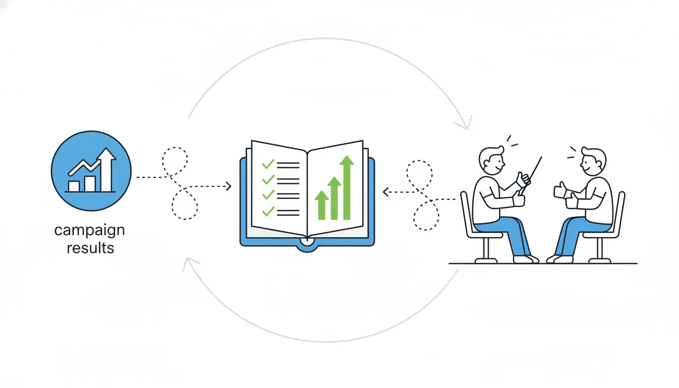
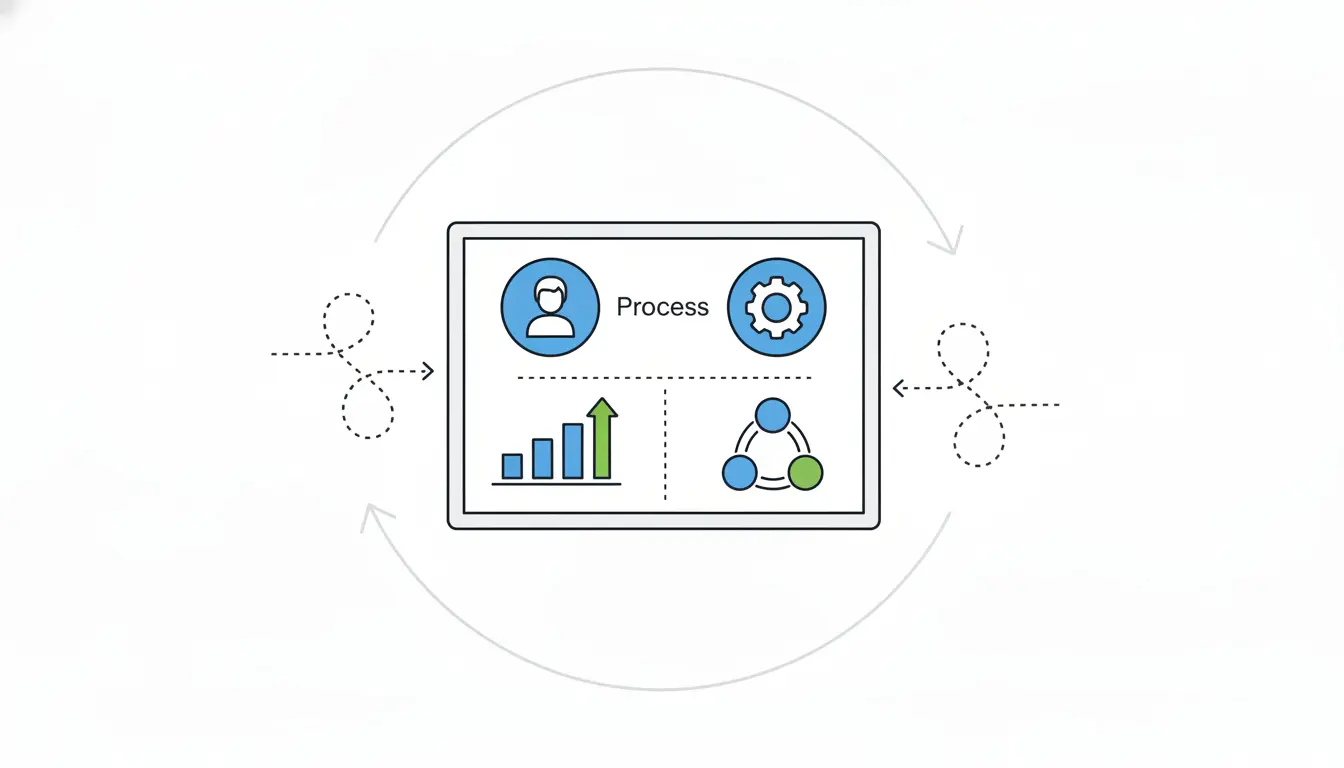
After the presentation, share an interactive version through something like Looker Studio so clients can explore the data themselves. Gauge your success by tracking how often people view and share the deck. In the end, clients will remember the stories that link data back to their real victories, not endless spreadsheets.