Your logo is your business card, your handshake, and your first impression all rolled into one tiny visual. It shows up everywhere—on your website, social media profiles, business cards, and product packaging. When people see your logo, they should instantly recognize your brand. But here’s the problem: hiring a professional designer can cost hundreds or even thousands of dollars, and not everyone has design skills to create one from scratch.
That’s where AI steps in to save the day. AI logo design tools have changed the game completely. You can now create a professional, eye-catching logo in just minutes without breaking the bank or spending years learning design software. According to recent industry data, the AI logo design market is expected to reach $12.34 billion by 2028, growing at 14.3% each year. This explosive growth shows how businesses everywhere are turning to AI for their branding needs.
In this guide, you’ll learn exactly how to design a stunning brand logo using AI tools. We’ll walk through every step, from understanding what makes a great logo to avoiding common mistakes that could hurt your brand. Whether you’re starting a new business or giving your existing brand a fresh look, this guide has everything you need to create a logo that stands out.
Table of Contents
- What Is AI Logo Design and Why Does It Matter?
- Why Use AI to Create Your Brand Logo
- How to Choose the Right AI Logo Design Tool
- Step-by-Step Guide to Designing Your Logo with AI
- Essential Logo Design Principles You Need to Know
- Common Logo Design Mistakes and How to Avoid Them
- How to Customize Your AI-Generated Logo Like a Pro
- Understanding Logo File Formats and When to Use Them
- How to Implement Your Logo Across All Brand Materials
- Frequently Asked Questions
- Key Takeaways

What Is AI Logo Design?
AI logo design uses artificial intelligence and machine learning to create logos based on your input. You tell the tool about your business—things like your company name, industry, style preferences, and favorite colors. The AI analyzes this information and generates multiple logo designs in seconds.
Think of it as having a design assistant that knows thousands of design principles and can apply them instantly. The AI has been trained on countless successful logos, so it understands what works and what doesn’t. It knows that a tech company needs a modern, sleek look while a bakery might benefit from warm, friendly designs.
According to industry research, about 80% of logo design processes in 2025 now involve some form of AI assistance. This doesn’t mean AI replaces human creativity—it enhances it. The best logos combine AI’s speed and efficiency with human refinement and emotional intelligence.
What makes AI logo design special is its accessibility. You don’t need to know the difference between kerning and leading, or understand color theory. The AI handles the technical stuff while you focus on choosing what feels right for your brand. You can experiment with dozens of variations without any additional cost or time investment.
Why Use AI to Create Your Brand Logo
Creating a logo with AI offers massive advantages over traditional methods. Let’s break down why so many businesses are making the switch.
Speed
Traditional logo design can take weeks or even months. You meet with a designer, explain your vision, wait for concepts, provide feedback, wait for revisions, and repeat. With AI, you get hundreds of logo options in under five minutes. AI FREE FOREVER makes this process even simpler by offering instant logo generation without complicated steps.
This speed matters especially when you’re launching a business and need everything ready yesterday. Instead of waiting weeks for a designer, you can have your logo finalized and start using it the same day. This quick turnaround lets you focus on other important aspects of your business.
Cost Savings
Hiring a professional designer typically costs between $300 to $3,000 for a logo package. For startups and small businesses watching every penny, this price tag feels steep. AI logo makers usually cost between $0 to $200 for a complete package including various file formats and usage rights.
Many tools, like our logo design generator, let you experiment for free. You only pay when you’re ready to download your final design. This risk-free approach means you can try different ideas without commitment.
Easy Access
You don’t need design training to create a great logo with AI. The tools use simple, straightforward interfaces that anyone can figure out. You answer a few questions, pick some preferences, and let the AI do its magic. Even if you’ve never used design software before, you’ll feel comfortable using AI logo makers.
This democratization of design means small businesses can compete visually with bigger companies. You don’t need a massive budget or connections to get a professional-looking logo. The playing field has leveled, and that’s good news for entrepreneurs everywhere.
Unlimited Experimentation
One of the biggest benefits is the ability to try countless variations. Want to see your logo in different colors? Done. Curious how it looks with another font? Easy. Traditional designers charge for major revisions, but AI tools let you experiment endlessly.
This freedom to explore helps you discover what truly works for your brand. You might start thinking you want one style and realize something completely different captures your brand’s essence better. The ability to pivot without penalties encourages better creative decisions.

How to Choose the Right AI Logo Design Tool
Not all AI logo generators are created equal. Some excel at certain styles while others offer different features. Here’s what to look for when selecting your tool.
Check Your Options
AI FREE FOREVER stands out as a top choice for creating professional logos without the usual hassles. Our platform combines powerful AI with an intuitive interface, making logo creation accessible to everyone. We offer extensive customization options and deliver high-quality results that match what professional designers charge thousands for.
Other popular options include Looka, which recent testing shows creates some of the most professional-looking logos in the market. Brandmark excels at understanding industry vibes and generating contextually appropriate designs. Canva’s AI logo maker works great if you’re already familiar with their platform and want to create other marketing materials alongside your logo.
Features
Look for tools that offer customization flexibility. You want to adjust colors, fonts, layouts, and icon placements easily. Some tools lock you into rigid templates, while better ones give you creative freedom. Check if the tool provides multiple logo variations—you might love one design but prefer the color scheme of another.
File format options are crucial. You need vector files (SVG, EPS) for printing and scalability, plus standard formats (PNG, JPG) for digital use. Quality tools provide all these formats in your download package. Also check if you get different logo versions—full logo, icon-only, horizontal layout, and stacked versions give you flexibility for different applications.
Budget
Many AI logo makers offer free trial versions where you can generate and customize logos without paying. You only pay when downloading the final files. This approach lets you test the tool’s capabilities before committing money.
Pricing typically ranges from free to $200. Free options work for basic needs but often come with limitations—lower resolution files, watermarks, or restricted commercial use. Premium options usually cost $20 to $100 and include everything you need—high-resolution files, unlimited revisions, and full commercial rights. Consider what you’re getting for your money, not just the price tag.
User Experience
The best tool is one you’ll actually enjoy using. Some platforms overwhelm you with options and technical jargon. Others guide you through a simple, logical process. Look for tools with clean interfaces and clear instructions. Many offer example logos or style quizzes that help narrow down your preferences.
Customer support can make a huge difference when you’re stuck. Check if the tool offers chat support, email help, or detailed tutorials. Reading user reviews gives insight into common issues and how responsive the company is to problems.
Step-by-Step Guide to Designing Your Logo with AI
Ready to create your logo? Follow these steps for the best results.
Step 1: Define Your Brand Identity First
Before touching any design tool, spend time understanding your brand. This foundation makes every other decision easier. Ask yourself these questions:
- What does your business do, and what makes it special?
- Who are your ideal customers, and what do they care about?
- If your brand was a person, how would they talk and act?
- What three words best describe your brand personality?
- Who are your main competitors, and how do you differ from them?
Write down your answers. These insights guide your design choices later. For example, if you’re launching a luxury spa, your logo needs to feel calm, sophisticated, and premium. If you’re opening a children’s play center, your logo should be fun, colorful, and energetic. Brand identity experts emphasize that this strategic foundation prevents logos that feel generic or disconnected from your actual business.
Step 2: Research Your Industry and Competitors
Look at logos from businesses similar to yours. What styles are common in your industry? What colors appear frequently? What works well, and what feels overdone? This research doesn’t mean copying—it means understanding the visual language of your field.
For instance, coffee shop logos often feature warm browns, cups, coffee beans, or steam imagery. Tech companies tend toward clean lines, blues, and abstract symbols. Notice these patterns, then think about how you can fit in while standing out. You want customers to immediately understand your industry while remembering you specifically.
Create a mood board with logos you admire. Save images that capture the feeling you want your logo to convey. This visual reference helps when you’re selecting styles in the AI tool.
Step 3: Use the AI Tool to Generate Initial Designs
Now comes the fun part. Open your chosen AI logo generator—we recommend starting with AI FREE FOREVER’s logo generator for the best results. You’ll typically go through these prompts:
Enter your business name: Type exactly how you want it to appear. Some businesses use their full name, others use initials or a shortened version. Think about which version is most recognizable and practical for your logo.
Select your industry: Most tools ask which field you’re in. This helps the AI suggest appropriate symbols and styles. If your exact industry isn’t listed, choose the closest option.
Choose style preferences: You’ll see example logos in different styles—minimalist, vintage, playful, elegant, bold. Pick the ones that resonate with your brand personality. Don’t overthink this step; trust your gut reaction.
Pick your colors: Select 2-3 colors that represent your brand. Consider color psychology—blue conveys trust and professionalism, red creates energy and urgency, green suggests growth and wellness. Many tools offer color scheme suggestions based on your industry.
Select icons or symbols: Choose visual elements that relate to your business. These might be literal (a house for real estate) or abstract (a swoosh for motion). You can often skip this step if you want a text-only logo.
After answering these questions, hit generate. The AI will create dozens or even hundreds of logo variations. Take your time browsing through them. Save any designs that catch your eye.
Step 4: Narrow Down Your Favorites
You’ll likely see several logos you like. Don’t try to pick the perfect one immediately. Instead, select your top 5-10 favorites. Look for designs that:
- Feel aligned with your brand personality
- Look professional and polished
- Work well even when you squint at them (this tests simplicity)
- Create an emotional response—does it make you smile, feel inspired, or trust the brand?
- Stand out from your competitors’ logos
Save these finalists and step away for a bit. Come back with fresh eyes later. Sometimes a logo that seemed perfect initially doesn’t hold up, while another grows on you.
Step 5: Customize and Refine Your Logo
Once you’ve chosen your favorite base design, it’s time to make it truly yours. Most AI tools offer robust editing features. Here’s what to adjust:
Fine-tune colors: The AI might have picked good colors, but maybe you want a slightly different shade. Many tools let you enter specific color codes (hex codes) for exact matches to your existing branding.
Adjust typography: Try different fonts to see what fits best. For icon-based logos, the font choice can completely change the feeling. Serif fonts (with little feet on letters) feel traditional and trustworthy. Sans-serif fonts (without feet) feel modern and clean. Script fonts feel personal and creative.
Modify the layout: Play with how elements are arranged. Try the icon above the text, beside the text, or integrated into the text. Test horizontal versus vertical layouts. Some arrangements work better for specific applications—horizontal logos fit well on websites, while stacked logos work better for social media profiles.
Simplify when possible: If your logo feels busy, remove unnecessary elements. The best logos often have one key feature that makes them memorable. Think of Apple’s apple, Nike’s swoosh, or McDonald’s golden arches—simple, clear, unforgettable.
Step 6: Test Your Logo Everywhere
Before finalizing, preview your logo in different contexts. Good AI tools show you mockups—your logo on business cards, websites, social media, merchandise, and signage. This preview step reveals potential problems. A logo that looks great in full color might fail when printed in black and white. A design that works on a website header might become unreadable when scaled down to a social media profile picture.
Test these scenarios:
- How does it look very small (like a website favicon)?
- How does it look very large (like a billboard)?
- Does it work in black and white?
- Does it work on both light and dark backgrounds?
- Is it still recognizable when you remove the text?
If your logo fails any of these tests, go back and simplify or adjust it. Versatility is essential for a professional logo.
Step 7: Get Feedback Before Finalizing
Show your top logo choice to people you trust—friends, family, potential customers, or business mentors. Ask specific questions:
- What’s your first impression?
- What do you think this business does?
- How does this logo make you feel?
- Is there anything confusing about it?
- Would you trust a business with this logo?
Listen to the feedback, but don’t let it overwhelm you. If multiple people mention the same concern, take it seriously. If one person doesn’t like your color choice but everyone else loves it, don’t worry about that single opinion. You’ll never please everyone, but patterns in feedback reveal real issues.
Step 8: Download and Save Your Files Properly
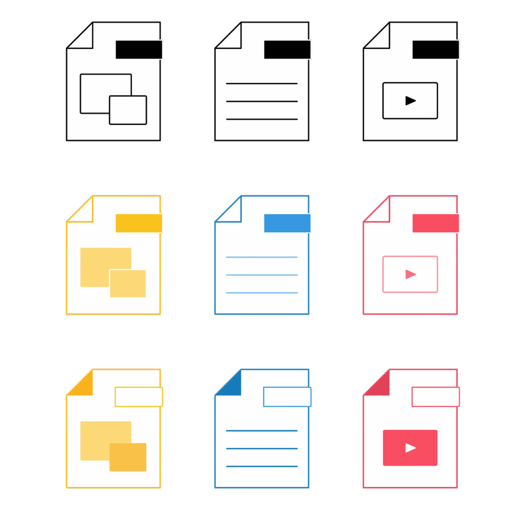
When you’re happy with your logo, download all available file formats. You’ll need different versions for different purposes:
- Vector files (SVG, EPS, PDF): These scale infinitely without losing quality. Use them for printing on anything—business cards, banners, vehicle wraps, merchandise.
- PNG files with transparent backgrounds: Perfect for websites and digital applications where you need the logo without a background box.
- JPG files: Good for email signatures and some web uses, though PNG is usually better for logos.
- Different color versions: Get full-color, black, white, and grayscale versions.
Organize these files in a folder with clear names like “MyBrand-Logo-FullColor.svg” or “MyBrand-Logo-Black.png.” This organization saves you headaches later when you need a specific version quickly.
Essential Logo Design Principles You Need to Know
Even when AI does the heavy lifting, understanding basic design principles helps you make better choices. These principles separate mediocre logos from memorable ones.
Keep It Simple and Clear
The best logos are ridiculously simple. Nike’s swoosh is just a curved line. Apple’s logo is an apple with a bite. McDonald’s golden arches are two curves. Simple doesn’t mean boring—it means clear and memorable.
According to design research, people remember simple designs far better than complex ones. Your brain can process and store simple shapes quickly. Complex logos with many details get forgotten because they’re too hard to recall.
When reviewing your AI-generated logos, ask if you could draw it from memory after seeing it once. If not, it’s probably too complex. Simplify by removing decorative elements that don’t serve a purpose. Every part of your logo should earn its place.
Make It Scalable and Versatile
Your logo needs to work at every size, from a tiny website favicon to a giant billboard. It needs to look good in full color, single color, and black and white. It needs to work on light backgrounds, dark backgrounds, and busy photographs.
This versatility requires smart design choices. Avoid thin lines that disappear when scaled down. Don’t rely on subtle details that vanish in small sizes. Skip intricate patterns that turn into muddy blobs when reduced. Test your logo by shrinking it to thumbnail size—if you can’t tell what it is, simplify it.
Choose Colors with Purpose
Colors aren’t just decoration—they communicate meaning and emotion. Different colors trigger different psychological responses. Color psychology studies show how much impact color has on brand perception.
Here’s what common logo colors communicate:
- Blue: Trust, professionalism, calm, stability (used by banks, tech companies, healthcare)
- Red: Energy, passion, urgency, excitement (used by food brands, entertainment, sales)
- Green: Growth, health, nature, money (used by environmental brands, organic products, financial services)
- Yellow: Optimism, friendliness, warmth, caution (used by children’s products, food, creative services)
- Purple: Luxury, creativity, wisdom, spirituality (used by beauty brands, premium products)
- Orange: Enthusiasm, confidence, fun, affordability (used by entertainment, food, tech)
- Black: Sophistication, power, elegance, premium (used by luxury brands, fashion)
- White: Purity, simplicity, cleanliness, modern (used by tech, healthcare, minimalist brands)
Choose colors that align with your brand message. A law firm probably shouldn’t use hot pink, and a children’s toy company probably shouldn’t use corporate gray. Match your colors to your industry expectations while finding ways to stand out.
Limit your palette to 2-3 colors maximum. More colors create visual chaos and make your logo harder to reproduce. Many iconic logos use just one color—think of Coca-Cola’s red or John Deere’s green.
Select Typography That Matches Your Brand
If your logo includes text, the font choice matters enormously. Fonts have personalities just like colors do. A playful rounded font sends a completely different message than a stern, angular font.
Font categories and what they communicate:
- Serif fonts: Traditional, trustworthy, established, authoritative (think newspapers, law firms, universities)
- Sans-serif fonts: Modern, clean, approachable, simple (think tech companies, contemporary brands)
- Script fonts: Elegant, personal, creative, refined (think weddings, beauty, crafts)
- Display fonts: Unique, attention-grabbing, specific personality (used sparingly for distinct brands)
Avoid using more than two different fonts in your logo. Multiple fonts create visual confusion. Usually, one font is plenty. If you use two, make them distinctly different—like pairing a bold sans-serif with an elegant script. Never use two similar fonts that almost match but not quite.
Make It Relevant to Your Brand
Your logo should give people hints about what you do or what you stand for. This doesn’t mean literal representation—Apple doesn’t sell apples, and Nike doesn’t sell swooshes. But the design should feel appropriate for your industry and values.
A funeral home with a cartoonish, bouncy logo would feel wrong. A children’s daycare with a serious, stark logo would seem cold. Consider what emotions and associations your target audience expects in your field, then deliver a logo that meets those expectations while adding your unique twist.
Aim for Timeless Rather Than Trendy
Design trends come and go faster than ever. What looks cutting-edge today might look dated next year. Branding experts consistently warn about chasing trends at the expense of longevity.
Trends to be cautious about:
- Overly complex gradients
- Extreme geometric shapes
- Ultra-thin lines
- Overly trendy color combinations
- Font styles that are currently “hot”
Instead, focus on classic design principles. Look at logos that have survived decades—they usually rely on simple shapes, clear typography, and straightforward color schemes. This doesn’t mean your logo should look old-fashioned. It means it should look good now and still look good in ten years.

Common Logo Design Mistakes and How to Avoid Them
Even with AI assistance, you can still make mistakes that weaken your logo. Let’s tackle the most common problems so you can sidestep them.
Making Your Logo Too Complicated
This mistake tops every list of logo design failures. Beginners often think more elements make a logo look more professional. The opposite is true. Every extra element makes your logo harder to remember and reproduce.
Signs your logo is too complicated:
- It has more than three colors
- It includes multiple symbols or icons
- The text is hard to read
- You can’t describe it in one simple sentence
- It becomes a blob when shrunk down
How to fix it: Remove elements one by one until your logo feels clean. Ask yourself what each part contributes. If removing something doesn’t hurt the overall design, leave it out. Remember that design research shows people remember simple logos significantly better than complex ones.
Using Too Many Fonts
Multiple fonts rarely work well together. Using three or more fonts in a logo creates visual chaos. Even two fonts can clash if they’re too similar or too different.
How to fix it: Stick to one font, or maximum two if you absolutely need variety. If using two fonts, make them distinctly different—for example, a bold geometric sans-serif for your business name and a simple serif for your tagline. Never use two fonts from the same category that almost match.
Ignoring How Your Logo Looks in Black and White
Color makes logos pretty, but you can’t always use color. What happens when your logo gets photocopied? Faxed? Embroidered? Printed on a single-color receipt? If your logo only works in color, you’re limiting how you can use it.
How to fix it: Test your logo in black and white early in the design process. Many designers create the black and white version first, then add color. This ensures the core design is strong regardless of color. Your logo shape and composition should work perfectly even without any color at all.
Forgetting About Scalability
A logo that looks amazing on your computer screen might fall apart on a business card or become muddy on a billboard. Thin lines disappear. Small details blur. Intricate patterns turn into mush.
How to fix it: View your logo at thumbnail size (like 50 x 50 pixels). Can you still recognize it? Can you still read the text? If not, simplify the design. Remove fine details, thicken thin lines, and increase spacing between elements. Your logo should be clear and identifiable even when it’s the size of a postage stamp.
Choosing Inappropriate Colors
Colors that clash hurt viewers’ eyes. Colors that don’t match your industry confuse potential customers. Colors with poor contrast make text impossible to read.
How to fix it: Use color harmony principles. Pick colors that work well together—complementary colors (opposite on the color wheel), analogous colors (next to each other), or monochromatic schemes (different shades of one color). Always ensure text is readable against background colors by testing contrast.
Following Trends Too Closely
Remember those 3D chrome logos from the 2000s? Or the gradient mess of the 1990s? They looked modern at the time and dated now. Chasing the latest design trend means your logo will need redesigning soon.
How to fix it: Use trends for inspiration, not as the foundation. If gradients are hot right now, maybe incorporate a subtle gradient element, but don’t make it the star of your logo. Focus on timeless elements—simple shapes, readable fonts, appropriate colors—that will still work decades from now.
Making Your Logo Too Generic
Using overused symbols or clip art makes your logo forgettable. If a hundred businesses in your city use the same generic icon, you blend into the background instead of standing out.
How to fix it: Research your competitors’ logos before finalizing yours. If everyone uses a certain symbol, find a different visual approach. Add unique elements that reflect your specific brand personality. Even if you use a common symbol, stylize it in an original way. Our icon generator can help you create custom symbols that set you apart.
Neglecting Different Logo Variations
Thinking one logo version works everywhere is a rookie mistake. You need different versions for different situations—a full logo with text for your website header, an icon-only version for your social media profile, a horizontal layout for email signatures, and a stacked version for square spaces.
How to fix it: Create multiple logo variations from the start. Most AI tools provide these automatically. Make sure you have horizontal, vertical, icon-only, and text-only versions. This flexibility ensures your logo always looks professional regardless of where it appears.
Using Low-Quality Files
Downloading only JPG or PNG files limits what you can do with your logo. These raster formats lose quality when scaled up. You need vector files that maintain crisp edges at any size.
How to fix it: Always get vector files (SVG, EPS, or AI format) along with standard image files. Vector files let you scale your logo to any size without quality loss. They’re essential for printing on large formats like banners or vehicle wraps. Most quality AI logo tools include vectors in their download packages.
How to Customize Your AI-Generated Logo Like a Pro
AI gives you a strong starting point, but the magic happens in customization. Here’s how to take an AI logo from good to great.
Adjust Spacing and Alignment
Small spacing adjustments make huge differences in how professional your logo looks. Pay attention to the space between letters (kerning), the space between words, and the space between your icon and text.
Elements should feel balanced—not too cramped, not too spread out. If your logo includes an icon and text, experiment with different spacing between them. Sometimes moving elements closer creates better unity. Other times, adding breathing room improves clarity.
Everything should align properly. If you have text on multiple lines, make sure they line up correctly. Center alignment works for formal, traditional brands. Left alignment feels modern and dynamic. Right alignment rarely works for logos.
Play with Icon Positioning
If your logo combines an icon with text, try different arrangements. Common placements include:
- Icon on left, text on right: This horizontal layout works great for website headers and letterheads
- Icon above, text below: This stacked version fits well in square spaces like social media profiles
- Icon integrated into text: This approach creates unique, memorable designs but requires more skill
- Icon as a letter replacement: Using the icon instead of a letter can be clever but avoid making it hard to read
Try each arrangement and see which feels most balanced and professional. You might create multiple versions for different uses—horizontal for your website, stacked for Instagram, icon-only for your favicon.
Fine-Tune Your Color Palette
The AI might suggest good colors, but you can refine them. Look at the exact shades—is that blue too bright? Too dark? Too washed out? Small adjustments create big improvements.
Use color tools to explore variations. If you like a blue but it feels off, try shifting it slightly toward teal or purple. If a red seems aggressive, softening it to burgundy might work better. Many art generators let you input specific hex codes for precise color control.
Consider creating a primary logo in full color and alternate versions in brand-friendly single colors. Having options gives you flexibility for different applications.
Experiment with Different Font Weights
Most fonts come in multiple weights—light, regular, medium, bold, extra bold. Changing the weight can dramatically shift your logo’s personality. A light weight feels delicate and modern. A bold weight feels strong and confident.
Sometimes combining different weights works well—your business name in bold with a tagline in light. This contrast creates hierarchy and visual interest. Just make sure everything remains readable.
Add Subtle Design Elements
Small touches can elevate a basic logo into something special. Consider adding:
- A simple line or shape that frames your logo
- Negative space tricks that create hidden meanings
- Slight geometric patterns that add texture without complexity
- A tagline that clarifies what you do
The key word here is “subtle.” These elements should enhance, not overwhelm. Less is almost always more in logo design.
Logo File Formats and When to Use Them
Having the right file format for each situation prevents frustration and ensures quality. Here’s what you need to know about different logo file types.
Vector Formats: Your Scalability Heroes
SVG (Scalable Vector Graphics): This format works perfectly for websites and modern applications. It scales infinitely without quality loss and has small file sizes. Use SVG files on your website, in digital documents, and anywhere you need flexibility. Most web designers love this format because it looks crisp on any screen resolution.
EPS (Encapsulated PostScript): Professional printers often request EPS files. This vector format works with professional design software like Adobe Illustrator. If you’re printing business cards, brochures, or any marketing materials, provide your printer with an EPS file.
AI (Adobe Illustrator): If you or your designer use Adobe Illustrator, AI files give maximum editing flexibility. However, many people don’t have Illustrator, so this format works mainly for professional design workflows.
PDF (Portable Document Format): PDFs can contain vector data and work across all platforms. They’re great for sending to printers or including in presentations. Most people can open PDFs, making them convenient for sharing.
Raster Formats: Your Everyday Workhorses
PNG (Portable Network Graphics): This is your go-to format for digital use. PNG files support transparent backgrounds, which means your logo can sit on any colored background without an ugly white box around it. Use PNG files on your website, in email signatures, on social media, and in presentations. Always get PNG files with transparent backgrounds.
JPG/JPEG (Joint Photographic Experts Group): JPG files create smaller file sizes but don’t support transparency. They work for some web uses and can be emailed easily. However, PNG is usually a better choice for logos. JPG works best when you need the smallest possible file size and don’t need transparency.
GIF (Graphics Interchange Format): GIF files support transparency and animation. You might use a GIF if you want an animated version of your logo for digital applications. However, for static logos, PNG is better quality.
What to Use When
Here’s a quick reference guide:
- Website header or footer: PNG with transparent background or SVG
- Social media profile picture: PNG with transparent background
- Social media posts: PNG or JPG
- Email signature: PNG with transparent background, small size (under 100KB)
- Business cards: Vector format (EPS or PDF)
- Large format printing (banners, signs): Vector format (EPS or PDF)
- T-shirts and merchandise: Vector format (EPS) or high-resolution PNG
- Documents and presentations: PNG with transparent background or PDF
- Favicon (browser tab icon): ICO format or PNG, 16×16 or 32×32 pixels
Download all available formats when you get your logo. Store them in an organized folder so you can quickly grab the right file when needed.
How to Implement Your Logo Across All Brand Materials
Creating your logo is just the beginning. Now you need to use it consistently everywhere your brand appears.
Create a Brand Style Guide
A style guide documents exactly how to use your logo. This consistency prevents your brand from looking messy. Your style guide should include:
- Your logo in all its variations (full color, black, white, different layouts)
- Minimum size requirements for each version
- Clear space rules—how much empty space should surround your logo
- Correct color codes (hex codes for web, RGB for screens, CMYK for print)
- Approved backgrounds—what colors or images work behind your logo
- Things NOT to do—don’t stretch, rotate, outline, or modify the logo
Even if you’re a one-person business, a style guide keeps your branding consistent. As you grow and hire people, it ensures everyone uses your logo correctly.
Update Your Digital Presence Immediately
Start implementing your new logo across all your digital touchpoints:
Website: Update your header, footer, and favicon. If you have a mobile app, update the app icon too. Make sure your logo appears consistently on every page.
Social Media: Change profile pictures on all platforms—Facebook, Instagram, Twitter/X, LinkedIn, TikTok, YouTube, Pinterest. Update cover photos or banners where your logo can be featured. Some platforms like Instagram and TikTok require square profile pictures, so use your icon-only version if needed.
Email: Add your logo to your email signature. Keep the file size small (under 50KB) so emails load quickly. Many email marketing platforms also let you add your logo to newsletters and automated emails.
Business listings: Update your logo on Google Business Profile, Yelp, industry directories, and any other places your business is listed online.
Print Your Logo on Physical Materials
Your logo should appear on tangible brand materials too:
- Business cards: Feature your logo prominently, usually in a corner or at the top
- Letterhead: Add your logo to official documents and correspondence
- Packaging: If you ship products, include your logo on boxes, bags, and labels
- Receipts: Many receipt printers can include logos
- Signage: Add your logo to storefront signs, window decals, and interior displays
- Merchandise: Print your logo on employee uniforms, promotional items, or products
For physical printing, always provide vector files to your printer. Ask for a proof before they print the full run to ensure colors and sizing look correct.
Maintain Consistency
The key to strong branding is consistency. Your logo should look the same everywhere it appears. This doesn’t mean everything must be identical, but your logo itself shouldn’t change.
Don’t be tempted to modify your logo for different purposes. Don’t stretch it, add effects, or use off-brand colors. If you need variation, use the alternate versions you created—but keep each version unchanged from its original design.
Consistency builds recognition. When people see your logo in the same form repeatedly, they start recognizing it instantly. This recognition becomes valuable brand equity over time.
Frequently Asked Questions
How much does it cost to design a logo with AI?
AI logo design costs range from completely free to around $200. Free options usually limit file formats or resolution. Paid options typically cost $20-$100 and include high-resolution files, multiple formats, and full commercial rights. This is significantly cheaper than hiring a professional designer, which usually costs $300-$3,000 or more.
Can I use an AI-generated logo for commercial purposes?
Most AI logo generators grant you full commercial rights to logos you create and download, but always check the specific terms of the tool you’re using. Premium plans typically include complete ownership and unlimited usage rights. Make sure to read the licensing terms before using your logo commercially to avoid any legal issues.
How long does it take to create a logo with AI?
The actual generation process takes just minutes. You can have hundreds of logo options in under five minutes. However, the full process—including thinking about your brand, generating options, customizing your favorite, getting feedback, and finalizing—typically takes a few hours to a couple of days. This is still dramatically faster than traditional design, which often takes weeks or months.
Do I need design skills to use AI logo makers?
No design experience is necessary. AI logo tools are specifically built for people without design backgrounds. They use simple interfaces with guided questions. You just need to know basic things about your business—your name, industry, and style preferences. The AI handles all the technical design work.
What if I don’t like any of the AI-generated logos?
Try adjusting your input preferences. Change the style selections, try different color combinations, or modify your icon choices. Most tools let you regenerate unlimited options until you find something you like. If you’re completely stuck, consider using the AI designs as inspiration and having a designer refine your favorite option—this hybrid approach costs less than starting from scratch.
Can I edit my logo later if I want to make changes?
This depends on the tool and plan you purchase. Some tools offer unlimited revisions for a monthly subscription. Others provide a one-time purchase with your files, and changes require buying again. Check this before purchasing. Having editable vector files means you or a designer can make adjustments anytime using professional design software.
Should I include a tagline in my logo?
Taglines work well if yours is short, memorable, and helps clarify what you do. Keep it under 5 words if possible. However, many strong logos don’t include taglines. You can always use your tagline on marketing materials without building it into your actual logo. This gives you flexibility—you can change your tagline without redesigning your entire logo.
How do I know if my logo is good enough?
Test these criteria: Can people recognize it quickly? Does it work at small and large sizes? Does it communicate something about your brand? Is it simple enough to remember? Does it look professional? Would you be proud to put it on a business card? If you answer yes to all these questions, your logo is probably solid.
What’s the difference between a logo and a brand identity?
Your logo is one element of your brand identity. Brand identity includes your logo plus colors, fonts, imagery style, tone of voice, and overall visual system. Your logo is the centerpiece, but comprehensive brand identity covers all visual and messaging elements that represent your business. Many AI tools help with broader brand identity, not just logos.
Can I trademark my AI-generated logo?
Yes, you can typically trademark an AI-generated logo once you own the rights to it. However, trademark law is complex and varies by location. Consult with a trademark attorney before filing. Make sure your logo is unique enough to qualify for trademark protection—overly generic designs may not be eligible. Also search existing trademarks to ensure you’re not infringing on someone else’s mark.
Key Takeaways
Creating a professional logo with AI is faster, cheaper, and easier than ever before. Here’s what you need to remember:
- Start by defining your brand identity before touching any design tools. Understanding your values, audience, and personality guides better design choices.
- Choose an AI logo maker that offers customization flexibility, multiple file formats, and fits your budget. AI FREE FOREVER provides professional results without the professional price tag.
- Follow the step-by-step process: define your brand, research your industry, generate options with AI, narrow your favorites, customize thoroughly, test everywhere, get feedback, and download all necessary files.
- Apply essential design principles: keep it simple, make it scalable, choose purposeful colors, select appropriate typography, ensure relevance to your brand, and aim for timelessness over trendiness.
- Avoid common mistakes like overcomplication, too many fonts, ignoring black and white versions, forgetting scalability, inappropriate colors, following trends blindly, generic symbols, missing logo variations, and low-quality files.
- Customize your AI logo by adjusting spacing and alignment, experimenting with icon positioning, fine-tuning colors, trying different font weights, and adding subtle design elements.
- Get both vector formats (SVG, EPS) and raster formats (PNG with transparency, JPG) so your logo works in every situation—digital, print, large, and small.
- Implement your logo consistently across all brand materials—website, social media, email, business cards, packaging, and physical locations. Create a simple brand style guide to maintain consistency.
- Test your logo at different sizes and in different contexts before finalizing. Make sure it works in color, black and white, on light backgrounds, and on dark backgrounds.
- AI handles the technical complexity of design, but your input about brand personality and preferences makes the logo uniquely yours. The best logos combine AI efficiency with human creativity and refinement.
With these tools and knowledge, you’re ready to create a logo that represents your brand professionally and memorably. Your perfect logo is just minutes away—start designing today with AI FREE FOREVER’s logo generator and give your brand the visual identity it deserves. Remember, your logo is more than just a pretty picture—it’s the face of your business, the first impression you make, and a powerful tool for building recognition and trust. Make it count.