
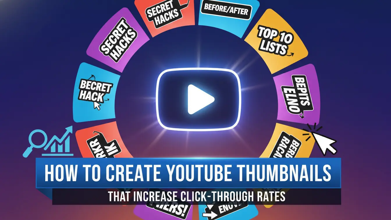
Your thumbnail determines whether people click your video or scroll past it. A custom thumbnail can boost your clicks by 60-70% compared to auto-generated screenshots, according to studies from vidIQ.
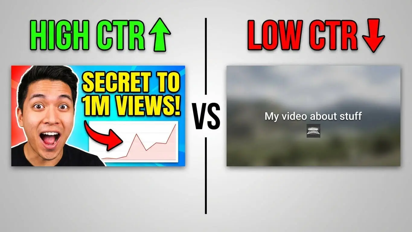
Click-through rate, or CTR, measures how many people click when they see your video. If 100 people see your thumbnail and 2 click, that is a 2% CTR. Good channels get 4-6% CTR. The best get 8-10% or more. Research from BuzzVoice confirms these numbers.
Your thumbnail shows up in three main spots. These are search results, suggested videos, and the homepage feed. Better thumbnails mean more clicks. More clicks tell YouTube to push your video more. This creates a cycle that helps you grow.
Most people watch YouTube on their phones now. Loomly reports that 70% of views happen on phones. On phones, thumbnails show up tiny. Text that looks clear on your laptop becomes blurry on a 6-inch screen. This fact changes every design choice you make. This guide gives you exact steps to create thumbnails that grab attention, match your content, and get more clicks. There is no fluff and no theory without real use.
Youtube Thumbnail Size and Format
YouTube accepts three file types. These are JPG, PNG, and static GIF. Your file must stay under 2MB. If it is bigger than that, the upload fails.
The platform recommends 1920×1080 pixels at a 16:9 ratio. Some older guides suggest 1280×720, but that is outdated. According to Loomly, smart TV viewing jumped to 18% of total watch time. Those screens make small thumbnails look fuzzy.
Here is what happens with the wrong dimensions:
- Stretched images that look distorted
- Pixelated text that cannot be read
- Cropped faces that cut off at weird angles
- Black bars on the sides
Set your design canvas to 1920×1080 at 72 DPI. Do this from the start. This prevents quality loss and scaling issues later. Export as PNG for sharp text and graphics. Or use JPG if you need smaller file sizes for photos.
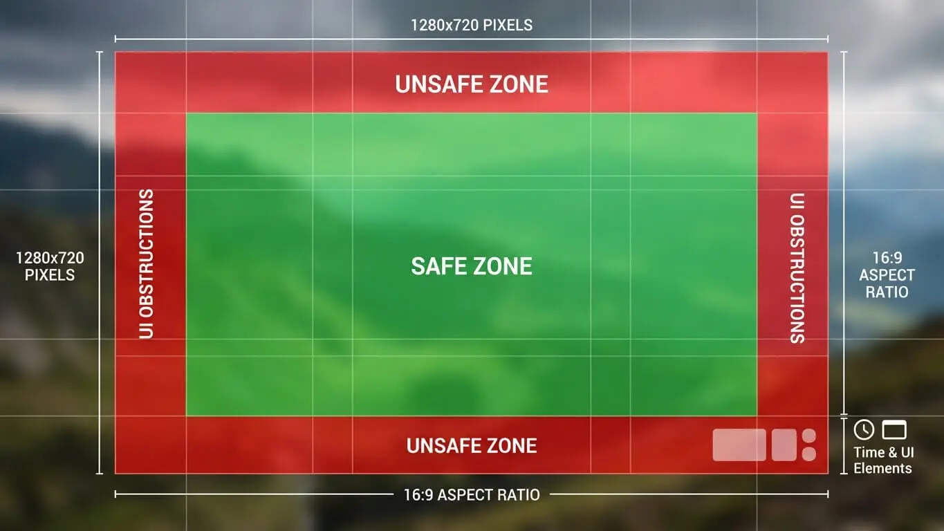
YouTube shows thumbnails at different sizes across devices. Desktop search shows them around 320×180 pixels. Mobile feed shows them closer to 168×94. Your design must work at both sizes.
The “safe zone” concept matters here. Keep critical elements like faces and text within the center 90% of your canvas. This protects against cropping when thumbnails appear in different formats.
Effective Youtube thumbnail Colors
Bright colors grab eyes faster than dull ones. Analysis from 1of10 reveals specific color combinations that consistently outperform others.
Red triggers urgency and speeds up decision-making. It pumps energy into your thumbnail but can feel aggressive if overused. Orange mixes red’s energy with yellow’s friendliness. This creates enthusiasm without aggression.
Yellow stands out even on small screens. The human eye processes yellow faster than other colors. Pair it with black or dark blue for maximum contrast. This combo works for education, entertainment, and how-to content.
| Color Combo | Effect | Best For |
|---|---|---|
| Yellow & Red | High energy, immediate attention | Entertainment, gaming, reaction videos |
| Blue & Orange | Trust meets excitement | Tech reviews, tutorials, product demos |
| Black & Yellow | Bold clarity, easy to read | Music, vlogs, lifestyle |
| Purple & Yellow | Creative energy | Art, design, educational content |
| Green & White | Fresh, clean, trustworthy | Health, finance, productivity |
Blue builds trust and calm. It works for tech content, business topics, and educational videos where authority matters. Research from Flintzy shows blue increases impulse clicks because viewers see the content as reliable.
Complementary colors sit opposite each other on the color wheel. These are blue and orange, red and green, purple and yellow. These pairings create natural tension that pulls the eye in. But stick to two or three colors maximum. More than that creates visual noise.
Your background color sets the foundation. Dark backgrounds make bright text pop. Light backgrounds need bold, dark text for readability. Test your thumbnail at phone size before finalizing. If you cannot read it instantly, neither can viewers.
When and How to Add Text to Youtube thumbnails
Text overlay can boost CTR by 20-30% when done right. The key word is “when.” Not every thumbnail needs text. Bad text hurts more than it helps.
Keep text between 3-6 words maximum. Your video title already gives context. The thumbnail text should spark curiosity or highlight a specific benefit. It should not repeat the title.
Examples of effective thumbnail text:
- “This Changed Everything”
- “Why I Quit”
- “$10K in 30 Days”
- “Never Do This”
- Number + Outcome: “7 Hidden Features”
Font size matters more than font choice. At minimum, use 60-point font for desktop visibility. Mobile viewers need even larger. Test by shrinking your design to 150 pixels wide. If you cannot read it comfortably, neither can anyone else.
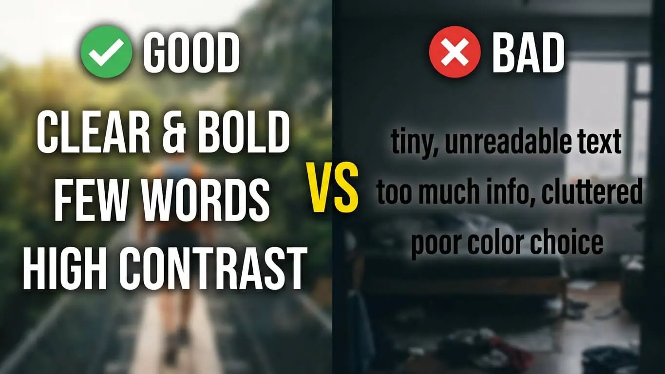
Sans-serif fonts read better at small sizes. Impact, Bebas Neue, Montserrat, and Oswald dominate YouTube thumbnails because they stay legible when compressed. Avoid thin fonts, script fonts, or anything with fine details that disappear at phone size.
Contrast makes or breaks text readability. Use these proven combinations:
- White text with black stroke on any background
- Yellow text with black stroke on dark backgrounds
- Black text on bright yellow or white backgrounds
- Bold colors with complementary colored strokes
The text stroke (outline) creates separation from busy backgrounds. Set your stroke to 10-15% of your font size. A 100-point font needs a 10-15 point stroke.
Position text in the top third or bottom third of your thumbnail. The center often conflicts with faces or main visuals. Leave breathing room around text. Make it at least 10% of the canvas edge to prevent cutting off on different devices.
Face Psychology and Emotion Triggers on Youtube thumbnails
Human brains process faces 60,000 times faster than text. Data from NearStream confirms that thumbnails with faces showing strong emotion increase CTR by 20-30%.
Close-up shots work better than full-body shots. Crop tight on the face. Show eyes, nose, and mouth clearly. The eyes need to be visible and in focus. They create connection with viewers.
Exaggerated expressions outperform subtle ones. Shock, surprise, excitement, and confusion grab attention in a sea of neutral faces. Think about the difference between a mild smile and an open-mouth “wow” face. The second one stops scrolls.
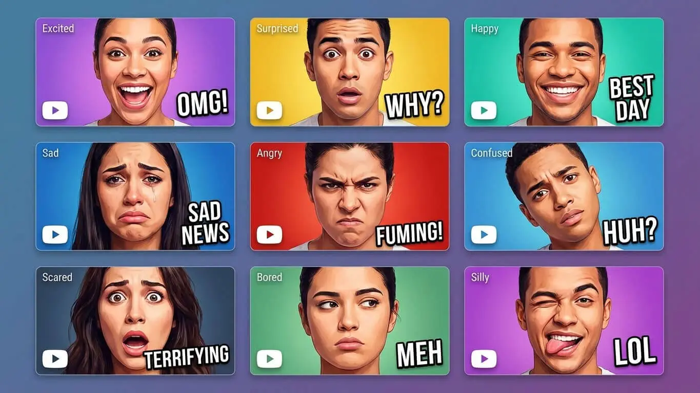
Eye contact matters. Looking directly at the camera creates engagement. Looking at an object or text in the thumbnail guides the viewer’s attention to that element. Both techniques work but serve different purposes.
Lighting makes faces pop. Side lighting creates depth and drama. Soft front lighting works for beauty and lifestyle content. Harsh top-down lighting looks amateur and creates unflattering shadows. Natural window light or a ring light solves most lighting problems.
Color grading on faces can enhance emotion. Warmer tones (orange/red tints) create energy. Cooler tones (blue tints) suggest calm or mystery. Saturation boost makes faces more vibrant. But push it too far and skin looks fake.
Youtube thumbnail Design Tools
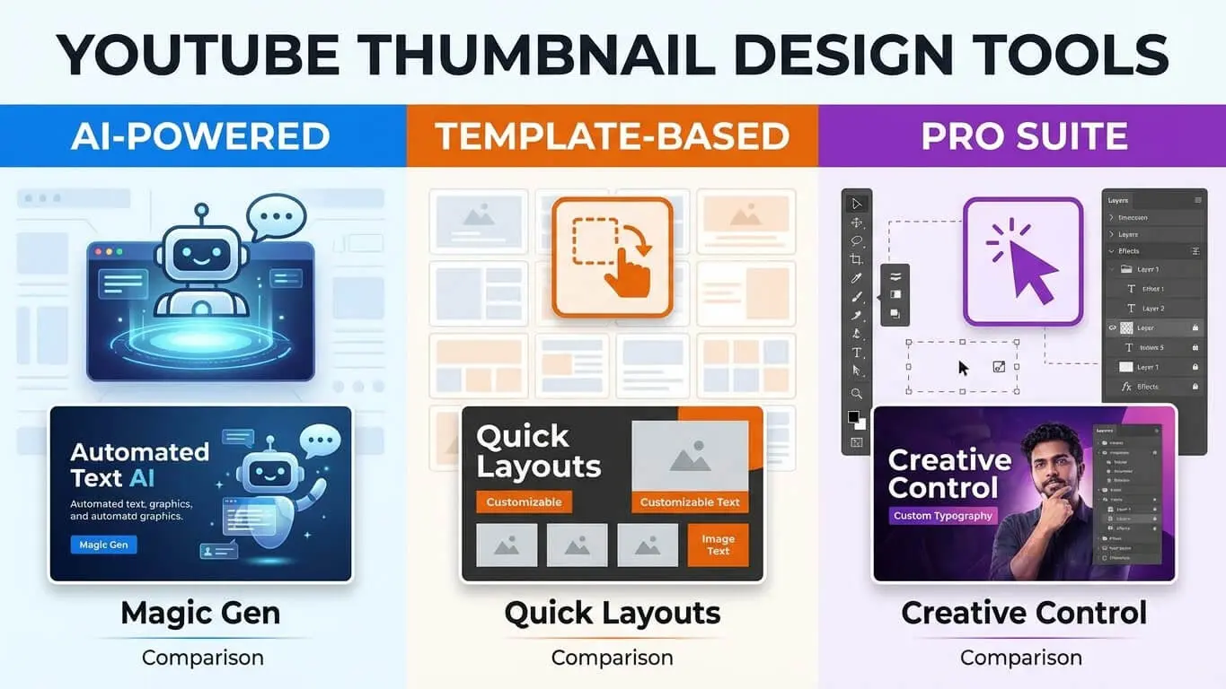
Free tools can create professional thumbnails if you know which ones to use. YouTube Thumbnail Ideas Generator helps you brainstorm concepts and layouts that match your video content. You can do this without spending hours stuck on a blank canvas.
Canva leads for beginners and intermediate creators. The free version includes hundreds of YouTube-specific templates at the correct size. The drag-and-drop interface lets you swap elements quickly. Canva Pro adds background removal, brand kit features, and Smart Resize for $13 monthly.
Adobe Express combines templates with AI tools. The free tier works fine for most creators. Paid subscriptions unlock generative fill. This lets you extend backgrounds or remove objects. Integration with Photoshop gives advanced users more control.
| Tool | Best For | Key Feature | Price |
|---|---|---|---|
| Canva | Beginners, batch creation | Templates and brand kits | Free / $13/month Pro |
| Adobe Express | Polished designs quickly | AI background removal | Free / $10/month Premium |
| Photoshop | Advanced editors | Generative fill, layers | $23/month |
| Snappa | Social media managers | Quick editing, stock photos | Free / $15/month Pro |
| Fotor | AI-assisted layouts | Smart suggestions | Free / $9/month Plus |
Mobile apps work for quick edits on the go. Canva Mobile, Adobe Express mobile, and Pixlr give you solid editing power from your phone. They are backup options, not primary tools. Desktop gives you better precision and screen space for detailed work.
AI thumbnail generators emerged in 2025 as time-savers. Tools like Thumbnail.AI and Designs.ai analyze your video title and suggest layouts. They are starting points, not finished products. You still need to adjust colors, text, and composition to match your brand.
Testing What Clicks
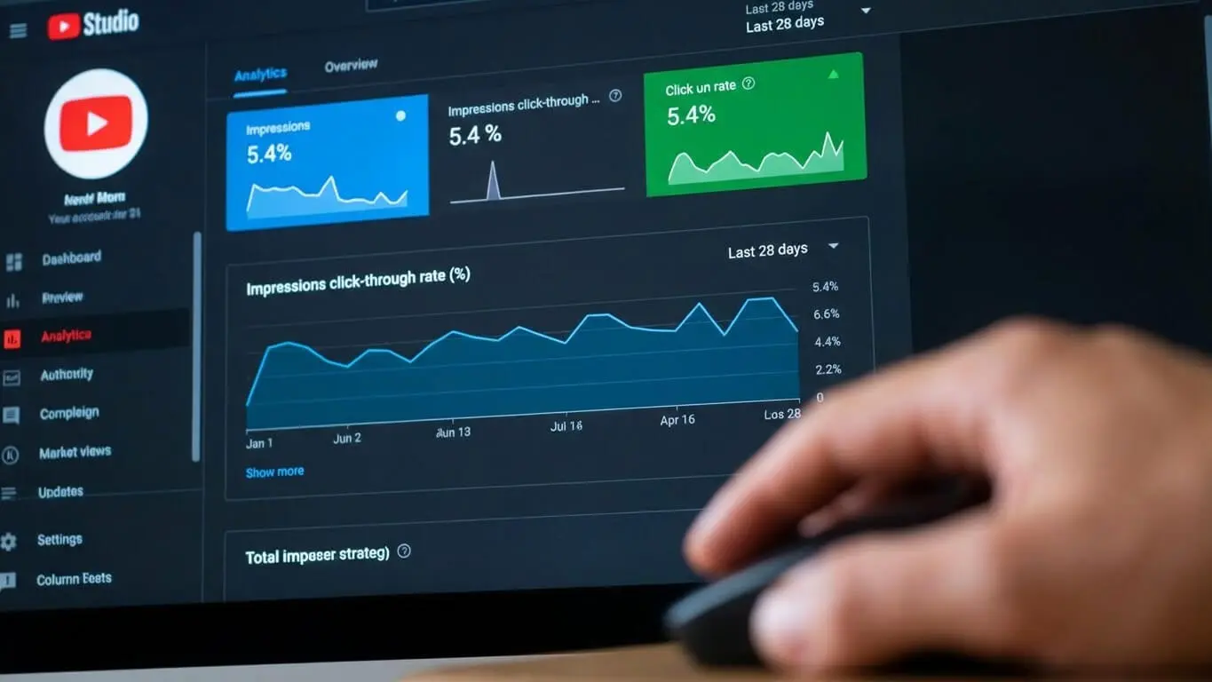
Guessing which thumbnail performs best wastes time. YouTube Studio’s A/B testing feature lets you upload three variations. It automatically shows each to different audience segments. TubeBuddy’s research shows A/B testing can lift views by 20-30%.
Change one element per test. Test text versus no text. Try different color schemes. Compare emotional expressions. Change multiple variables at once and you will not know which change made the difference.
Run tests for at least 7 days or 1,000 impressions, whichever comes first. Shorter tests give unreliable data. Check results in YouTube Studio under Analytics, then Reach, then Impressions Click-Through Rate.
Third-party tools expand your testing options. TubeBuddy Legend and vidIQ Boost offer split-testing across desktop and mobile separately. This reveals device-specific preferences. Maybe mobile viewers prefer simpler designs while desktop users respond to detailed images.
Track these metrics for each thumbnail test:
- Click-through rate (main indicator)
- Average view duration (confirms the thumbnail matches content)
- Traffic source (search, suggested, browse features)
- Device type (mobile, desktop, TV)
Low CTR with high average view duration means your thumbnail is not clickable but your content delivers. Redesign for more impact. High CTR with low average view duration signals clickbait. This means your thumbnail overpromises. Align thumbnail and content better.
Build a swipe file of winning thumbnails. Screenshot thumbnails that perform well. Note common elements: color schemes, text placement, image composition. This library becomes your reference when designing new thumbnails.
Building Visual Identity
Subscribers should recognize your videos before reading the title. Consistent branding makes this happen. Pick 2-3 primary colors and stick with them across all thumbnails.
Create a thumbnail template with set positions for key elements. Put your logo in the bottom right corner. Put text in the top third. Put faces in the left or center. This consistency builds recognition without making every thumbnail look identical.
Font consistency matters as much as color. Choose one or two fonts and use them in all thumbnails. Swapping fonts every video looks unprofessional. It confuses viewers about your brand identity.
Logo placement reinforces brand but should not dominate. Keep logos small. Make them 5-10% of the thumbnail size. Place them in a corner where they will not block important visuals. Some creators use a colored bar across the bottom with their logo and video series indicator.
Series or playlist thumbnails need extra consistency. Use the same background color or pattern. Add series-specific text or icons. Number episodes clearly. This helps viewers find and follow content series.
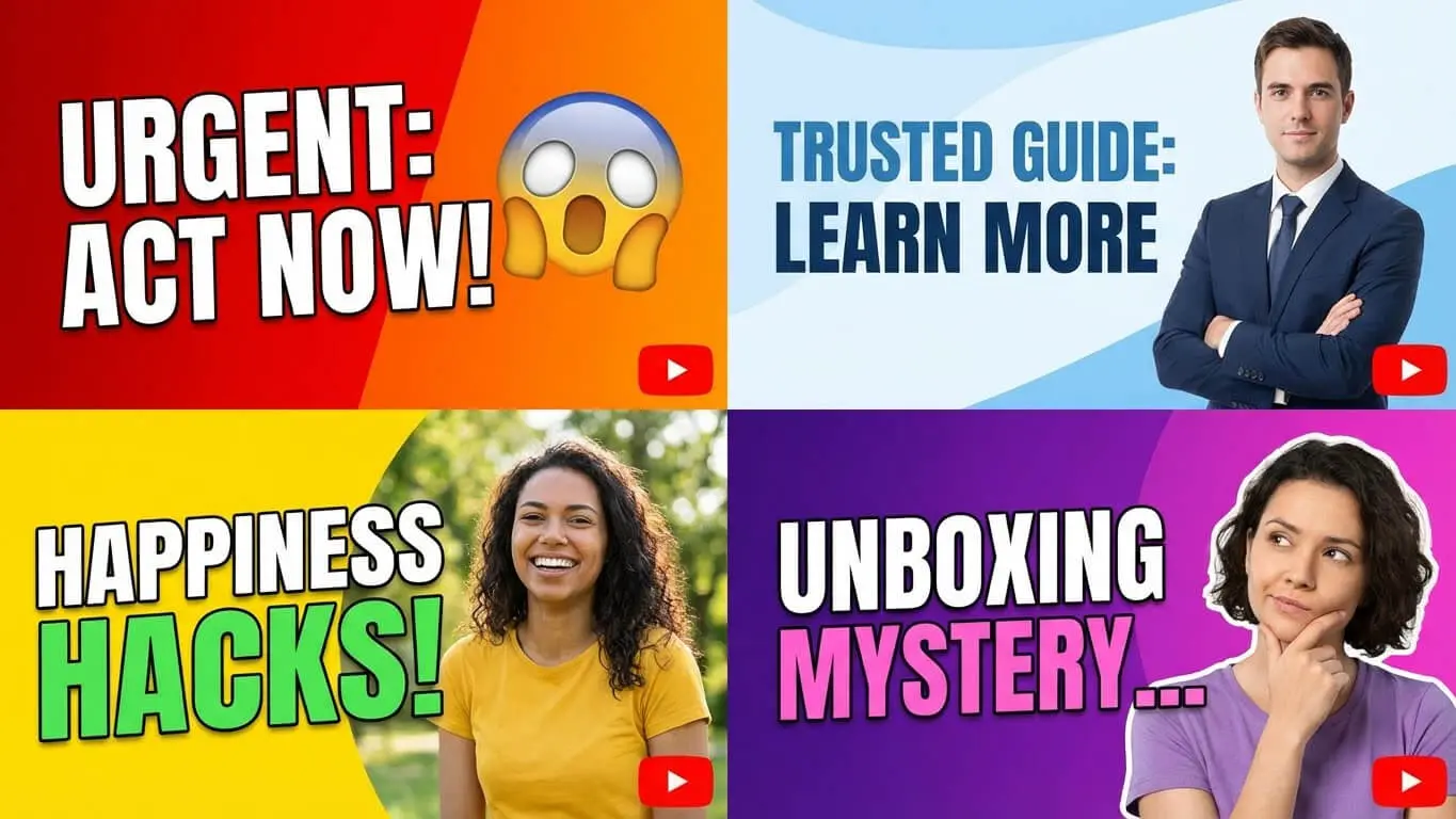
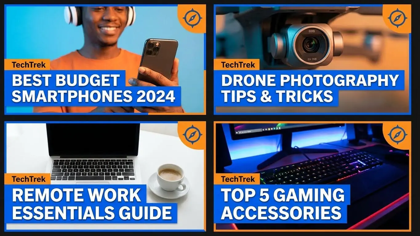
Video thumbnails by content type:
- Tutorials: Clean, instructional look with clear before/after or step indicators
- Reviews: Product front and center with rating or reaction element
- Vlogs: Expressive face, casual vibe, lifestyle feel
- Gaming: Action shot or character with game branding visible
- Commentary: Reaction face with context clue about topic
Seasonal tweaks keep things fresh without losing identity. Add holiday colors or seasonal elements while maintaining your core template structure. This shows you are active and current without confusing loyal viewers.
Don;t mak the following youtube thumbnail mistakes
Clickbait thumbnails hurt your channel long-term. A shocked face next to “You won’t believe this!” gets clicks. But if your video does not deliver, viewers bounce fast. YouTube’s algorithm tracks watch time and audience retention, not just clicks. High CTR with low retention gets your videos buried.
Text overload makes thumbnails unreadable. More than 8 words almost always fails. Viewers cannot process long text in the half-second they glance at your thumbnail. Cut ruthlessly. Every word must earn its spot.
Low-quality images scream amateur. Blurry screenshots, poorly lit faces, and pixelated graphics kill credibility before anyone clicks play. Use 1920×1080 source images minimum. Upscaling low-res images makes them worse, not better.
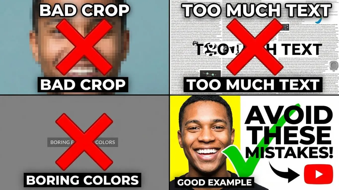
Mistakes that hurt CTR:
- Using auto-generated thumbnails from YouTube
- Repeating your title word-for-word in the thumbnail
- Cluttering the frame with too many elements
- Using colors that blend with YouTube’s interface
- Forgetting to check mobile appearance
- Ignoring safe zones and getting text cut off
- Making thumbnails too similar to competitors
- Adding distracting backgrounds that compete with main subject
Red circles and arrows look desperate unless used sparingly. Every thumbnail in your niche might use them, which means they have lost impact. Find other ways to direct attention: lighting, contrast, composition, eye direction.
Trend-chasing without understanding why trends work leads to awkward results. Mr. Beast thumbnails work because of massive production value and specific audience expectations. Copying his style without his resources often looks cheap. Study what works in your niche specifically.
Ignoring analytics means repeating mistakes. Check your CTR weekly. Sort videos by CTR in YouTube Studio. Your top 10% shows what works. Your bottom 10% shows what to avoid. Update old thumbnails on underperforming videos. This can revive dead content.
FAQ
What is a good CTR for YouTube thumbnails?
Between 4-6% is solid for most channels. Anything above 8% is excellent. New channels often start around 2-3% and improve with testing. VidIQ data shows CTR varies by niche. Education and tutorial content often hits 5-7% while entertainment might range 3-5%. Compare your performance to your own channel history, not just industry averages.
Do I need paid software to create good thumbnails?
No. Canva’s free tier and Adobe Express free version both create professional thumbnails. Paid plans add convenience features like brand kits and background removal. But free tools handle all essential functions. Your design skills and understanding of what works matter more than the software budget.
Should every thumbnail include my face?
Faces increase engagement by 20-30% according to multiple studies. But product reviews, tutorials, and certain educational content work better with object focus. Test both approaches on your channel. Face thumbnails build personal connection. Object-focused thumbnails emphasize the subject matter. Match the approach to your content type and audience preferences.
How often should I update old thumbnails?
Update thumbnails immediately on videos with CTR below 2%. For videos getting steady views, test new thumbnails quarterly. Seasonal content needs thumbnail updates before each relevant season. Major creators often refresh thumbnails on key videos every 3-6 months based on performance data.
Can I use the same thumbnail template for all videos?
Using the same structure with different content works well. Use the same font, colors, and layout. But swap images and text per video. This builds brand recognition while staying fresh. Avoid using literally the same thumbnail image. YouTube may flag this as spam or misleading content.
What’s the biggest thumbnail mistake beginners make?
Trying to include too much information. New creators pack titles, subtitles, multiple images, logos, and graphics into one thumbnail. This creates visual clutter that is impossible to read on mobile. Start with one strong image, minimal text, and high contrast. Add complexity only after mastering simple, clear designs.
Do thumbnails work differently for YouTube Shorts?
Shorts use vertical format and appear differently in feeds. The same design principles apply but composition needs adjustment for 9:16 ratio. Keep critical elements in the center vertical strip. Text needs to be larger since shorts thumbnails appear smaller in mobile feeds. Test shorts-specific designs separately from long-form content.
How long does it take to see CTR improvements from new thumbnails?
YouTube typically needs 24-48 hours to gather enough data for reliable CTR measurement. Run tests for at least 7 days or 1,000 impressions. Some videos take longer to gain traction, especially if they are not getting regular traffic. Check weekly, not daily, to avoid reacting to normal fluctuation.
Should thumbnails match my video’s opening frame?
Not necessarily. Your thumbnail should represent the video’s main value or promise. It should not just mirror the opening shot. Many successful creators use custom graphics or staged shots. These capture the video’s essence better than any actual frame. However, the thumbnail must accurately represent your content. This maintains viewer trust and watch time.
Can I reuse thumbnails across similar videos?
Reusing exact thumbnails confuses viewers and can hurt CTR. This happens because people think they have already watched that video. Create variations using your template. Change colors, text, images, or other elements to differentiate each video. Do this while maintaining brand consistency. Small changes signal ‘new content’ while familiar structure builds recognition.