Instagram carousel posts let you share up to 20 photos or videos in one post. Users swipe through your content like flipping pages in a magazine. This format beats regular posts by a mile carousels get 1.92% engagement while single images only reach 1.38%.
The numbers tell the whole story. Carousels drive more time on posts, which Instagram’s system loves. Users stick around longer, swipe more, and save your stuff for later. That’s what gets your posts shown to more people.
You’re about to learn how carousel posts can turn your Instagram game around. This guide shows you the exact moves that boost engagement, the types of content that work, and the mistakes that tank your results. By the time you finish reading, you’ll know how to craft carousels that make people stop scrolling and start swiping.
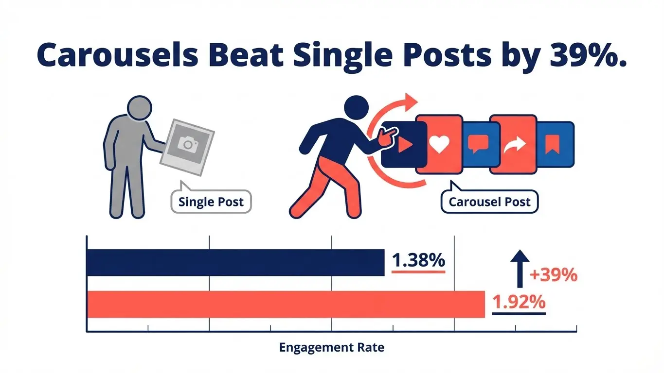
Table of Contents
- What Are Instagram Carousel Posts?
- Why Carousels Crush Single Posts
- 7 Storytelling Formats That Work
- Design Tricks for Better Swipes
- Technical Specs You Must Know
- Hook Them on Slide One
- Make Each Slide Flow
- Mistakes That Kill Engagement
- Tools for Fast Creation
- Frequently Asked Questions
What Are Instagram Carousel Posts?
Carousel posts stack multiple images or videos in one upload. Users see dots at the bottom showing there’s more to see. Each swipe reveals the next slide.
Instagram added carousels back in 2017. Since then, the limit jumped from 10 slides to 20. You can mix photos and videos in the same post. Each video clip runs up to 60 seconds.
The format changed how brands tell stories. Instead of cramming info into one image, you spread it across multiple cards. Each slide builds on the last, pulling users deeper into your message.
How Carousels Differ from Regular Posts
Single-image posts give you one shot. Carousels give you 20. That means 20 chances to hook someone, explain something, or show different angles.
The swipe action makes users active participants. They choose to see more. That decision signals to Instagram that your content matters. The algorithm picks up on this and pushes your post to more feeds.
You write one caption for all slides. Your hashtags apply to the whole post. This keeps things simple while letting you pack in visual variety.

Why Carousels Crush Single Posts
Carousels don’t just beat single posts—they destroy them. Research tracking 10,000 posts found mixed-format carousels hit 2.33% engagement. Video-only carousels reached 1.86%. Image-only carousels got 1.80%. Regular single images? They limped in at 1.38%.
Here’s why carousels win every time:
Time on post matters most. Instagram’s system rewards content that keeps people engaged. When someone swipes through five slides, they spend way more time with your content than glancing at one image. Data shows carousels keep users engaged longer, which tells the algorithm your stuff is worth showing.
More chances to connect. One image gives you one shot to make an impact. Twenty slides give you twenty shots. If slide one doesn’t grab someone, maybe slide three will. If slide three doesn’t land, slide seven might seal the deal.
Save rates skyrocket. People save carousel posts 95% more than single images. Why? Because carousels often contain useful info worth revisiting. A tutorial, a recipe, a product comparison—these are things people want to find again later.
Comments jump up. Carousels spark 24% more comments than other formats. When you present information across multiple slides, people have more to respond to. Each slide can trigger a different reaction.
Shares increase by 18%. Multi-slide posts give people more reasons to share. Maybe one slide resonates with a friend. Maybe the whole sequence tells a story worth passing along. Either way, carousels get shared more often.
What the 2025 Numbers Say
The carousel dominance isn’t slowing down. Despite overall Instagram engagement dropping 28% year over year, carousels still lead the pack. For large accounts over 100k followers, carousels now beat even Reels for impressions.
Brands putting at least 40% of their content into carousels report the strongest growth. That’s not a coincidence. The format works because it matches how people want to consume content—in bite-sized chunks they control.
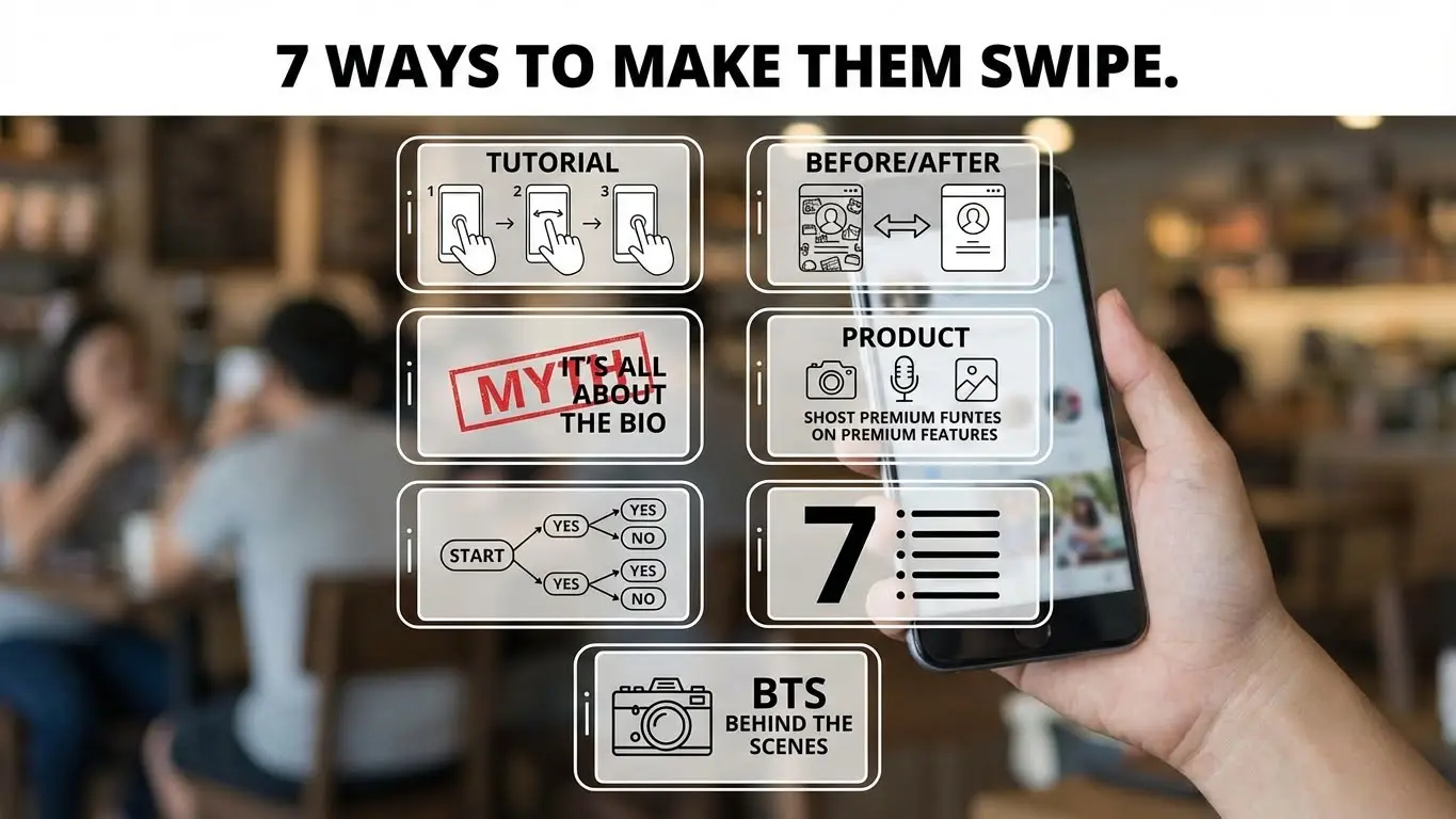
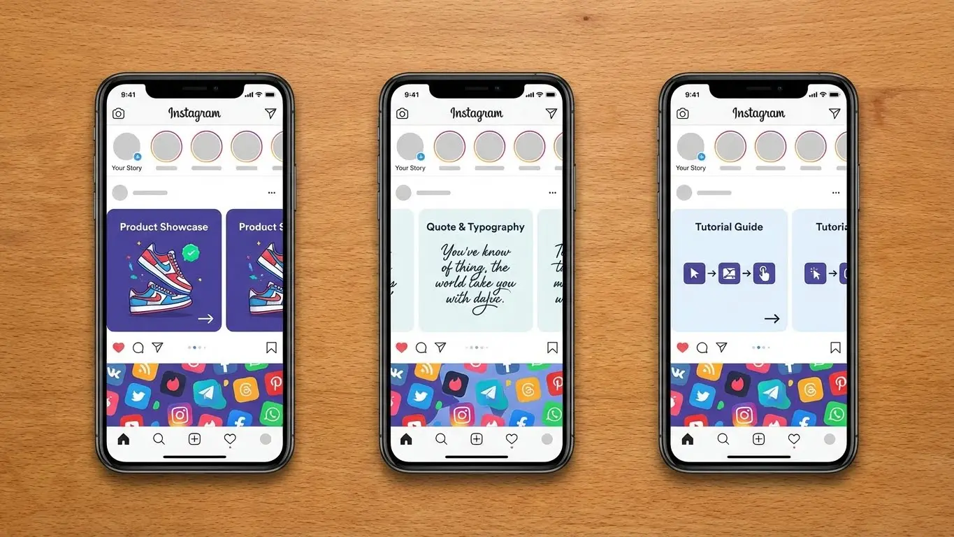
7 Storytelling Formats That Work
1. Step-by-Step Tutorials
Break down any process into clear steps. Slide one shows the finished result. Slides two through seven walk through each step. Slide eight reminds people to tag you when they try it.
Makeup brands crush with this format. Beauty tutorials work perfectly because each slide shows one specific action. No rewinding video. No pausing to read. Just swipe when you’re ready for the next step.
Recipe posts follow the same pattern. Ingredient shot first, then each preparation step gets its own slide. The final slide shows the plated dish. Fitness routines, DIY projects, tech setups—they all work this way.
2. Before and After Transformations
Show the starting point on slide one. Build anticipation with process shots in the middle slides. Hit them with the dramatic reveal at the end.
Home renovation accounts live on this format. Room makeovers spanning 8-10 slides keep people swiping to see the final result. Each slide reveals another improvement.
Weight loss coaches, professional organizers, car detailers—anyone in the transformation business should use this storytelling type. The contrast between beginning and end creates powerful emotional impact.
3. Myth-Busting Series
Start with a common belief. Make it bold: “You need to post every day to grow.” Slide two drops the bomb: “MYTH.” Slides three through five explain the real truth with data backing it up.
This format builds credibility fast. You’re correcting misinformation while positioning yourself as the expert who knows better. The dramatic “myth” reveal keeps people engaged.
Marketing experts debunk posting myths. Finance accounts bust money myths. Health and wellness creators tackle nutrition myths. Pick five myths in your field and you’ve got five high-engagement posts ready to go.
4. Product Feature Breakdowns
Each slide highlights one feature or benefit. Slide one introduces the product. Slides two through six each focus on a specific advantage. Slide seven shows all features together. Slide eight includes the call to action.
Tech products with multiple features need this approach. Software tools with various functions work great here. Even physical products with several uses benefit from breaking down benefits slide by slide.
Don’t list features in boring bullet points. Show each feature in action. Use visuals that demonstrate the benefit, not just describe it.
5. Interactive Flowcharts
Remember those magazine quizzes? “Answer these questions to find your perfect lipstick shade.” That same concept crushes on Instagram.
Slide one poses the question: “Which skincare routine fits you?” Slides two through five present choices based on skin type. Each path leads to a different product recommendation. The final slide shows the matched product with a purchase link.
Clothing brands use this for outfit selection. Coffee shops use it for drink recommendations. Any business with multiple products can guide customers to their best match through an interactive carousel.
6. List Posts with Visual Punch
Lists still work, but only if each item gets its own slide with strong visuals. “7 Ways to Save Time” becomes seven slides, each with a specific tip illustrated clearly.
Don’t just slap text on colored backgrounds. Use photos, graphics, or videos that reinforce each point. If tip three is “Batch your tasks,” show someone organizing their workspace into batches.
Keep each slide focused on one idea. Resist cramming multiple tips onto one slide. The carousel format gives you space to spread out, so use it.
7. Behind-the-Scenes Journey
Take people inside your process. How do you create your product? What happens during your workday? Brands that share their journey build stronger connections with audiences.
A coffee roaster might show bean selection, roasting process, quality testing, packaging, and shipping. Each step gets its own slide with captions explaining the care taken at that stage.
Service businesses can document a typical project from start to finish. Creators can show how content gets made. This transparency makes followers feel like insiders.
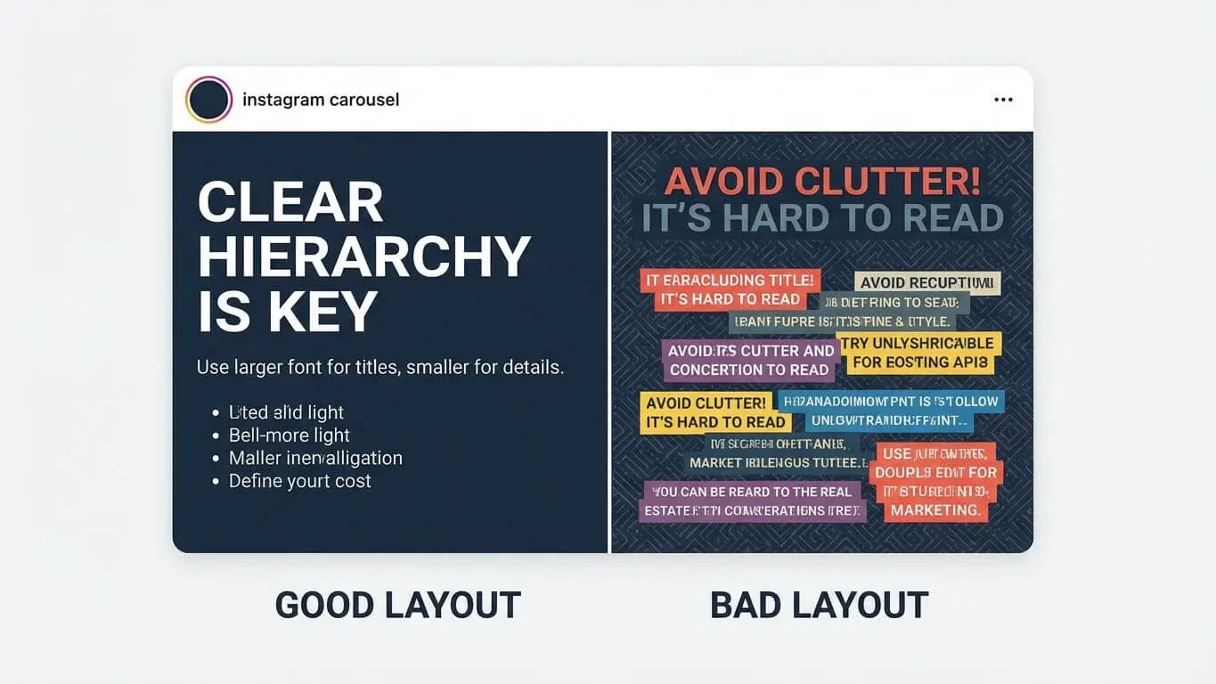
Design Tricks for Better Swipes
Match Your Visual Style Across Slides
Pick fonts, colors, and layouts, then stick with them throughout the carousel. When slides look like they belong together, the story flows better. Random style changes jar people out of the experience.
Choose two or three colors max. Use the same font family. Keep text placement consistent. If slide one has the headline at the top, don’t move it to the bottom on slide three.
Use the 4:5 Aspect Ratio
The 4:5 ratio (1080 x 1350 pixels) takes up more screen space than squares. Larger posts catch more eyes as people scroll. Your content literally occupies more real estate on their screen.
Square posts (1:1) look fine, but they’re smaller. Landscape posts (16:9) get cropped even more. Go vertical with 4:5 for maximum visibility.
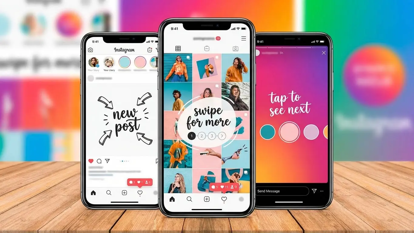
Add Visual Cues for Swiping
Arrows pointing right work. “Swipe for more” text works. Cutting off an image at the edge works. Anything that signals “there’s more here” increases swipe rates.
One brand puts their slide numbers in circles: “1/8” on the first slide. This tells viewers exactly how much content remains. People are more likely to finish when they know what to expect.
Balance Text and Visuals
Too much text kills carousels. Instagram recommends keeping text under 20% of each slide. People can read captions if they want details. Use slides for quick, visual impact.
If you need to explain something complex, break the text across multiple slides. Three slides with three sentences each beats one slide crammed with nine sentences.
Start and End Strong
Slide one needs to stop the scroll. Use bold headlines, striking images, or curiosity-driven questions. First-slide retention sits at 72%—if you hook them here, they’ll keep swiping.
The last slide needs a clear action. “Save this for later.” “Tag someone who needs this.” “Click the link in bio.” Don’t let people reach the end without knowing what to do next.
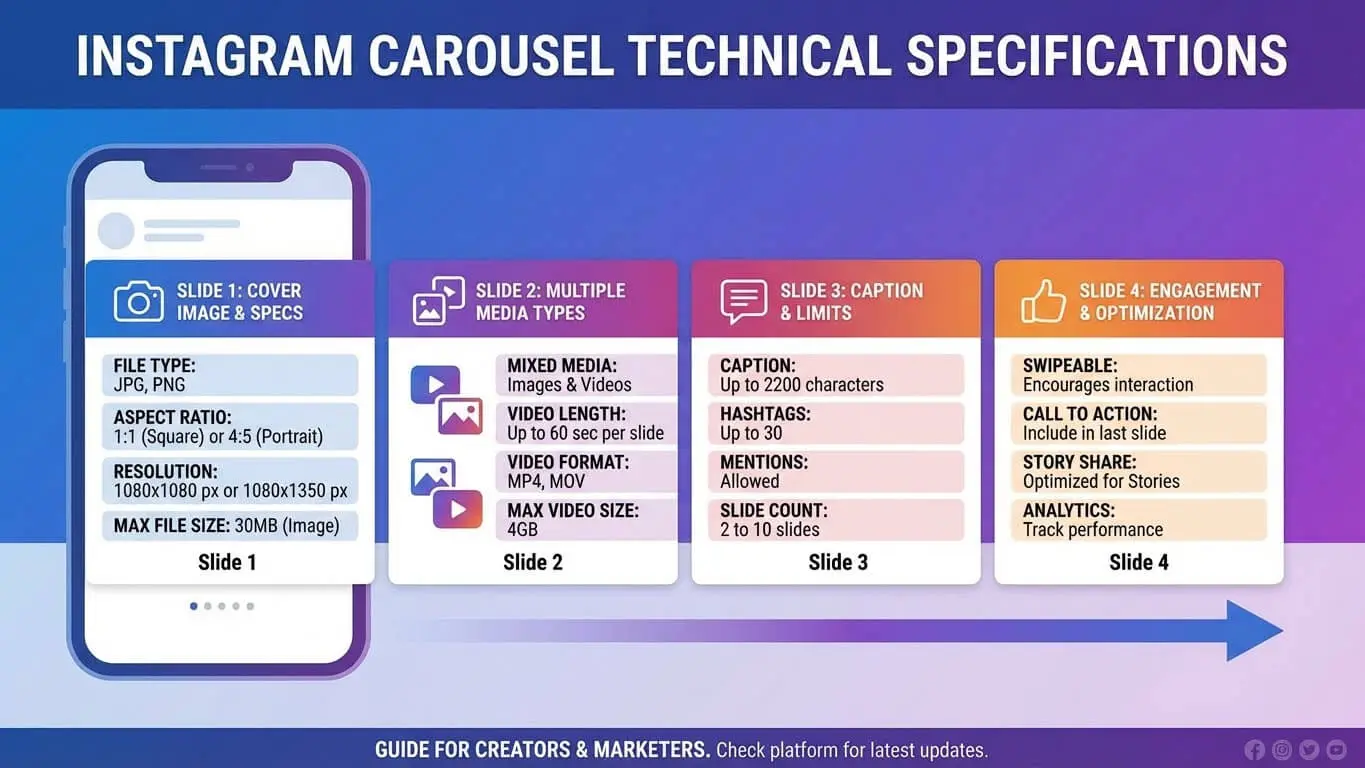
Technical Specs You Must Know
Instagram sets strict limits on carousel posts. Work within these boundaries or your upload fails.
Size and Format Requirements
- Maximum 20 slides per carousel
- Image dimensions: 1080 x 1350 pixels (4:5 ratio) recommended
- Minimum width: 1080 pixels
- Supported ratios: 1.91:1 to 4:5
- File size: 30MB per slide recommended, 4GB total limit
- Image formats: JPG, PNG
- Video formats: MP4, MOV
- Video length: 60 seconds per slide maximum
Best Practices for File Prep
Export images at high resolution. Instagram compresses everything, but starting with quality files gives you the best final result. Blurry uploads make your brand look amateur.
For videos, keep file sizes reasonable. Huge files take forever to upload and may fail. Compress your videos before uploading while maintaining visual quality.
Test your carousels on your phone before posting. What looks good on your computer might not work on mobile. Since most people view Instagram on phones, that’s your real target.
Optimal Carousel Length
Just because Instagram allows 20 slides doesn’t mean you should use all of them. Research shows 3-5 slides perform best for most content. That’s enough to tell a complete story without losing people.
Use more slides when the content demands it. A 10-step tutorial needs 10 slides. A product with 15 features might justify 15 slides. But don’t pad your carousel with filler just to hit a certain number.
Hook Them on Slide One
The first slide makes or breaks your carousel. If it doesn’t grab attention, people scroll past without swiping.
Question Hooks
Ask something your audience cares about. “Tired of wasting money on ads that don’t work?” If they answer yes in their head, they’ll swipe to see your solution.
Make questions specific. “Want more followers?” is too vague. “Want 1,000 real followers in 30 days without buying them?” creates specific interest.
Stat Hooks
Lead with surprising numbers. “89% of businesses fail at Instagram. Here’s why.” The stat grabs attention. The promise of explanation drives swipes.
Back up your numbers with sources. Don’t just make up stats. Link to studies in your caption so people can verify the claim.
Visual Hooks
Sometimes an image speaks louder than words. Strong visuals work great for brand stories. A dramatic before photo, an eye-catching design, or an intriguing product shot can all work as slide one.
Pair visuals with minimal text. The image does most of the work. Your text just adds context or poses the question that the carousel answers.
Problem-Solution Setup
State a problem your audience faces on slide one. “Your Instagram posts get 10 likes. You spend hours creating content. Nothing changes.” Slide two starts solving the problem.
This format works because you’re acknowledging their pain point immediately. They feel understood. Then they swipe to find relief.
Make Each Slide Flow
Random slides thrown together don’t work. Each slide needs to connect to the next one. Think of your carousel like chapters in a book.
Use Transitional Elements
Arrows pointing to the next slide create visual flow. Numbered slides (1 of 7, 2 of 7) show progress. Partial images that continue onto the next slide pull people along.
One clothing brand cuts their product shots so half the item shows on one slide, the other half appears when you swipe. This technique guarantees swipes because people want to see the complete image.
Build Narrative Momentum
Each slide should raise a question that the next slide answers. Slide three ends with “But here’s the problem…” Slide four reveals the problem. Slide five starts solving it.
Story structure matters even in short carousels. Beginning (hook), middle (information or story), end (resolution or call to action). Follow this pattern and your carousels feel complete.
Maintain Visual Rhythm
Alternate between text-heavy and image-heavy slides. Too much text in a row exhausts people. Too many images without context confuses them. Mix it up for better pacing.
A good rhythm might look like: bold image (slide 1), text explanation (slide 2), supporting image (slide 3), more text (slide 4), final image (slide 5), call to action (slide 6).
Callback to Earlier Slides
Reference something from slide two when you get to slide six. “Remember that stat from the beginning? Here’s why it matters.” This creates cohesion and rewards people who swiped through.
Full-circle endings work great. End where you started, but with new understanding. Slide one poses a question. Final slide answers it with everything learned in between.

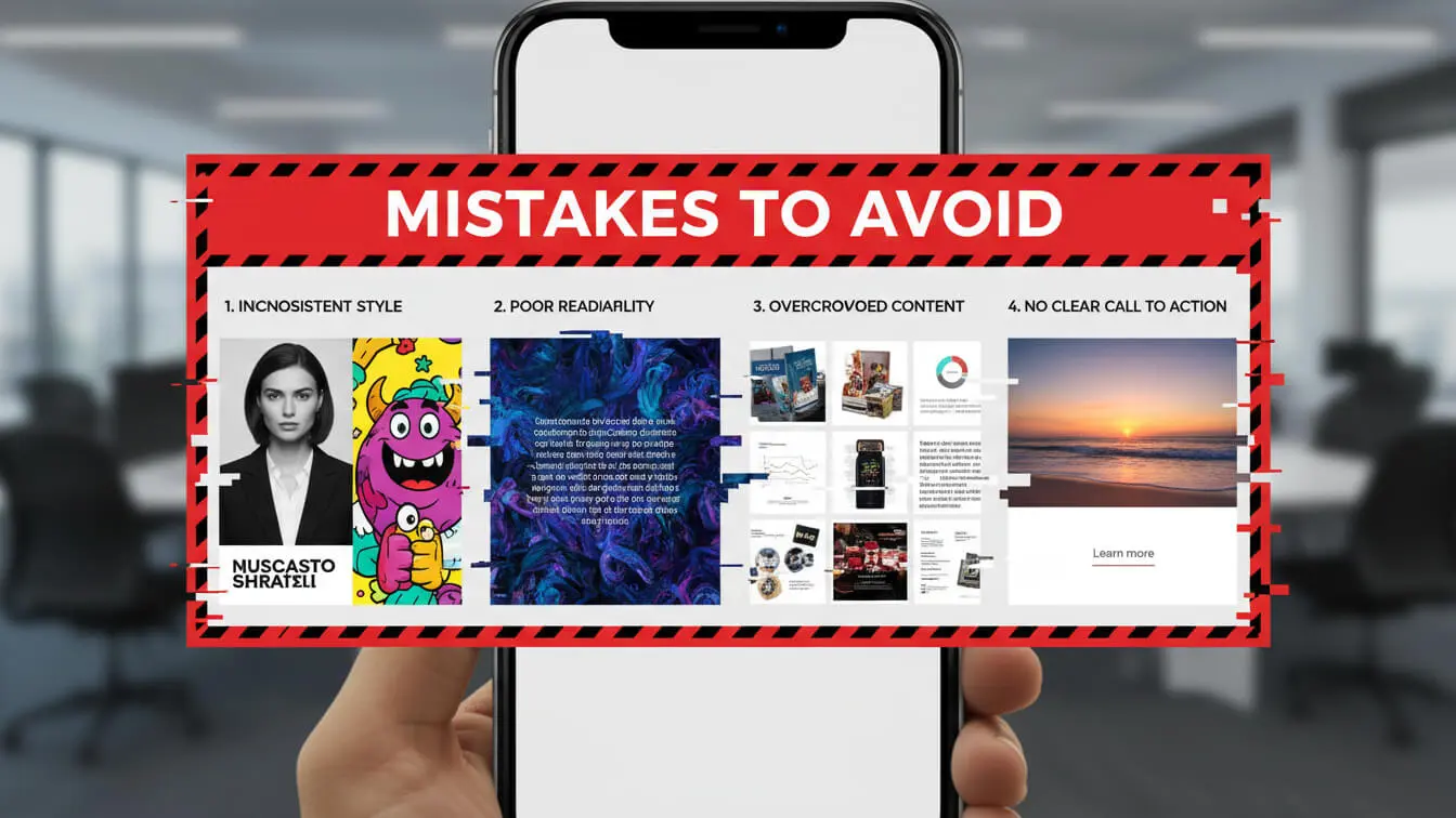
Mistakes That Kill Engagement
Cramming Too Much per Slide
Walls of text don’t work on Instagram. People are scrolling fast. If slide three looks like a novel, they skip it. Break information into smaller chunks across more slides.
One idea per slide. That’s the rule. Trying to explain three concepts on one slide means none of them land properly.
Inconsistent Branding
Changing fonts, colors, or styles mid-carousel looks unprofessional. It breaks the flow and makes people wonder if slides even belong to the same post.
Create a template and stick to it. Many successful brands use the exact same layout for all their carousels. This builds recognition and trust.
Weak First Slides
Generic openings kill carousels before they start. “Hey guys!” doesn’t hook anyone. “Top 10 Tips” is boring. Your first slide needs to be your strongest slide.
Test different first slides for the same carousel. Run the same content with three different openers and see which one gets more swipes. Then use that style going forward.
Missing Call to Action
Your carousel ends and… nothing. No next step, no prompt, no direction. People finish swiping and move on without engaging further.
Always tell people what to do next. Save the post. Comment their thoughts. Check your bio link. Visit your website. Tag a friend. Give them a specific action.
Ignoring Mobile View
Designing carousels on desktop and never checking mobile is a huge mistake. Text that looks readable on your monitor becomes tiny on phones. Complex graphics lose detail on smaller screens.
Preview everything on your phone before posting. Better yet, design on your phone so you see exactly what your audience sees.
Forgetting Captions
Your slides tell part of the story. Your caption completes it. A strong carousel with a weak caption misses opportunities for keywords, context, and engagement prompts.
Use captions to add depth slides can’t provide. Share backstory. Ask questions. Add hashtags. Give people reasons to comment.
Tools for Fast Creation
Creating carousels from scratch takes time. Smart creators use tools to speed up the process without sacrificing quality.
Canva
Canva offers pre-made carousel templates you can customize. Search for “Instagram carousel” and you’ll find thousands of options. Pick a template, swap in your content, adjust colors to match your brand.
The free version works fine for basic carousels. Pro version unlocks more templates, brand kit features, and background removal tools. Most small businesses start with free and upgrade later.
Adobe Express
Adobe’s simplified design tool includes carousel templates with professional layouts. The mobile app lets you create carousels directly on your phone, which helps you see exactly how they’ll look to your audience.
Animation options let you add subtle motion to slides. Moving elements catch eyes better than static images. Don’t overdo it—subtle beats flashy.
Figma
Designers love Figma for carousel creation. You can build custom templates, maintain brand consistency across multiple projects, and collaborate with team members in real-time.
The learning curve is steeper than Canva, but the control is worth it for brands creating lots of carousels. You can automate repetitive elements and work faster once you master the interface.
ContentStudio
ContentStudio lets you schedule carousels in advance. Upload all your slides, write your caption, pick your posting time. The tool handles everything else.
Analytics built into the platform show which carousels perform best. Track engagement per post and adjust your strategy based on real data.
RecurPost
RecurPost recommends best posting times based on your audience’s activity. Schedule carousels for when your followers are most active.
The tool supports up to 20 slides per carousel. You can also recycle high-performing carousels automatically, giving them new life months later.
Frequently Asked Questions
How many slides should my carousel have?
Three to five slides work best for most content. This length tells a complete story without losing attention. Use more slides only when your content truly needs them. A 10-step tutorial needs 10 slides. A simple product announcement needs 3-4 slides.
Can I mix photos and videos in one carousel?
Yes. Mixed-format carousels actually get higher engagement than photo-only or video-only carousels. Mixed carousels average 2.33% engagement compared to 1.86% for video-only.
Should I post carousels or Reels?
Use both, but for different purposes. Reels reach more new people and work great for discovery. Carousels engage your existing audience deeper and get saved more often. Small accounts should lean into Reels for growth. Larger accounts can rely more heavily on carousels.
What’s the best time to post carousels?
Post when your specific audience is most active. Check your Instagram Insights to see when your followers are online. General data suggests 3 p.m. and 6 p.m. on weekdays, with Friday being the best day.
How often should I post carousels?
Brands seeing the fastest growth put carousels in at least 40% of their content mix. If you post five times per week, make two of those posts carousels. Quality matters more than quantity—one great carousel beats three mediocre ones.
Do carousel posts show up in Reels feed?
Not by default, but there’s a workaround. Add music to your carousel when posting. This makes Instagram treat it partially like a Reel, giving it potential placement in the Reels and suggested content feeds.
Can I edit a carousel after posting?
You can edit the caption and alt text, but you cannot add, remove, or reorder slides. Check everything before hitting publish. If you need to fix slides, you must delete and repost.
Should I use hashtags with carousels?
Yes. Hashtags increase engagement by 4.2% on average. Use a mix of branded hashtags and popular community hashtags. Some creators put hashtags in the first comment instead of the caption to keep things clean.
What makes people save carousel posts?
Useful information drives saves. Tutorials, tips, recipes, resource lists, and how-to guides get saved because people want to reference them later. Saves tell Instagram your content has lasting value, which boosts your reach.
Can I boost or promote carousel posts?
Absolutely. Carousel ads work extremely well for product showcases and storytelling. Each slide can highlight a different product or feature. The swipeable format keeps ad viewers engaged longer than single-image ads.