Pareto Chart
The Pareto Chart is a project management reference tool covering pareto chart, pareto chart template, how to make a pareto chart, pareto chart excel. Use the chart below to look up values instantly. Printable and downloadable versions are available on this page.
Interactive Pareto Chart — Example: Customer Complaint Categories
Edit the category names and values in the table below. The chart redraws automatically. Hover over any bar to see count, percentage of total, and cumulative percentage. Click any bar to highlight it.
| Category | Frequency / Count | Remove |
|---|---|---|
Source: Original illustrative example based on Pareto analysis methodology
What Is a Pareto Chart?
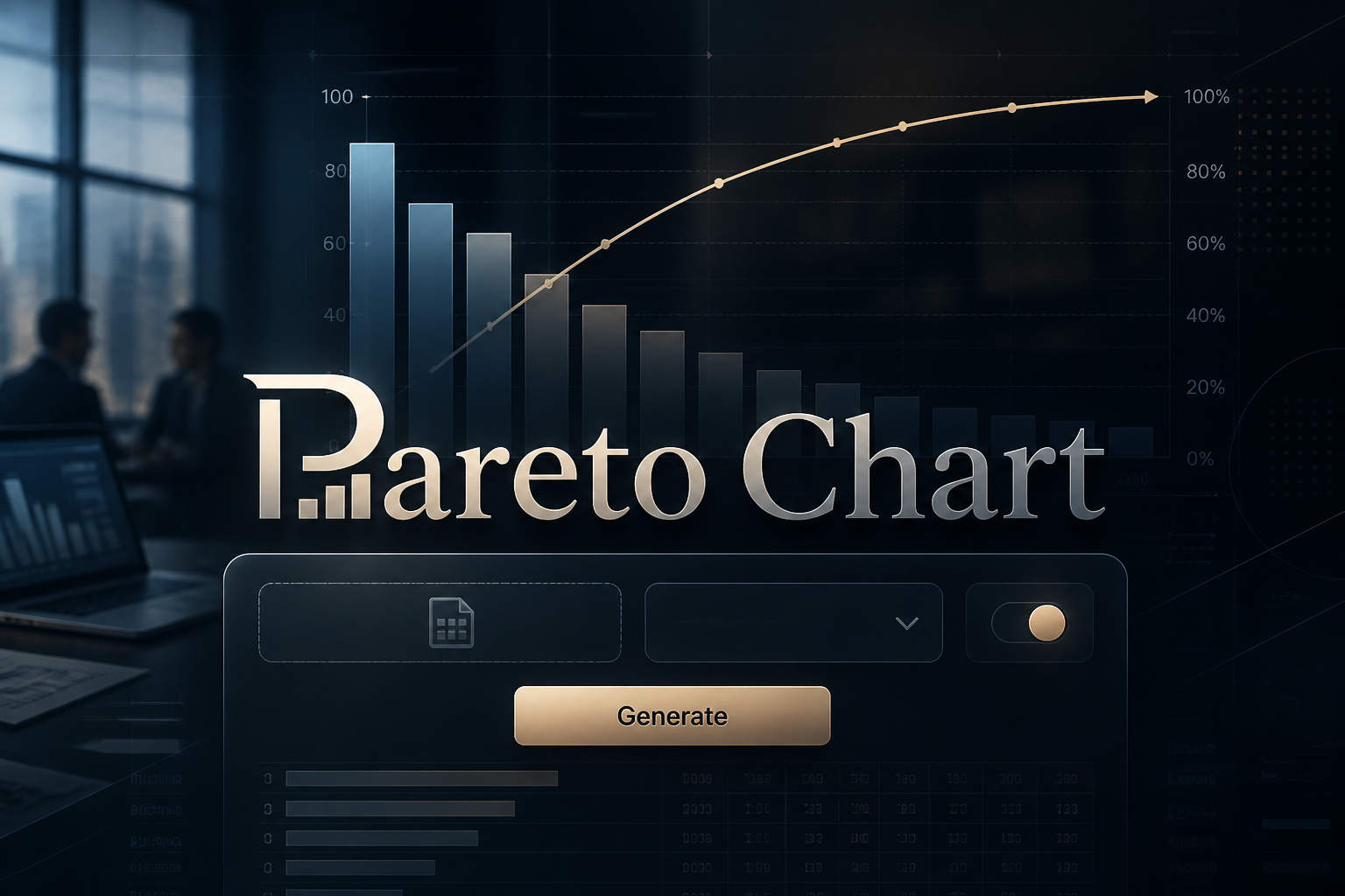
A Pareto chart is a specific type of bar chart combined with a line graph that helps identify the most significant causes in a dataset — based on the Pareto principle that approximately 80% of effects come from 20% of causes.
- The vertical bars represent categories — such as types of defects, complaint categories, or failure causes — sorted from the most frequent on the left to the least frequent on the right.
- The left y-axis shows the frequency, count, or cost for each category.
- The right y-axis shows the cumulative percentage from 0% to 100%, plotted as a rising line that starts at the top of the first bar and ends at 100% at the rightmost bar.
- The point where the cumulative line crosses 80% is the key insight — the categories to the left of that crossing are the vital few causes that account for 80% of the total problem.
Pareto Chart Example Table
| Complaint Category | Frequency | Cumulative Frequency | Cumulative Percentage |
|---|---|---|---|
| Slow response time | 80 | 80 | 34.8% |
| Wrong item received | 60 | 140 | 60.9% |
| Damaged packaging | 30 | 170 | 73.9% |
| Billing error | 20 | 190 | 82.6% |
| Missing item | 8 | 198 | 86.1% |
| Poor communication | 7 | 205 | 89.1% |
| Other | 25 | 230 | 100% |
The first four categories — slow response, wrong item, damaged packaging, and billing error — account for 82.6% of all complaints. These are the vital few. Focusing quality improvement efforts here delivers the greatest impact.
Source: Original illustrative example
How to Build a Pareto Chart — Step by Step
- Collect data on the frequency or cost of each category — defect types, complaint categories, failure modes, or any other classification of problems.
- Sort the categories from highest frequency or cost to lowest.
- Calculate cumulative frequency by adding each category's count to the running total of all previous categories.
- Calculate cumulative percentage: divide the cumulative frequency by the total frequency and multiply by 100.
- Create a bar chart with categories on the x-axis and frequency on the left y-axis. Set the bars in descending order.
- Add a secondary y-axis on the right side scaled from 0% to 100%. Plot the cumulative percentages as a line chart. Draw a horizontal dashed reference line at 80%.
Pareto Chart vs Regular Bar Chart
| Feature | Pareto Chart | Regular Bar Chart |
|---|---|---|
| Bar order | Always sorted highest to lowest frequency | Any order chosen by the creator |
| Secondary axis | Cumulative percentage line on a right y-axis | None |
| Reference line | 80% line showing the vital few threshold | None standard |
| Primary purpose | Identify and prioritise the most significant causes | Compare values across categories |
| Based on a principle | Yes — the 80/20 Pareto principle | No |
| Best used for | Quality control, root cause analysis, process improvement | General comparison of categorical data |
Where Pareto Charts Are Used
- Manufacturing quality control — identifying which defect types account for the most product failures or customer returns.
- Customer service — ranking complaint categories to focus improvement efforts on the issues affecting the most customers.
- Healthcare — identifying which medical errors, readmission causes, or safety incidents are most frequent.
- Software development — tracking which bug categories or feature requests account for the most user-reported issues.
- Business management — any situation where prioritising limited improvement resources requires knowing which problems have the biggest impact.
Pareto Chart Builder
Enter your own categories and values. The chart auto-sorts bars from highest to lowest, calculates the 80/20 cutoff automatically, and lets you export the result as SVG or CSV.
| Category | Frequency / Count | Remove |
|---|---|---|
Source: Original illustrative example based on Pareto analysis methodology
Frequently Asked Questions
What is a Pareto chart used for?
A Pareto chart is used to identify which categories of a problem account for the most impact — allowing teams to focus their improvement efforts on the vital few causes rather than spreading effort equally. It is a core tool in Six Sigma, Lean, and quality management frameworks.
What is the 80/20 rule in a Pareto chart?
The 80/20 rule states that approximately 80% of effects come from 20% of causes. A Pareto chart visualises this by showing where the cumulative line crosses 80% — everything to the left of that point represents the vital few.
Who invented the Pareto chart?
The Pareto chart was created by quality pioneer Joseph Juran in the 1940s who named it after Italian economist Vilfredo Pareto. Pareto had observed in 1896 that approximately 80% of land in Italy was owned by 20% of the population.
How do I read a Pareto chart?
Read the bars for individual category frequency and note which bars are tallest — those are the biggest contributors. Follow the cumulative line to find where it crosses 80% — the categories to the left of that point account for 80% of the total.
What is the difference between a Pareto chart and a histogram?
A histogram shows the distribution of a single continuous variable divided into equal-width intervals. A Pareto chart shows categorical data sorted by frequency — the categories can have any size and are chosen by the analyst.
Can a Pareto chart have fewer than five categories?
Yes — a Pareto chart works with any number of categories. With very few categories the 80/20 principle may not be clearly visible but the sorting-and-cumulating approach still provides useful prioritisation.
What does the cumulative line in a Pareto chart represent?
The cumulative line shows the running total percentage as you add each category from left to right. At the first bar it equals that bar's percentage of the total. At the last bar it always reaches exactly 100%.
Is a Pareto chart a type of bar chart?
Yes — a Pareto chart is a specialised type of bar chart where bars are sorted in descending order and combined with a cumulative percentage line on a secondary axis. The combination makes it distinctly different from a standard bar chart in purpose and interpretation.