Color Wheel Chart
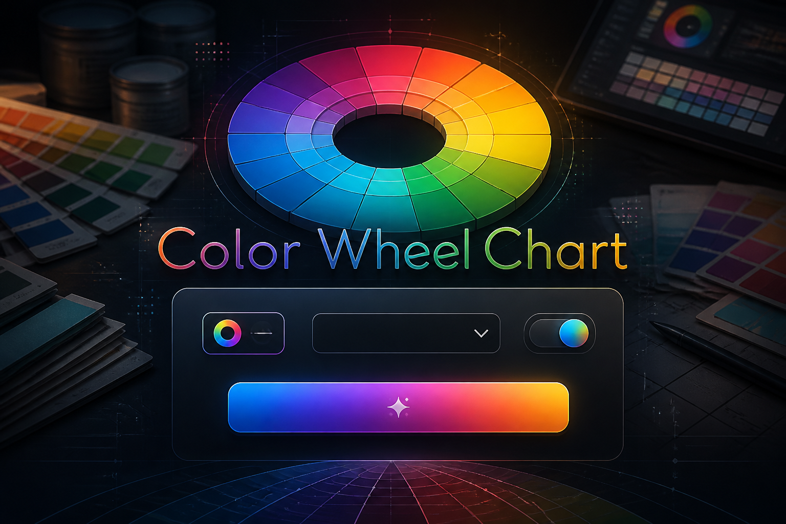
The Color Wheel Chart is a reference tool covering color wheel chart, color wheel, primary secondary tertiary colors, complementary colors chart. Use the chart below to look up values instantly. Printable and downloadable versions are available on this page.
Colour Wheel Basics — Primary, Secondary, and Tertiary Colours
| Colour | Category | Position on Wheel | Mixed From |
|---|---|---|---|
| Red | Primary | 12 o'clock | Cannot be mixed from other colours |
| Red-Orange | Tertiary | 1 o'clock | Red + Orange |
| Orange | Secondary | 2 o'clock | Red + Yellow |
| Yellow-Orange | Tertiary | 3 o'clock | Yellow + Orange |
| Yellow | Primary | 4 o'clock | Cannot be mixed |
| Yellow-Green | Tertiary | 5 o'clock | Yellow + Green |
| Green | Secondary | 6 o'clock | Yellow + Blue |
| Blue-Green | Tertiary | 7 o'clock | Blue + Green |
| Blue | Primary | 8 o'clock | Cannot be mixed |
| Blue-Violet | Tertiary | 9 o'clock | Blue + Violet |
| Violet | Secondary | 10 o'clock | Red + Blue |
| Red-Violet | Tertiary | 11 o'clock | Red + Violet |
Source: Traditional RYB (Red-Yellow-Blue) colour theory — artist's colour wheel
Colour Harmony Types Reference
| Harmony Type | Rule | Number of Colours | Visual Effect and Best Use |
|---|---|---|---|
| Complementary | Two colours directly opposite each other on the wheel | 2 | Maximum contrast and vibration. Use one as dominant and one as accent. E.g. Red and Green, Orange and Blue. |
| Split-Complementary | One colour plus the two colours adjacent to its complement | 3 | High contrast but more nuanced than complementary. Easier to balance. Good for beginners. |
| Analogous | Three to five colours adjacent to each other on the wheel | 3 to 5 | Harmonious and pleasing — found abundantly in nature. Creates a sense of unity and calm. |
| Triadic | Three colours equally spaced around the wheel (120° apart) | 3 | Vibrant and balanced. All three colours get equal visual weight. Primary triadic: Red, Yellow, Blue. |
| Tetradic (Rectangle) | Four colours forming a rectangle on the wheel — two complementary pairs | 4 | Rich and complex. Works best when one colour dominates. Challenging to balance. |
| Square | Four colours equally spaced (90° apart) on the wheel | 4 | Similar to tetradic but more balanced. All four colours should be used carefully to avoid visual chaos. |
Source: Itten's colour theory and standard art and design colour harmony principles
RYB vs RGB vs CMYK Colour Models
| Model | Primary Colours | Used In | Notes |
|---|---|---|---|
| RYB (Red-Yellow-Blue) | Red, Yellow, Blue | Traditional art — painting, drawing, fine art colour mixing | The artist's colour wheel. Not physically accurate for light but useful for pigment mixing intuition and design theory. |
| RGB (Red-Green-Blue) | Red, Green, Blue | Digital screens, photography, web design, computer graphics | Additive colour model — mixing light. All colours together make white. Used in all screen-based design. |
| CMYK (Cyan-Magenta-Yellow-Key/Black) | Cyan, Magenta, Yellow, Black | Print design, commercial printing, inkjet printers | Subtractive colour model — mixing ink. All colours together make black (theoretically). Used in all print production. |
Source: Standard colour science — CIE and print industry references
Color Harmony Generator
Pick a base color to instantly get complementary, analogous, triadic, split-complementary, and tetradic palettes with hex, RGB, and HSL codes.
Frequently Asked Questions
What are the primary colours?
In the traditional RYB (artist's) colour model the primary colours are Red, Yellow, and Blue — they cannot be created by mixing other colours. In the RGB (light/screen) model the primaries are Red, Green, and Blue. In the CMYK (print) model they are Cyan, Magenta, Yellow, and Black.
What colours are opposite on the colour wheel?
Colours directly opposite each other on the wheel are called complementary colours — they create the highest contrast when placed together. The main complementary pairs in the RYB wheel are Red/Green, Orange/Blue, and Yellow/Violet.
What is an analogous colour scheme?
An analogous colour scheme uses three to five colours that sit next to each other on the colour wheel — for example orange, yellow-orange, and yellow. Analogous schemes are harmonious and naturally pleasing because colours adjacent on the wheel share a common hue.
What are warm and cool colours?
Warm colours — reds, oranges, and yellows — are associated with fire, sunlight, and energy. Cool colours — blues, greens, and violets — are associated with water, sky, and calm. On the colour wheel warm colours occupy roughly the right half and cool colours the left half.
What is the difference between hue, saturation, and value?
Hue is the pure colour itself — red, blue, yellow. Saturation (also called chroma) is the intensity or purity of the colour — fully saturated is vivid, desaturated is grey. Value (also called brightness or lightness) measures how light or dark the colour is — high value is light, low value is dark.
What colour does red and blue make?
In the RYB traditional colour model red and blue mixed together make violet or purple. The exact shade depends on the proportions — more red produces red-violet and more blue produces blue-violet.
What is the colour wheel used for in design?
The colour wheel is used by designers, artists, and decorators to select harmonious colour combinations — using rules like complementary, analogous, and triadic to create palettes that are visually balanced. It is the fundamental reference tool for colour theory in graphic design, interior design, fashion, and fine art.
What is tint, shade, and tone?
Tint is a colour with white added — making it lighter. Shade is a colour with black added — making it darker. Tone is a colour with grey (both white and black) added — reducing its saturation without changing its lightness as dramatically.